“How might we visualize complex data in an interactive environment?”
TTC Subway Delays
Website, Data Visualization and Web Design
Deliverable
Live website
Role
Research, Ideation, Mockups, Coding
Software
Adobe Illustrator, Sublime Code Editor
Problem
The Toronto Transit Commission (TTC)’s subway system faces delays every day. The TTC has released detailed data on every single delay across all subway lines. 54% of incidents in 2016 were caused by passenger-related incidents while 9% of the incidents were TTC employees-related. The other 37% were caused by unplanned outages.
Solution
In order to inform the public about why there’s delays, I built a website with JavaScript-based data visualization models, where the user can interact with data on the subway and delays. This website presents a clearer vision of where the biggest problem in delays is for the TTC subway while presenting it in a illustrative and interactive way to engage the user.Interactive Charts
The charts on the website display 2016’s delays. The original data set was organized by date, time, day of the week, station, delay code, delay (in minutes) to subway service direction, time length (in minutes) between trains, direction of train, line and vehicle. I compressed and summarized the data into the types of delays, how many occurred organized by each line and how many minutes of delay in total for each type.
The second chart breaks down the data even further, as you can look at the typical number of delays in each month and even the weekdays of each month.
Design Approach
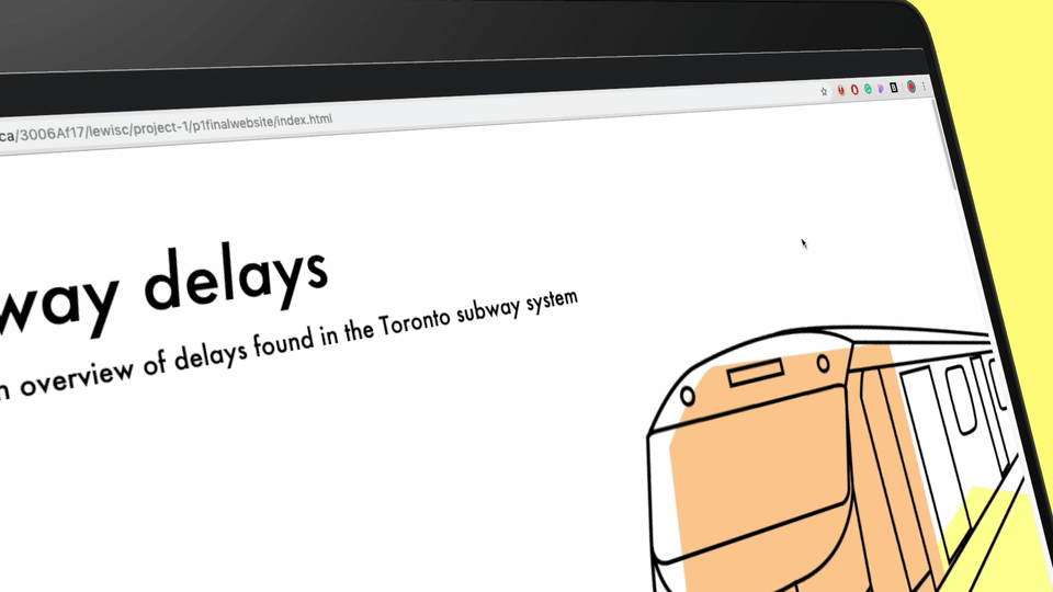
Line illustrations were used to play with the typical sightings of the TTC subway: TTC Rocket subway train, line numbers, seats on the subway, and the TTC logo. These illustrations help place the interactive charts within the context of the subject.
Futura was used as the header typeface as the previous TTC typeface used in stations throughout the system, Toronto Subway, is based off of Futura’s angled glyphs and round O's. Futura is still present in the current typeface produced in 2013, Bloor-Yonge, as it is a cleaned up expansion of Toronto Subway.
Outcome
Through this website, I was able to learn how to code a JavaScript-based chart and integrate it into a website. Information is complex in our digital world, but this project provided me skills to take on complex information and turn it into a visualization that is easier to understand.
