“How might we ease the process of working in a public space?”
Seat
iOS App, UI/UX Design
Deliverables
Live prototype, style guide, and walkthrough
Team Members
Mirabelle Wang, Livia Widjaja and Anna Bacani
Role
Research, Ideation, Prototyping, User Testing, Motion Graphics
Software
Sketch, InVision, After Effects
Problem
Young professionals typically like to work outside of the office at places like cafes or libraries. Currently, there is no quantitative data of how many seats are left in a public space. In a busy populated city, seats fill up quickly and many people end up frustrated due to the time spent in trying to find a seat somewhere around them.
Solution
Seat is a mobile app that allows young professionals to find a seat in any place they want to work. Seat provides real-time data on how many seats are left in a space and is a platform to reserve a guaranteed seat. It is an app that encourages young professionals to be more productive as they would spend less time finding a place to work in.Research
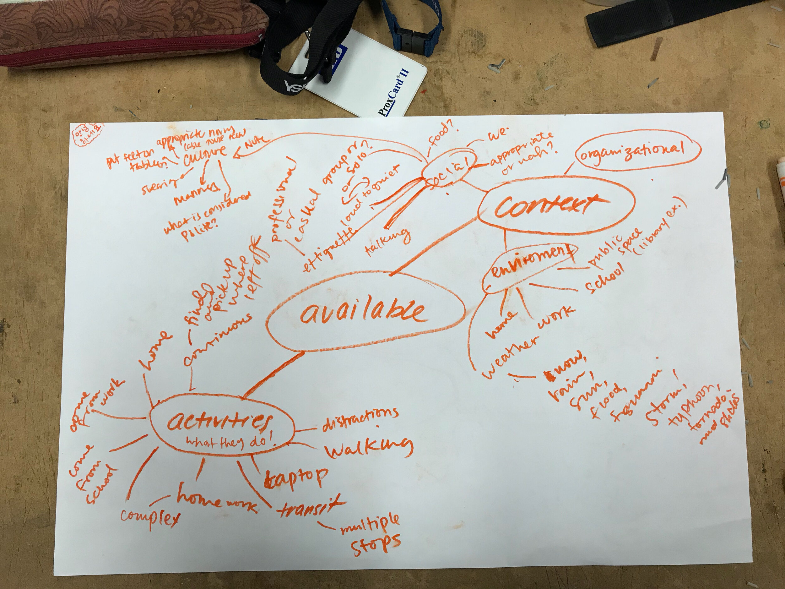
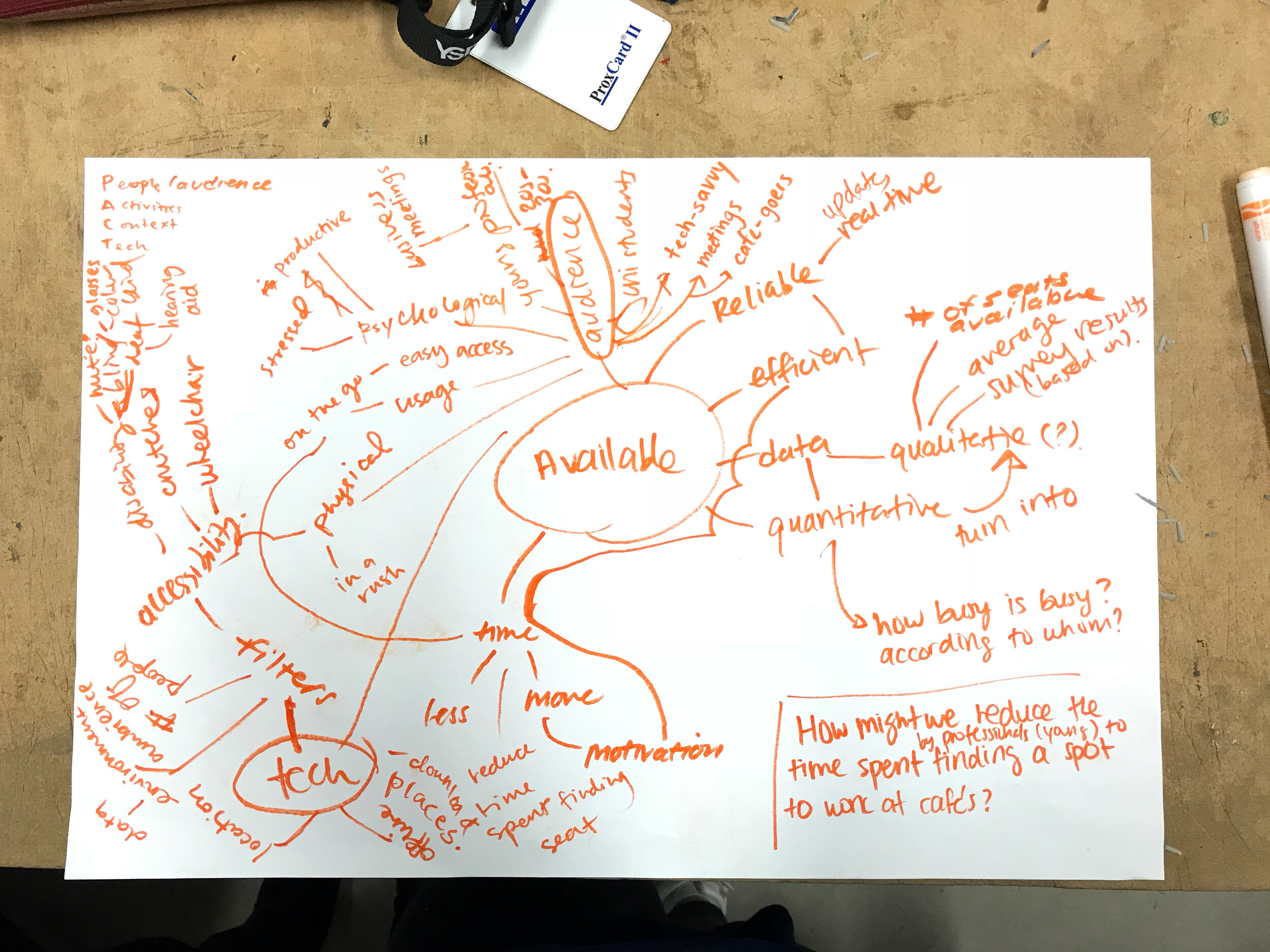
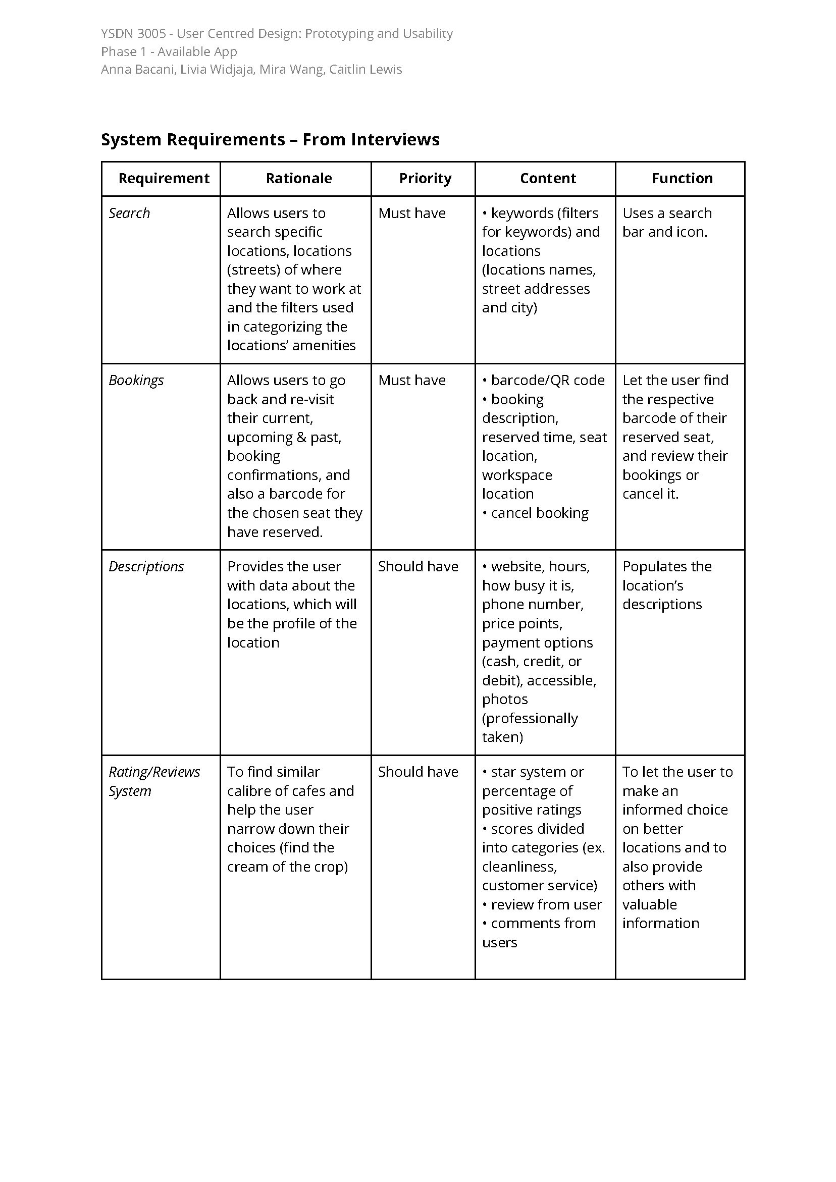
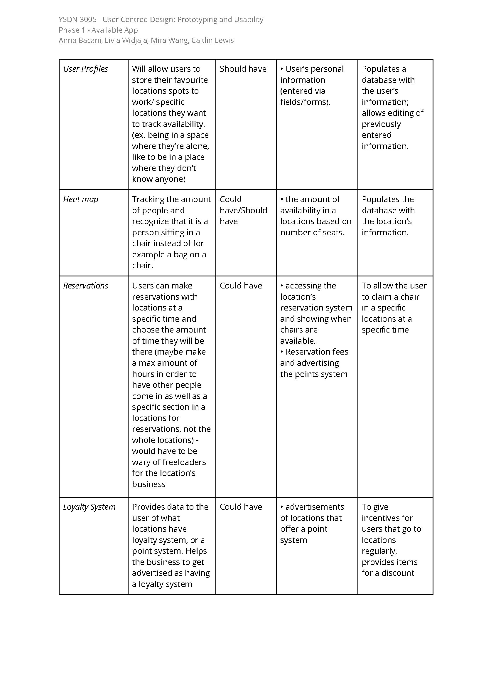
We went through rigorous steps of research before making the prototype of the app and these are the methods of research we used:
PACT analysis
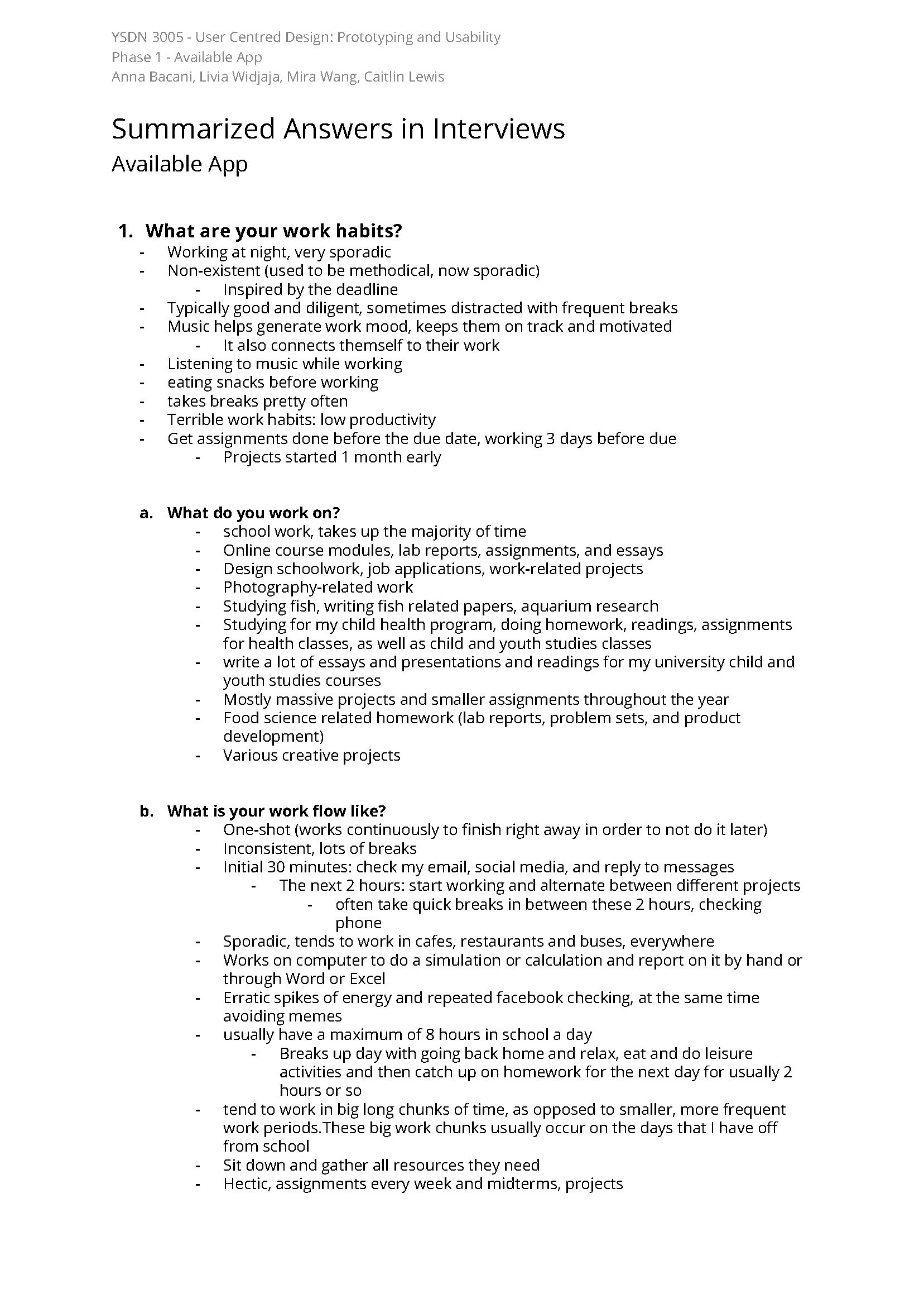
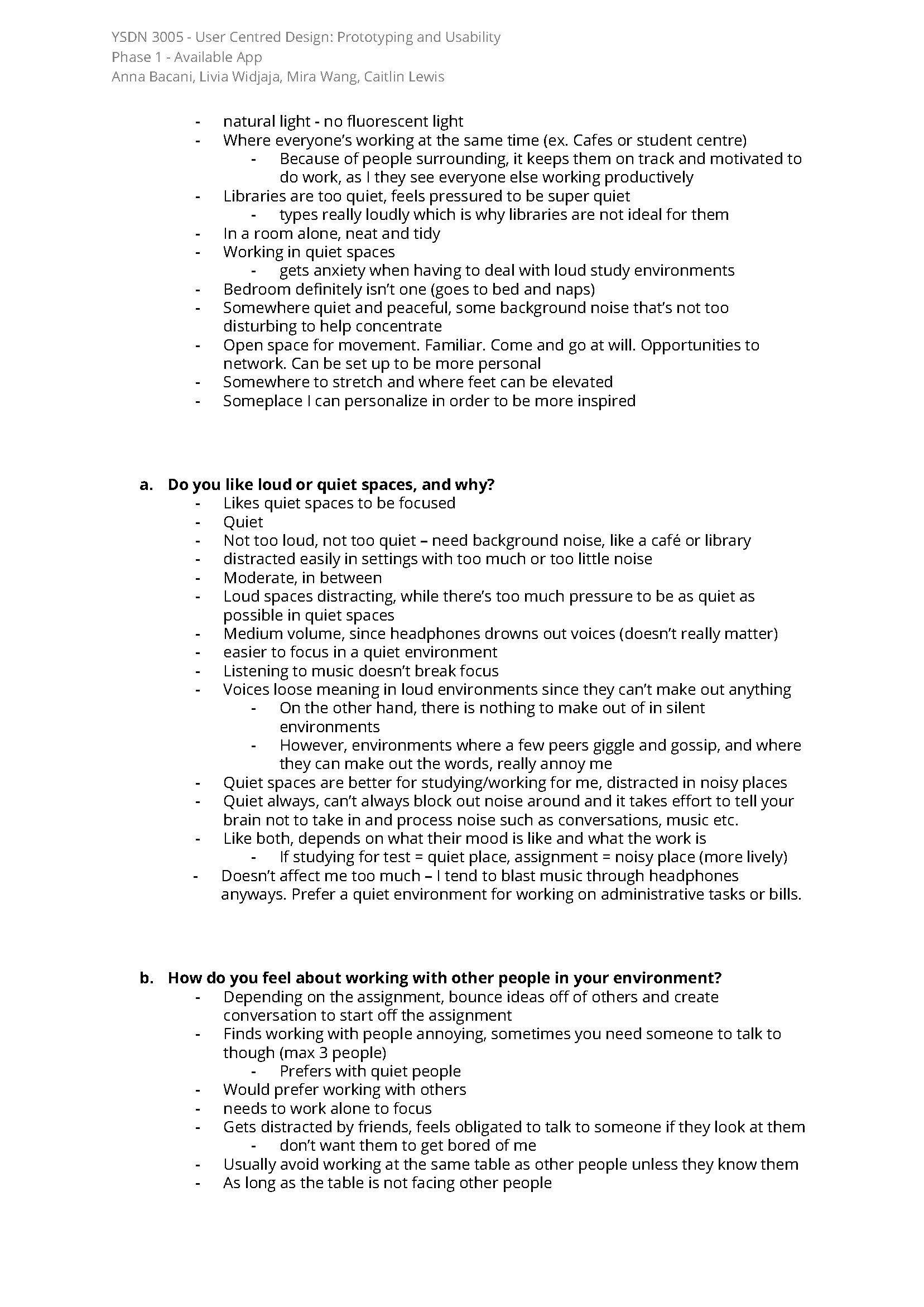
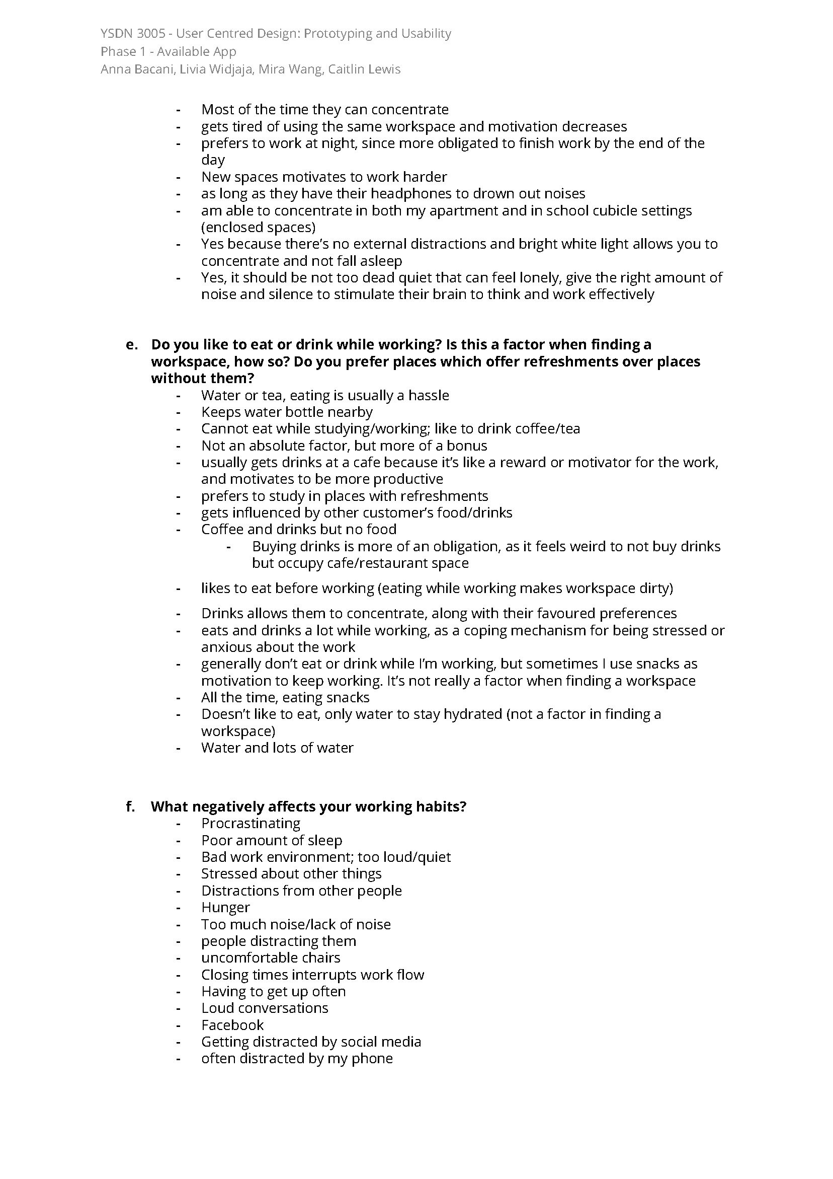
User interviews
MoSCoW (Must Have, Should Have, Could Have, Would Have) method
User personas
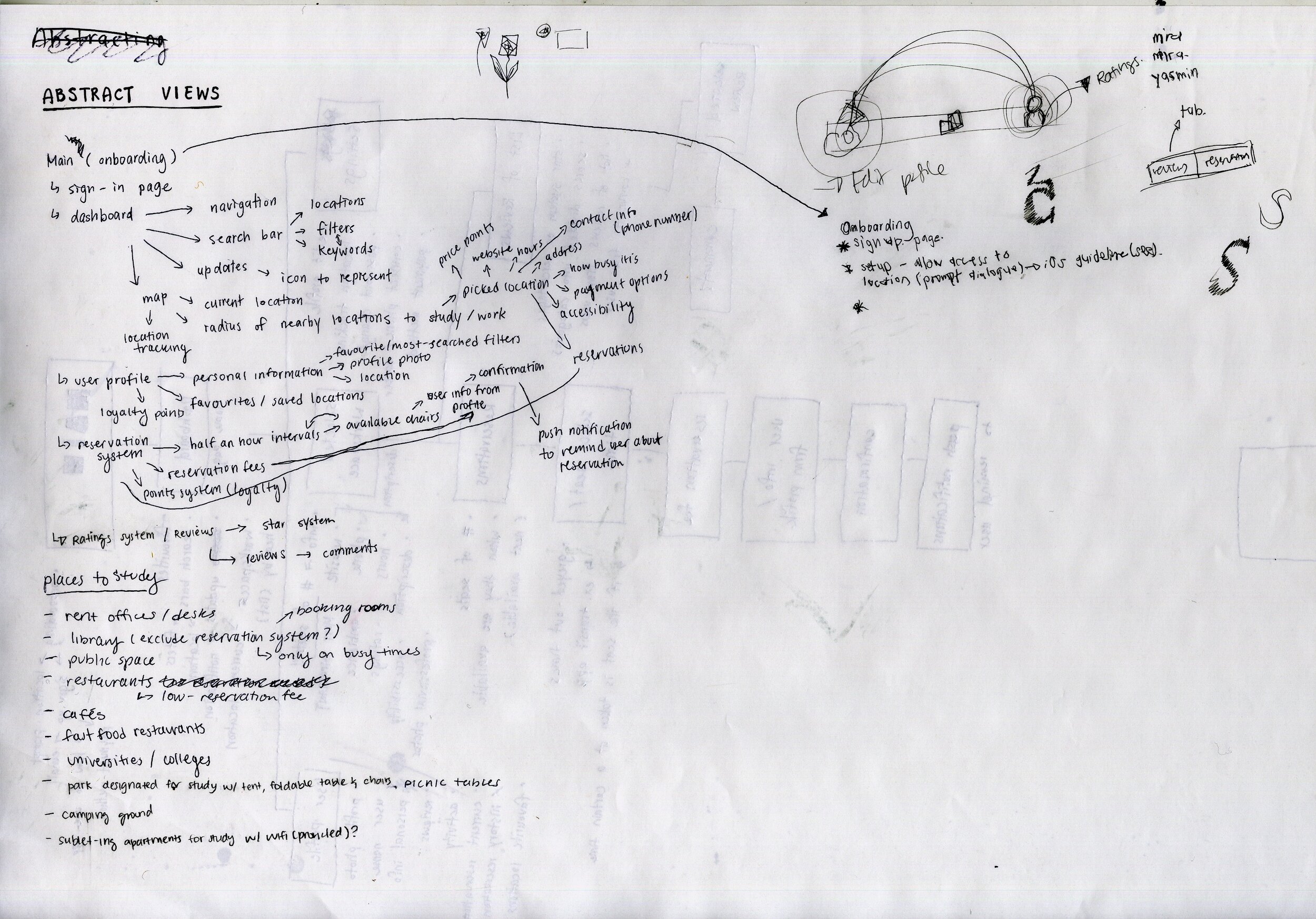
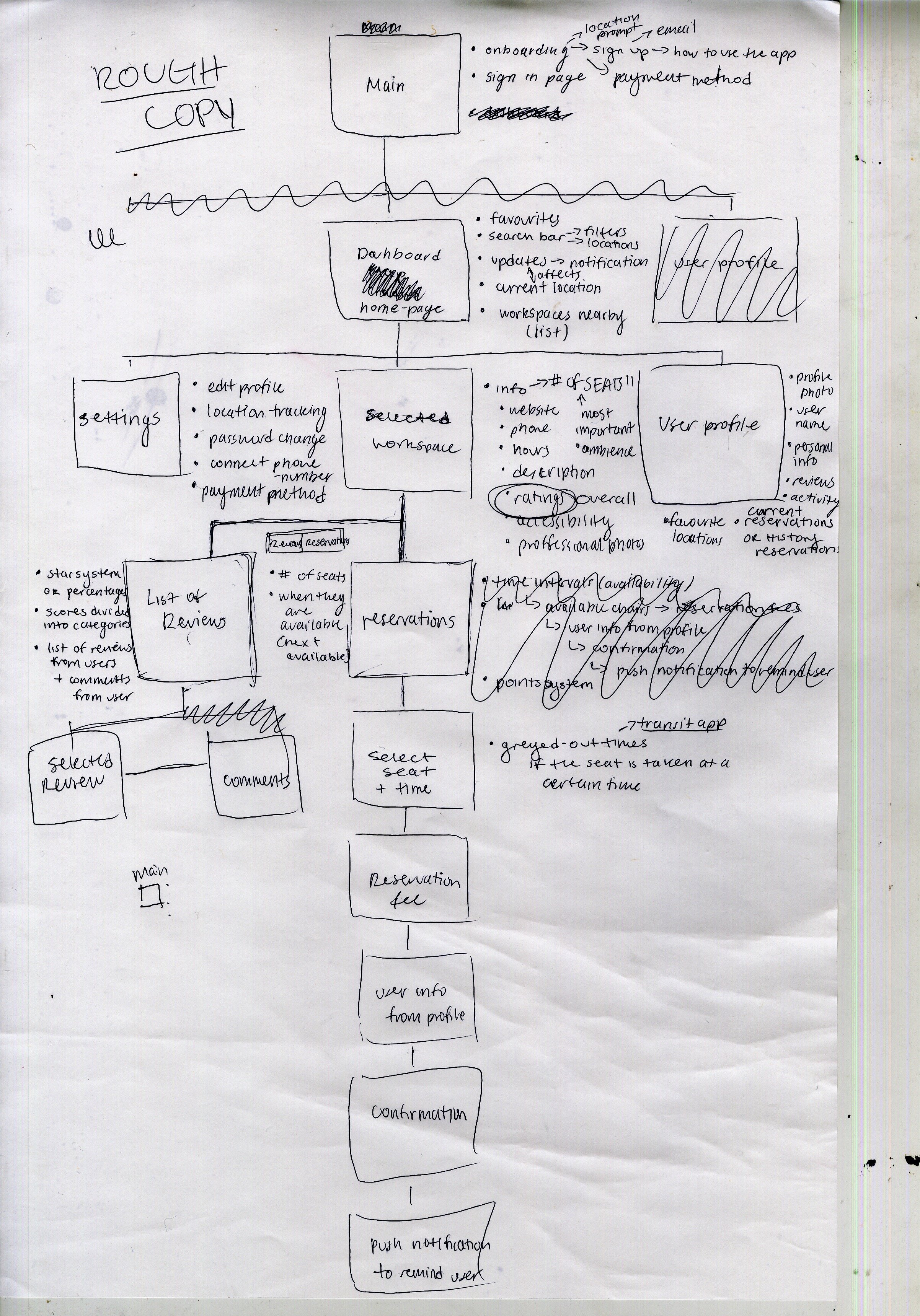
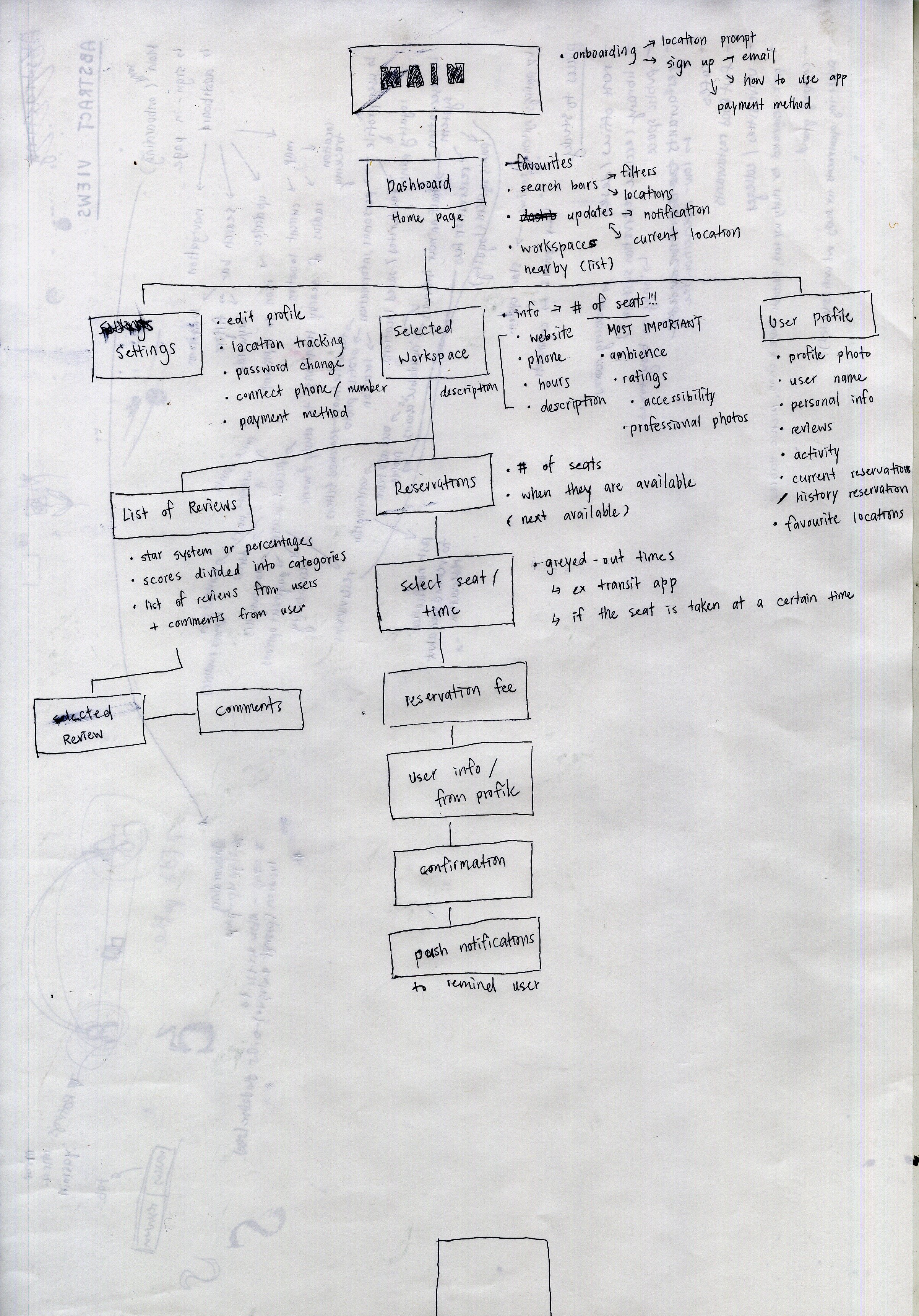
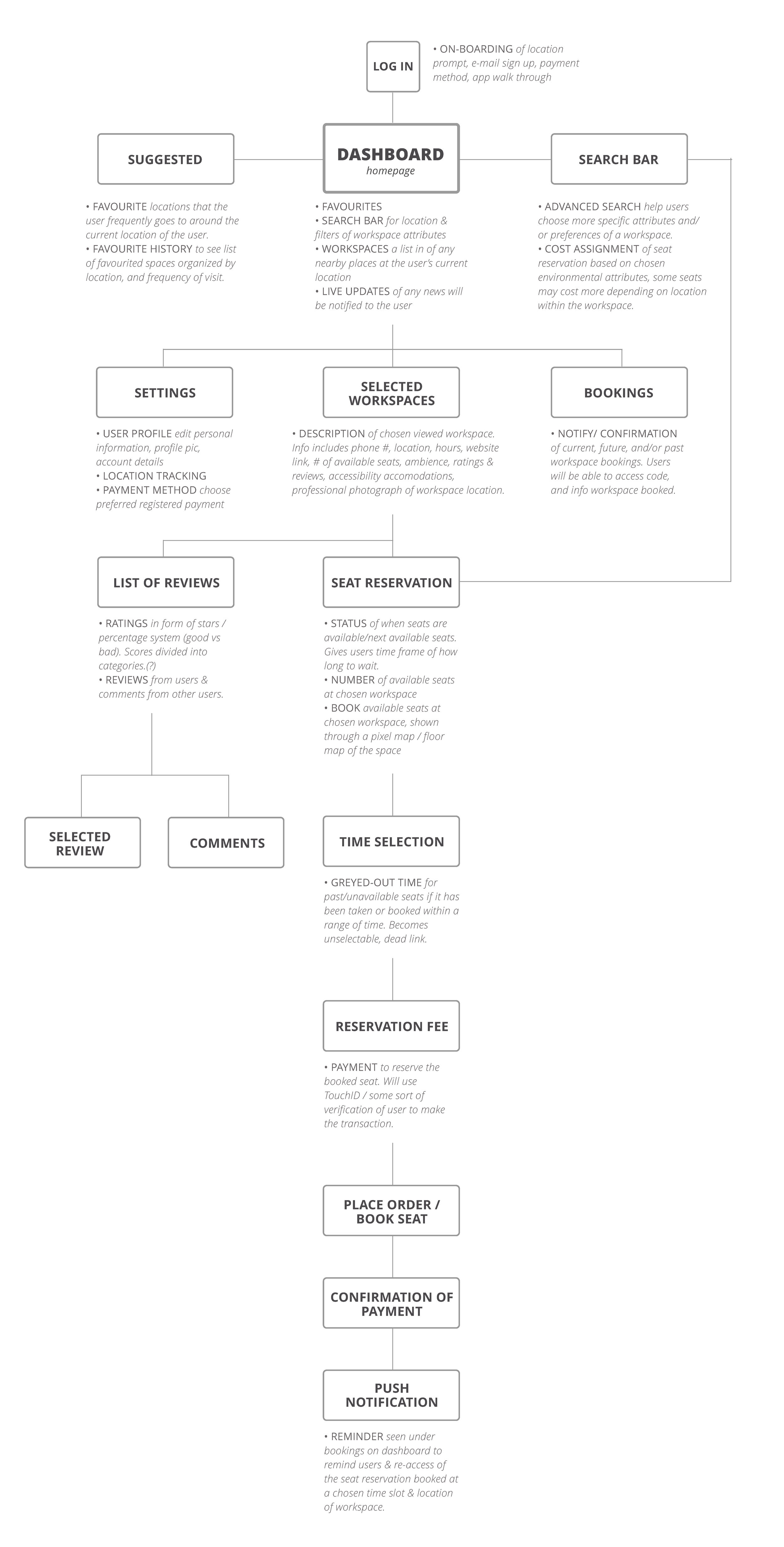
System map
Our app is targeted at young professionals who like to work in public spaces, therefore we put most of our research efforts into understanding their wants and needs in working spaces.
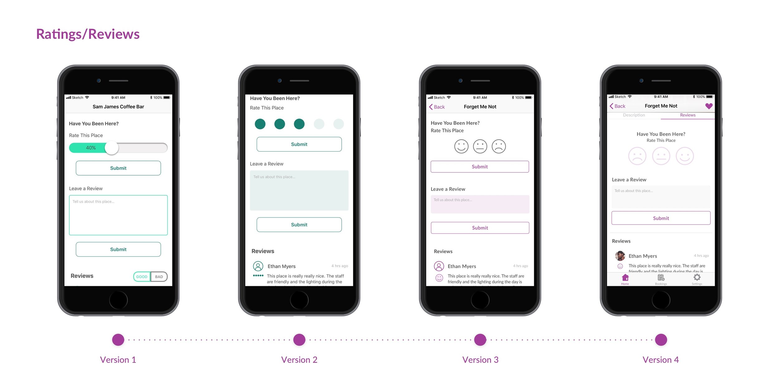
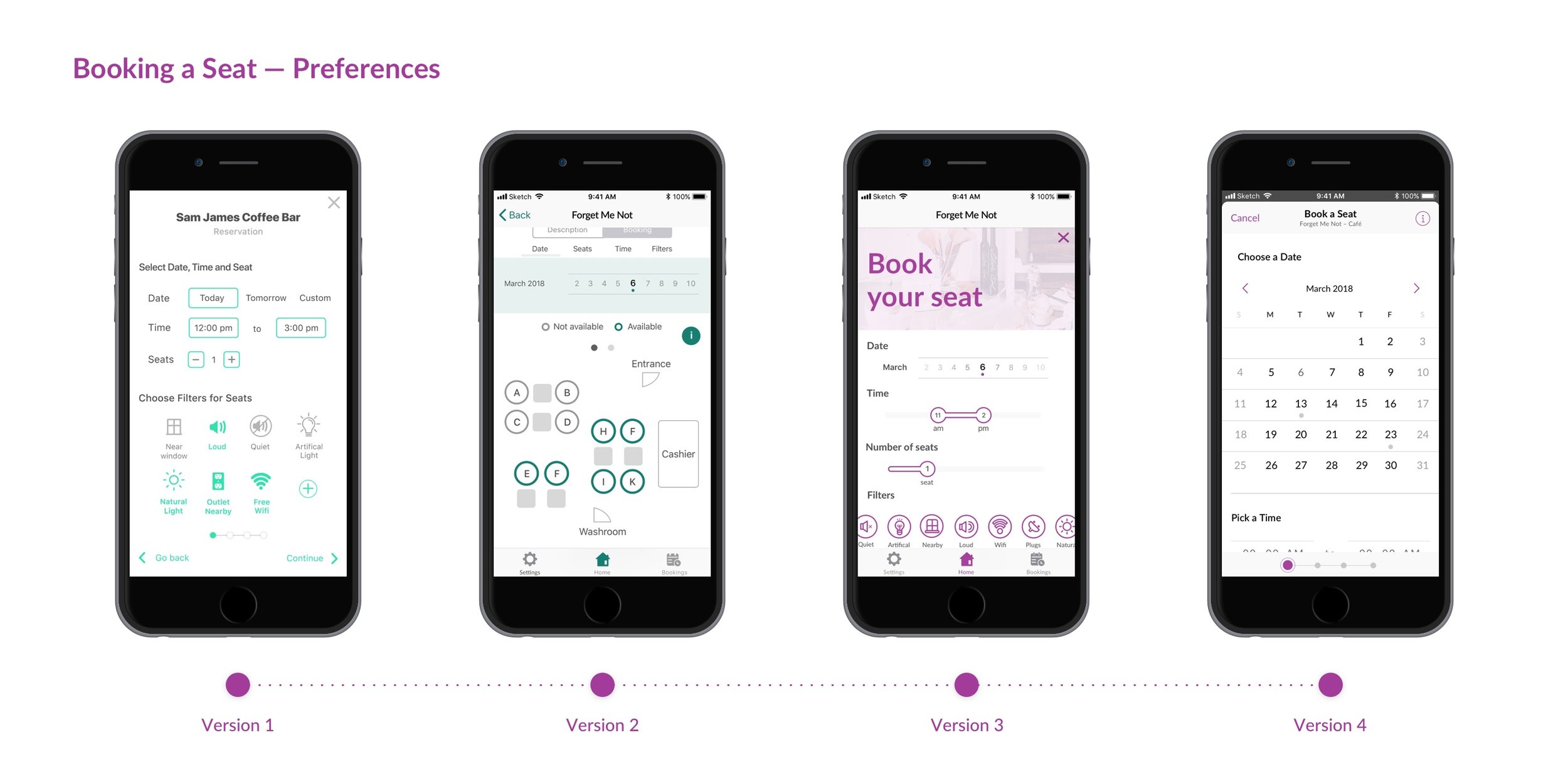
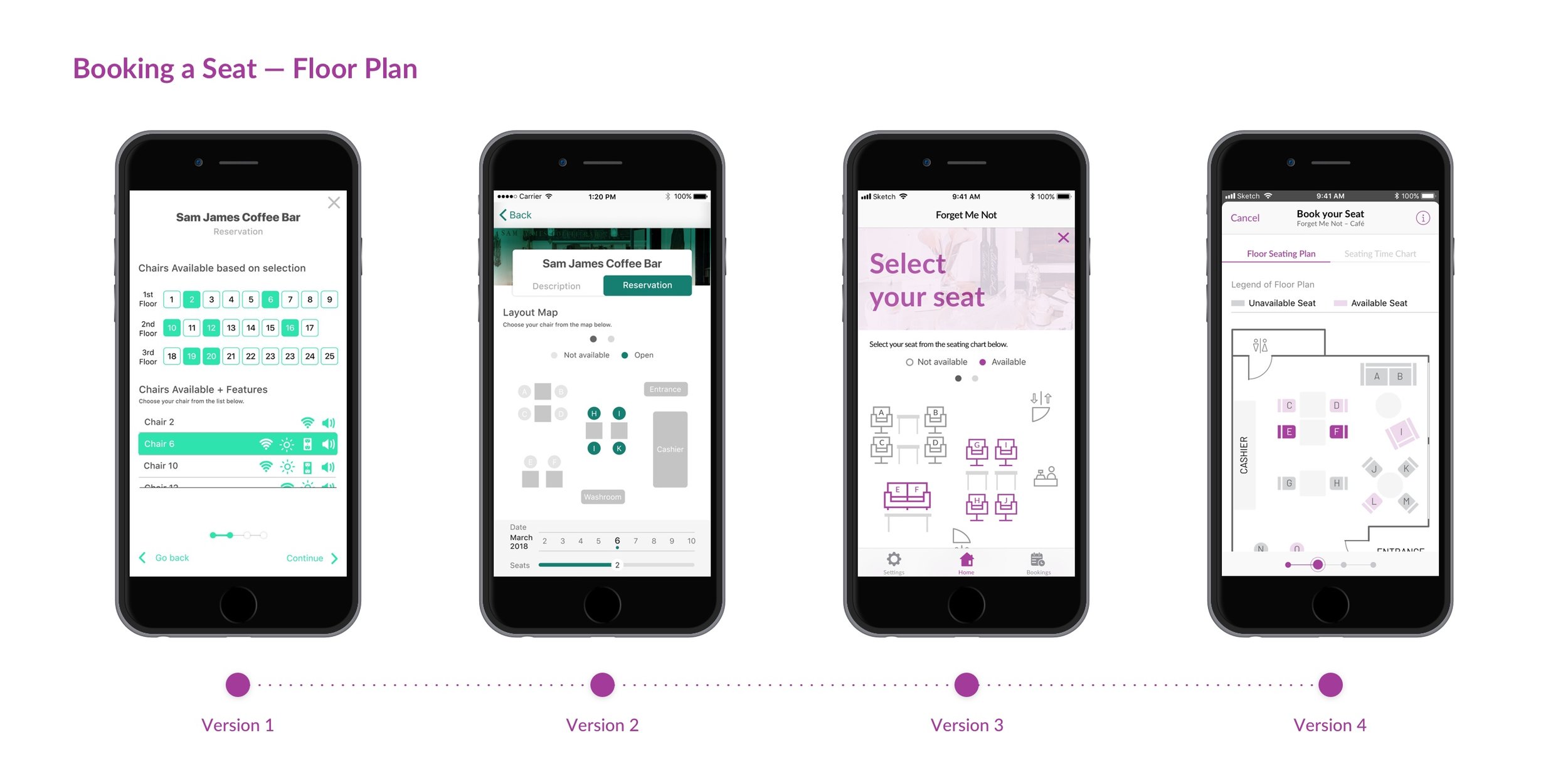
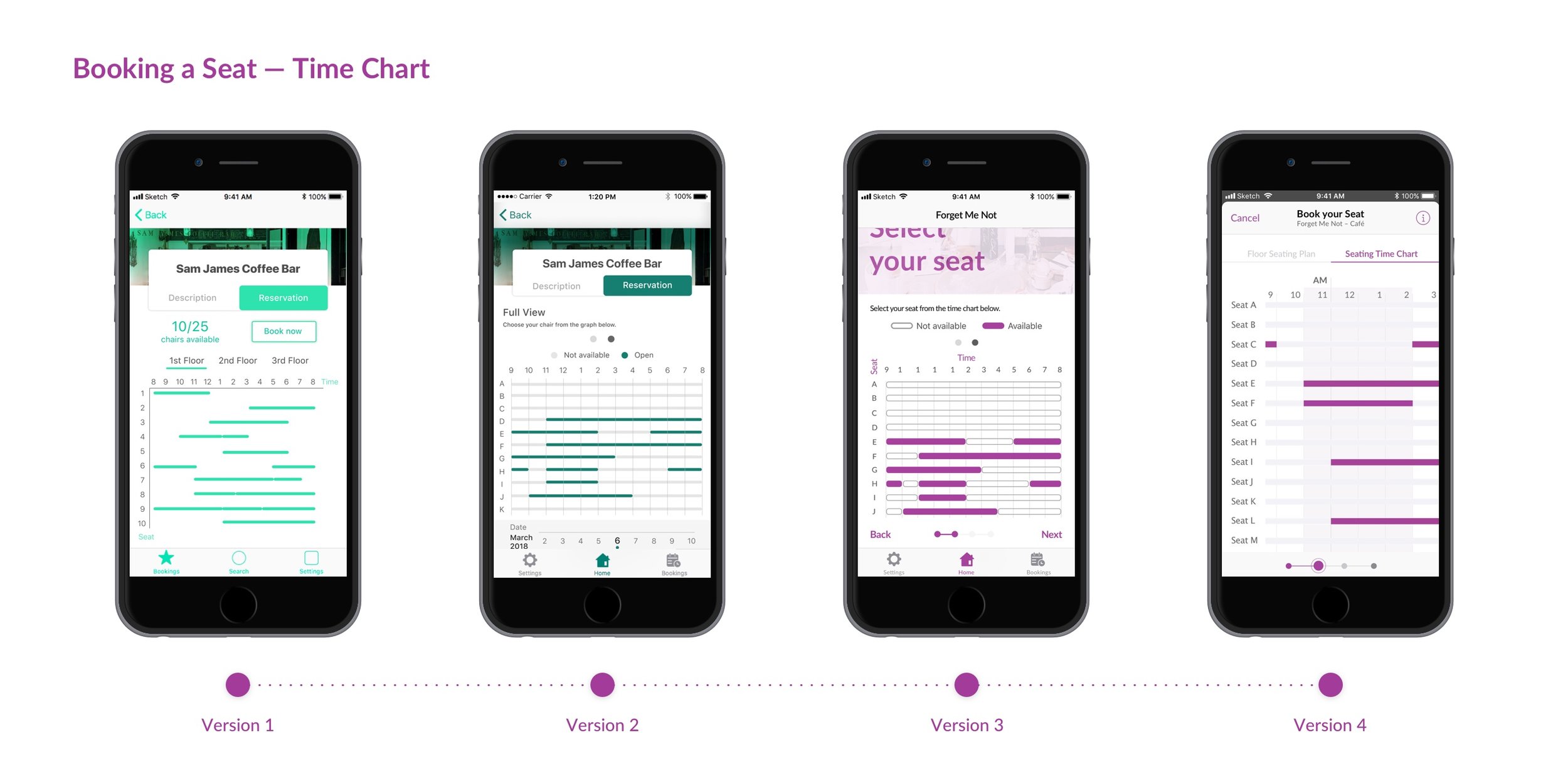
UI Iteration
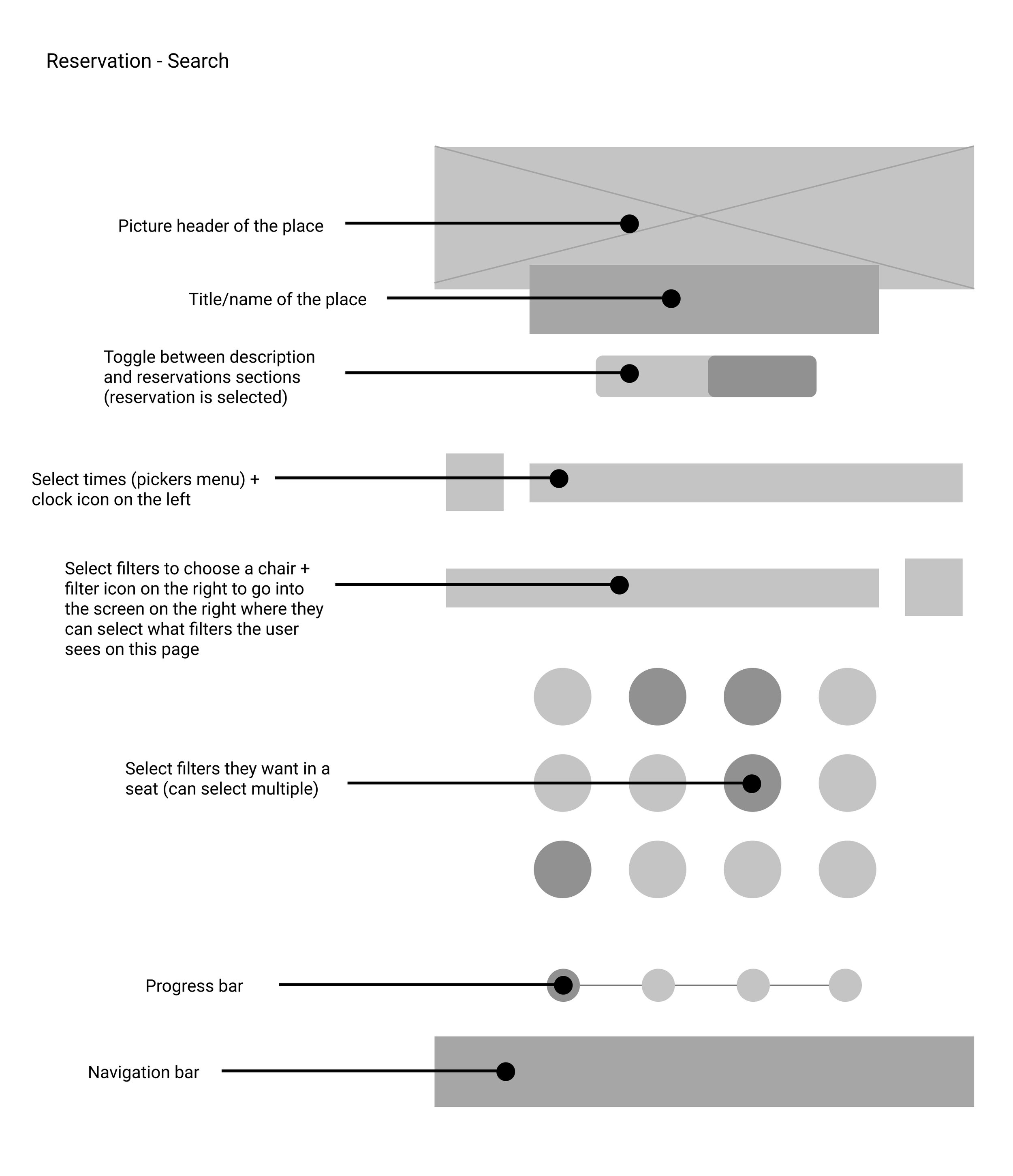
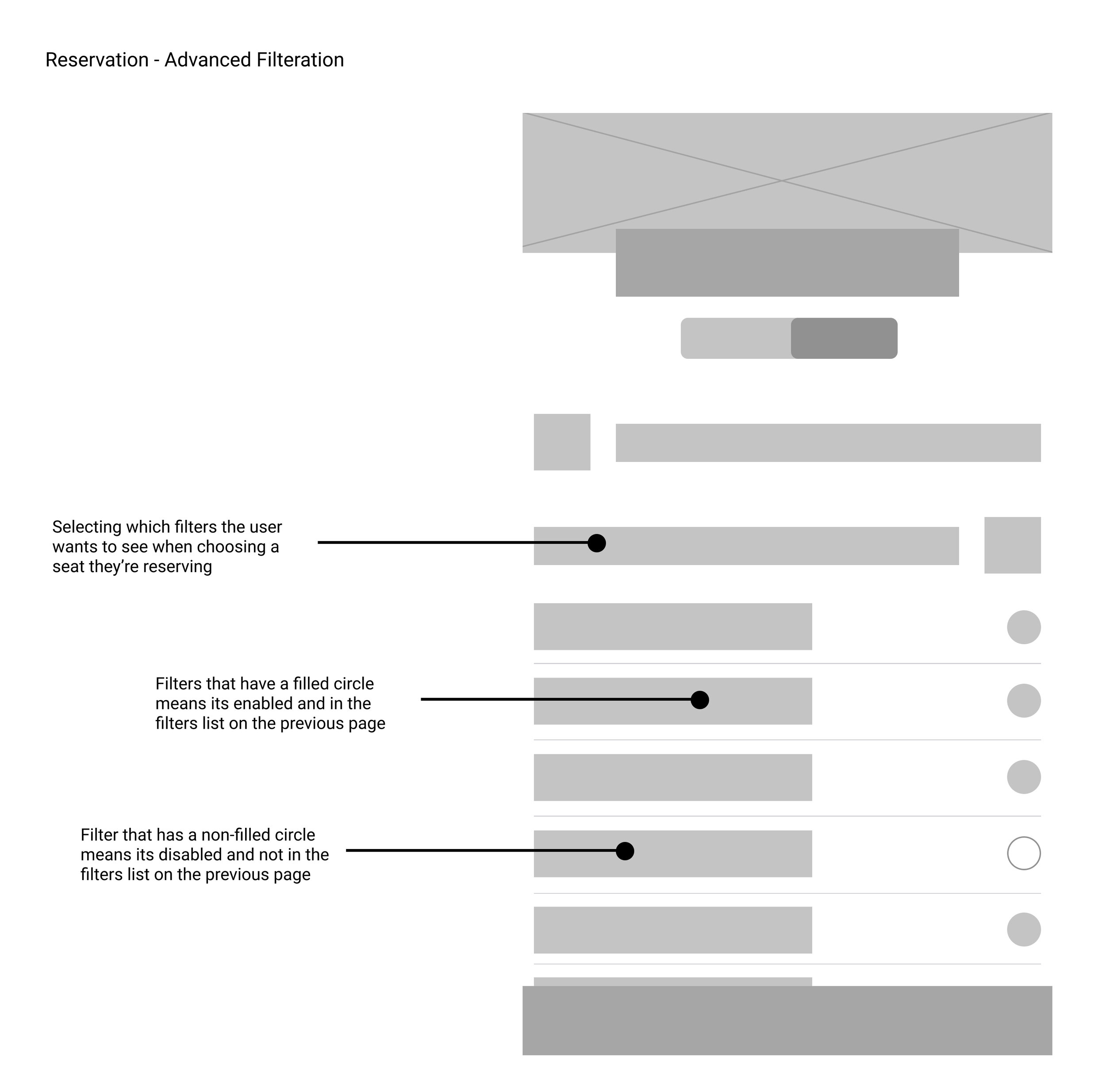
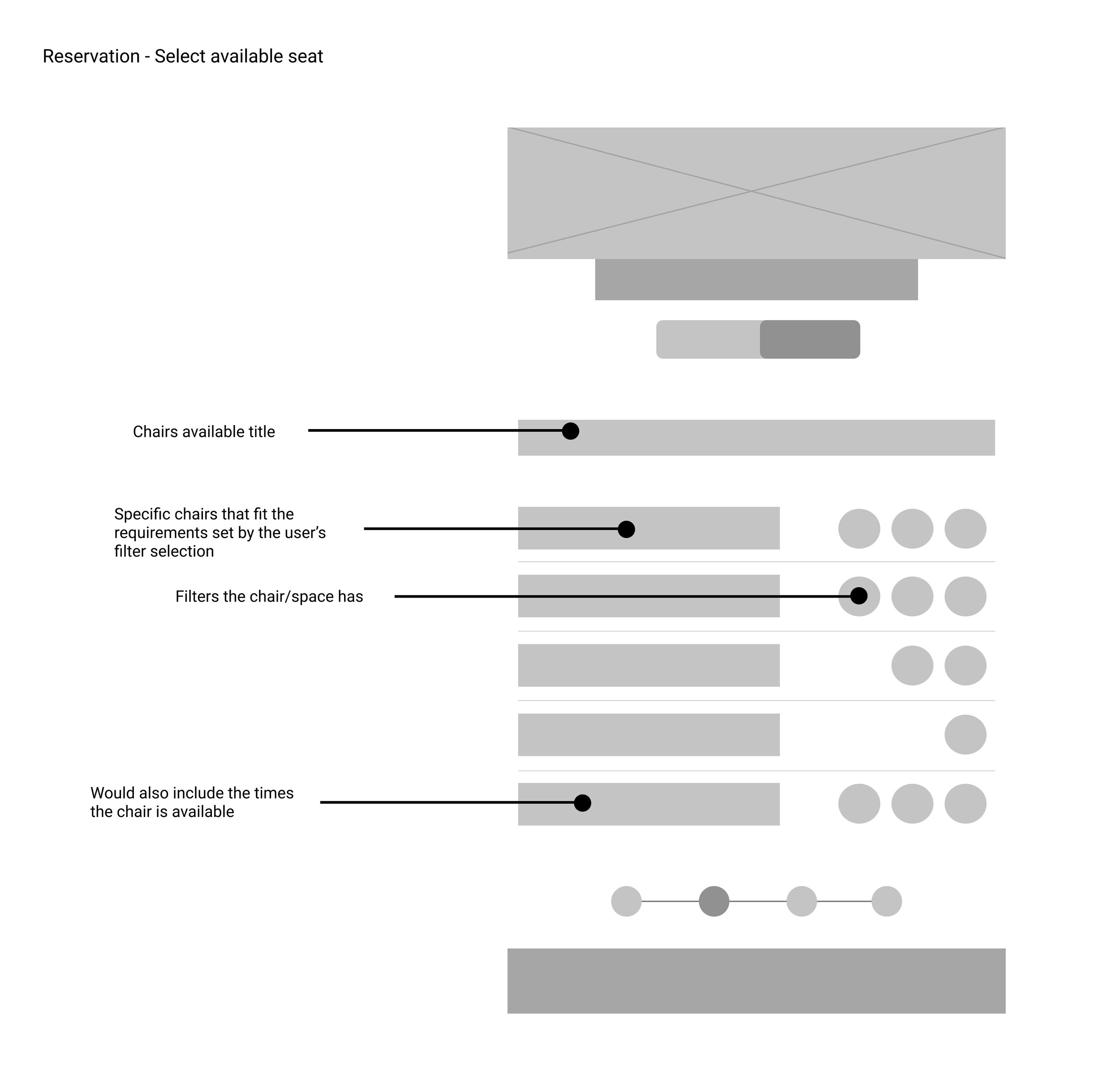
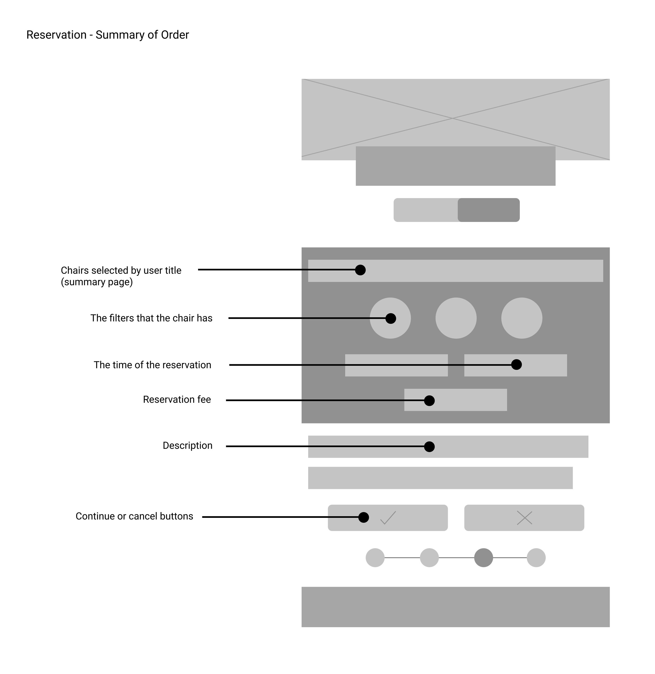
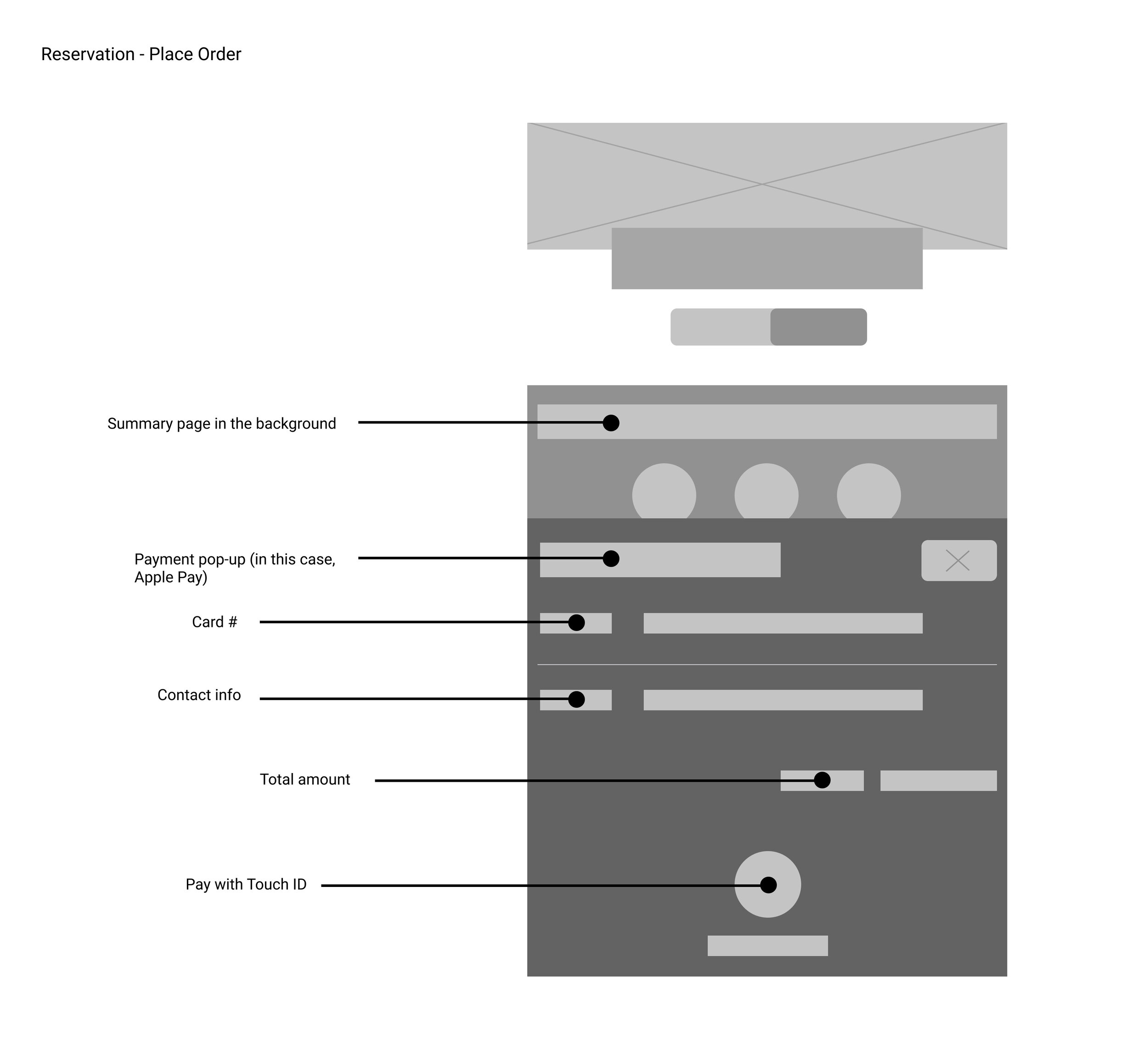
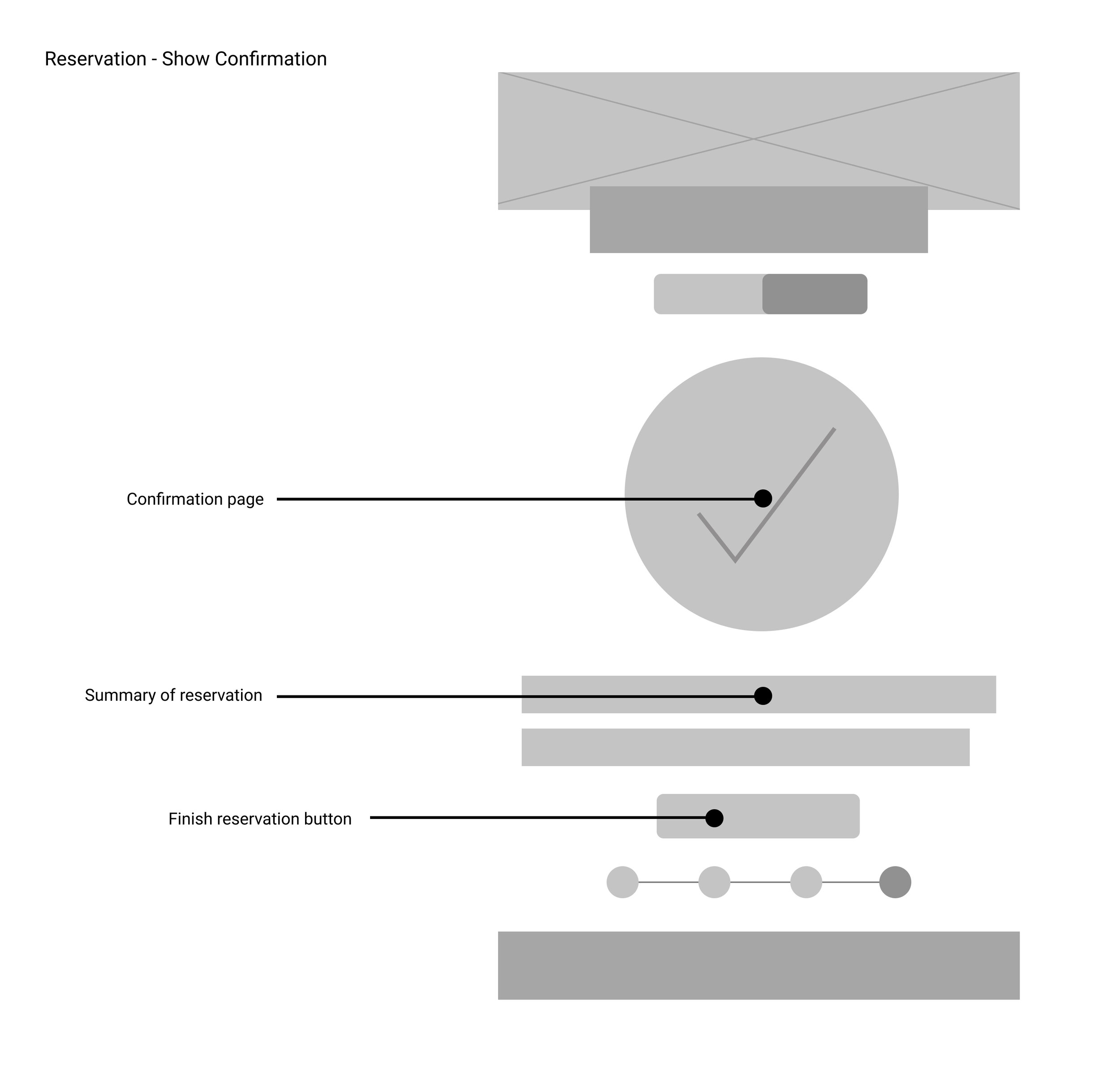
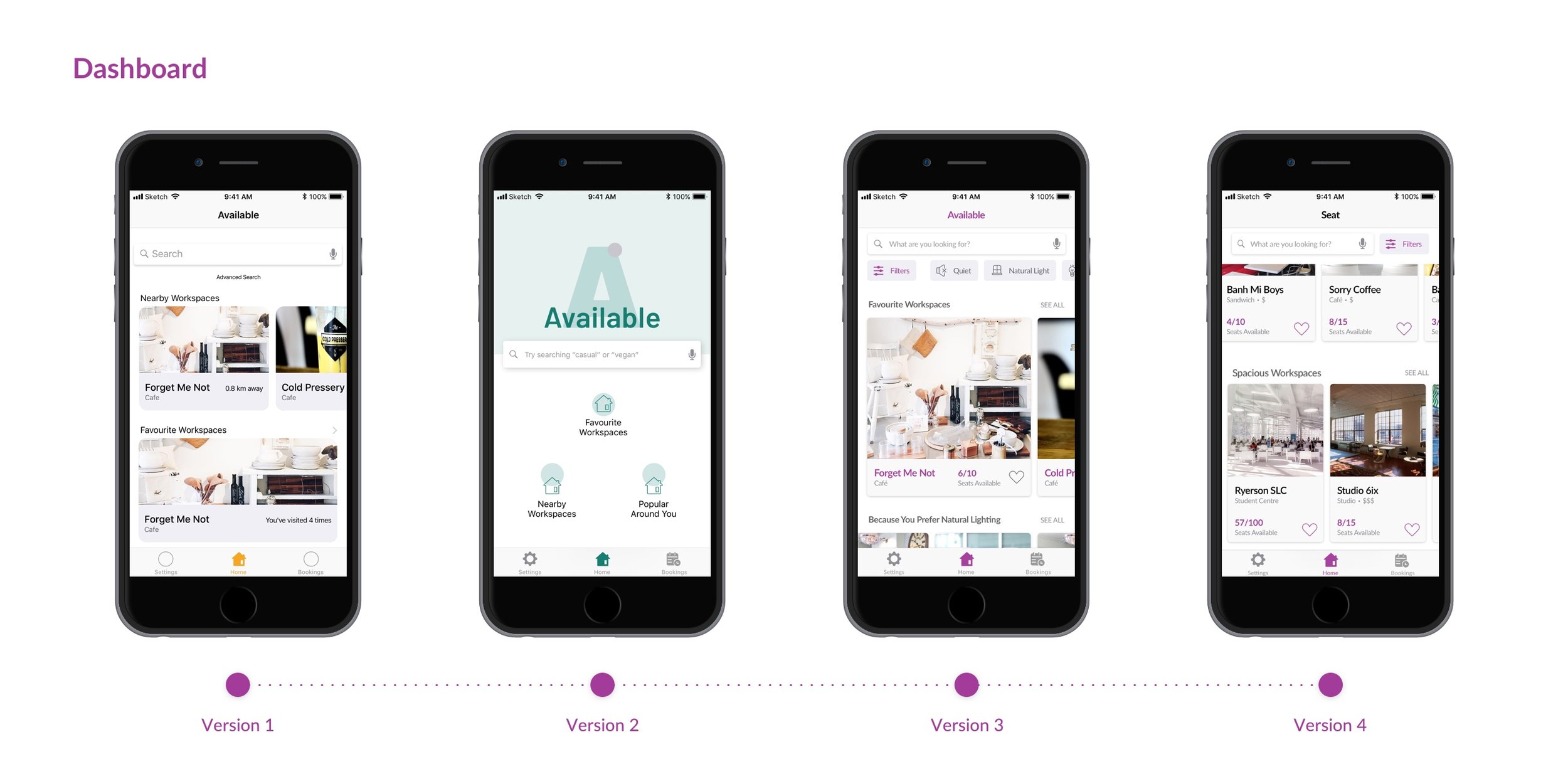
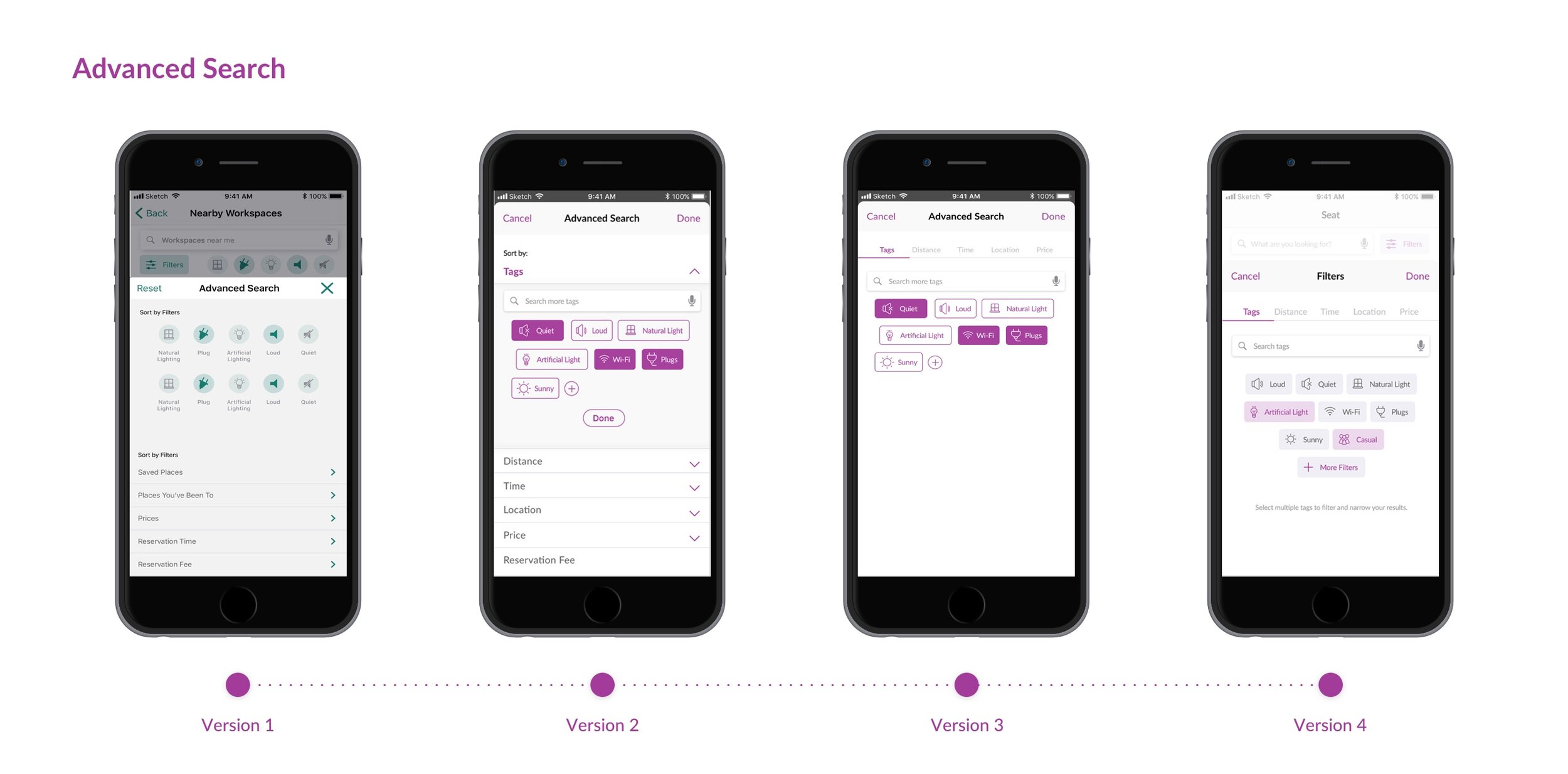
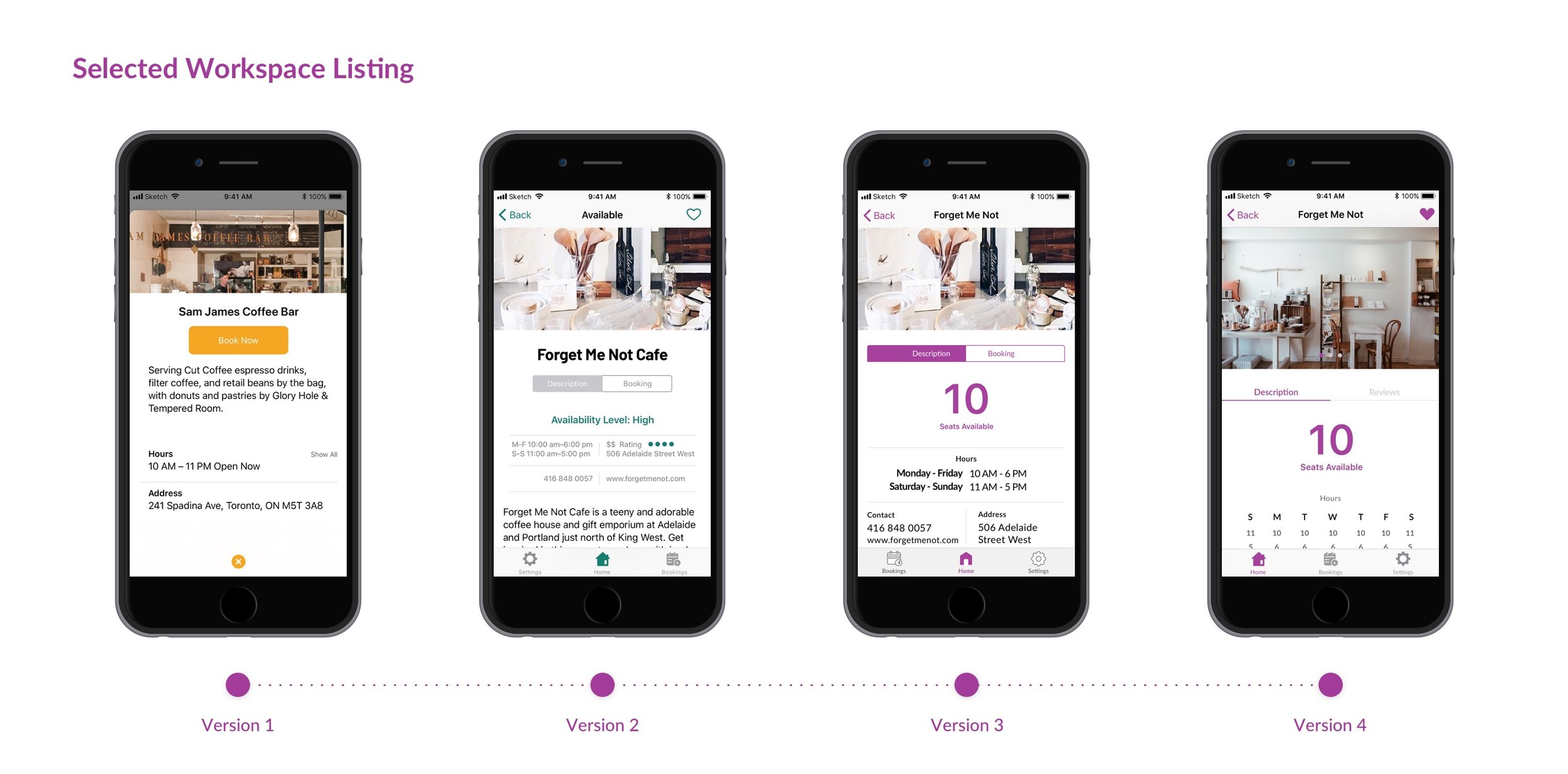
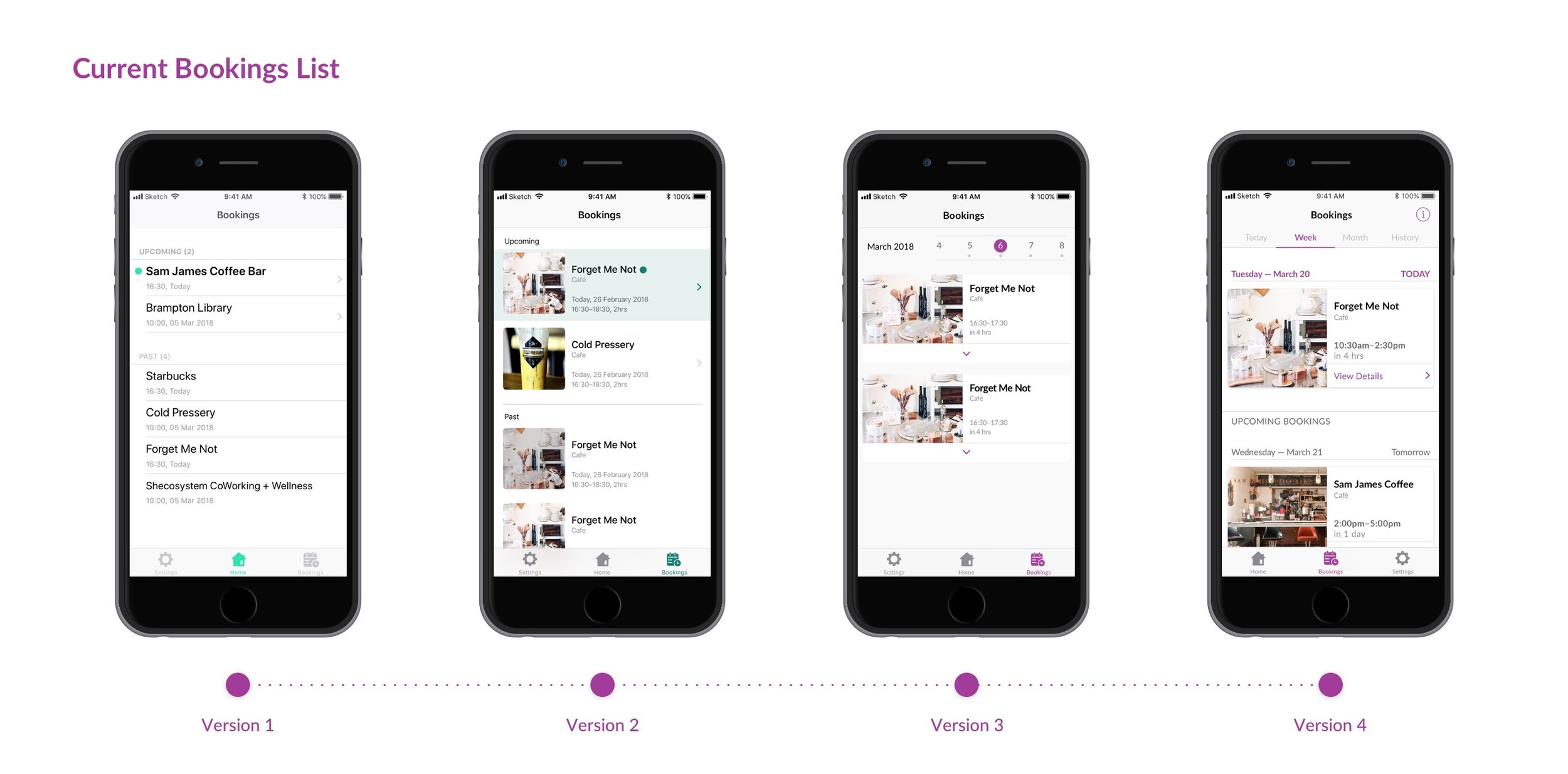
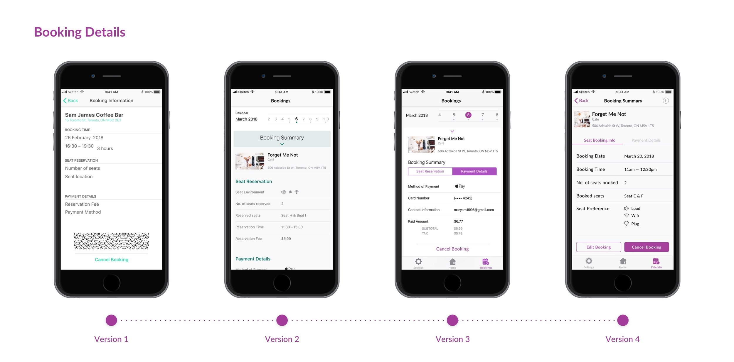
Once we had a background of research and a firm understanding on what our users/app needs, the app’s UI went through vigorous revisions. Starting with low-fidelity sketches to designing high-fidelity screens, each of my teammates had a section of the app we were in charge of; I was in charge of the Booking a Seat feature in the app.
The first three revisions were before the user testings and the last revision was after the user testings and further critiques. The user testings were a large part of the process as it helped with pointing out things we didn’t notice before with the prototype to be improved or added.
Main Features
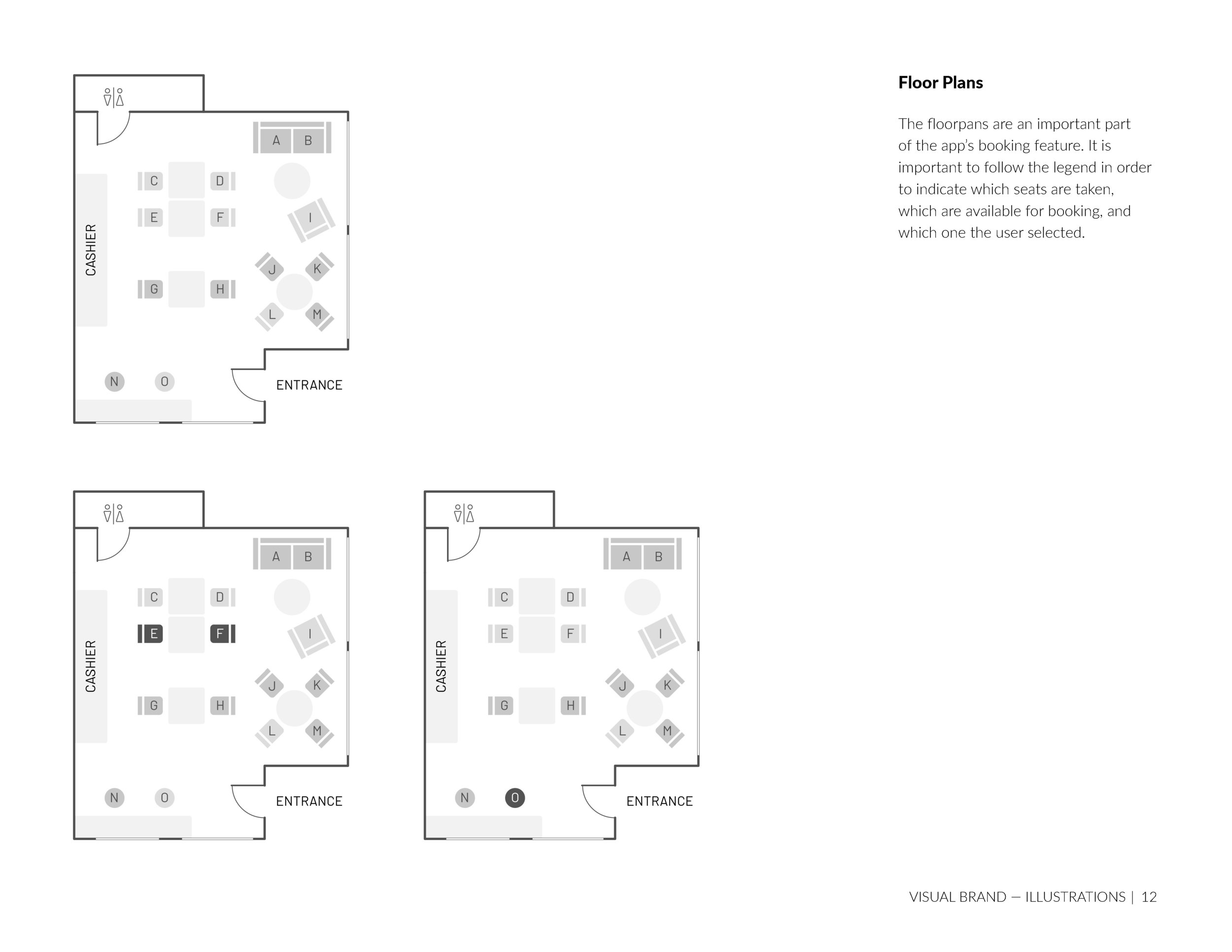
There are four main features in Seat: advanced searching (search by word or filters), workspace listings (selected workspaces), booking a seat, and manage bookings.
These features are key to the usage of the app and contribute to solving the user’s problems with finding a seat in a public space.
Visual Style
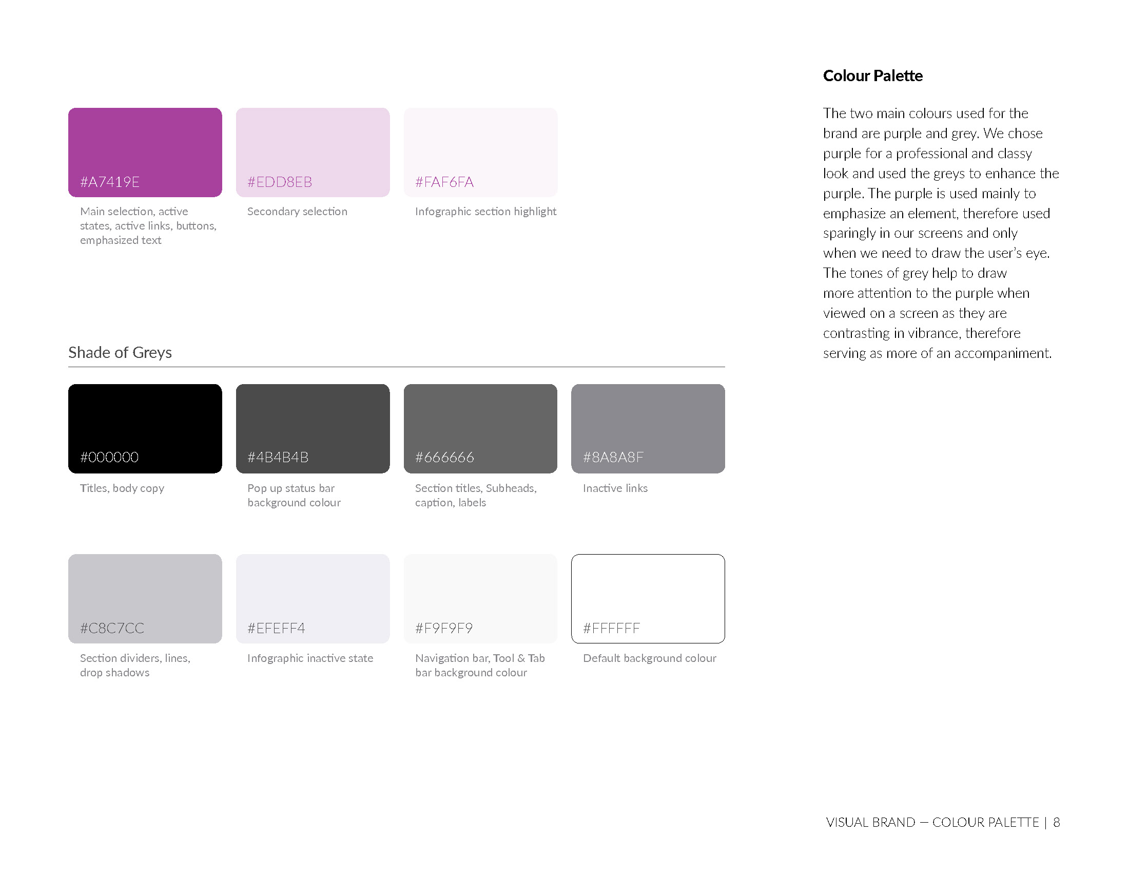
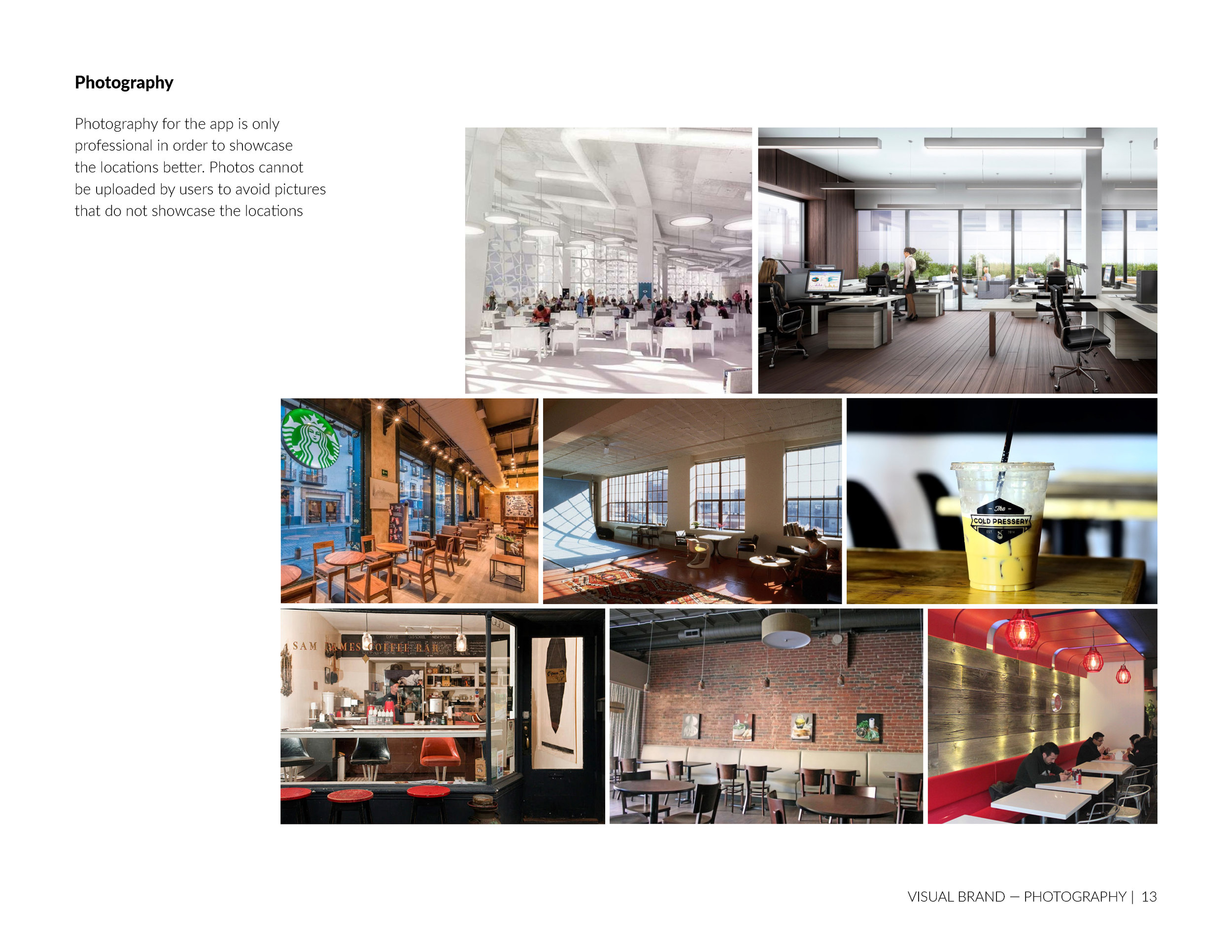
In the process of the interface designing, we conducted visual research in four different directions and in the end we chose the minimalistic route, while taking inspiration from the other directions.
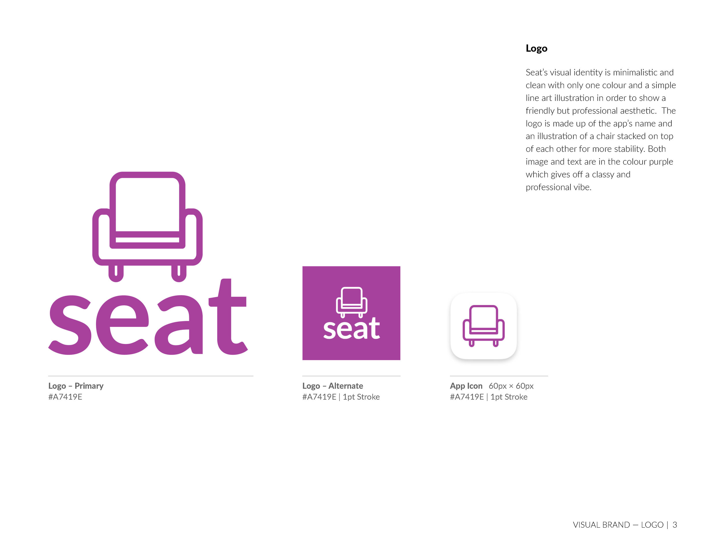
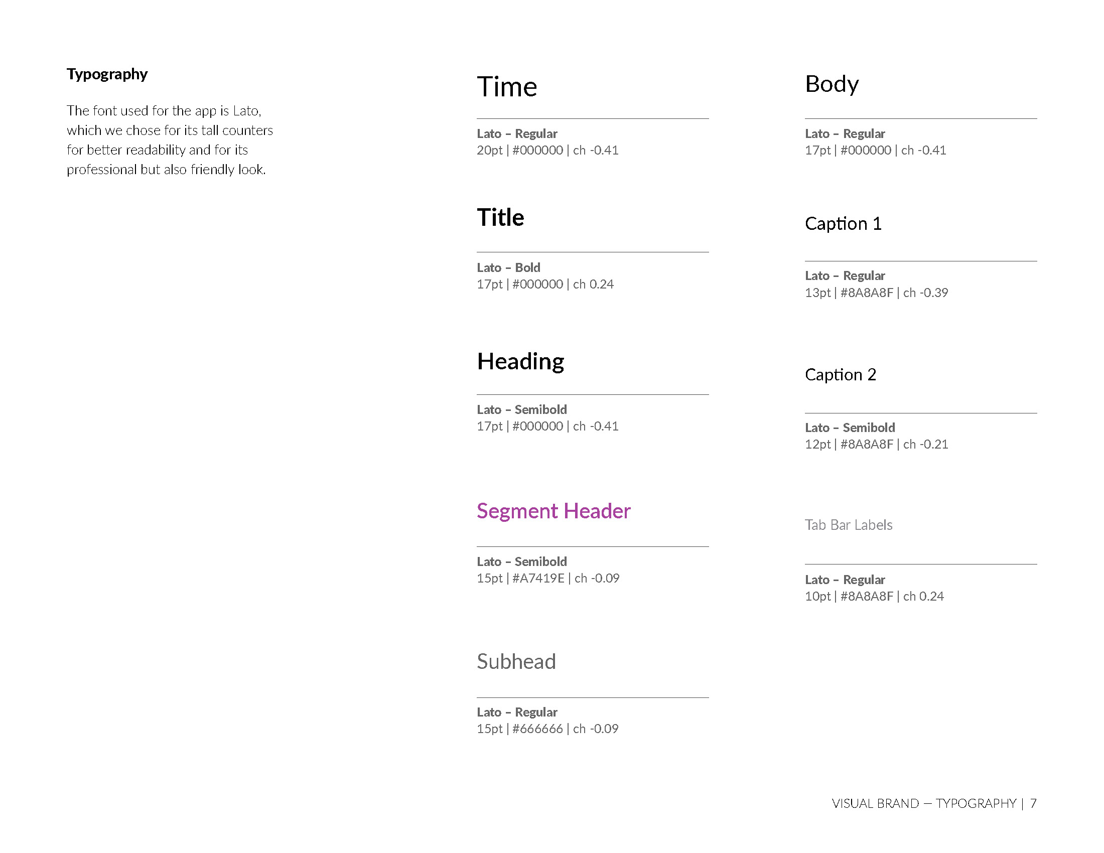
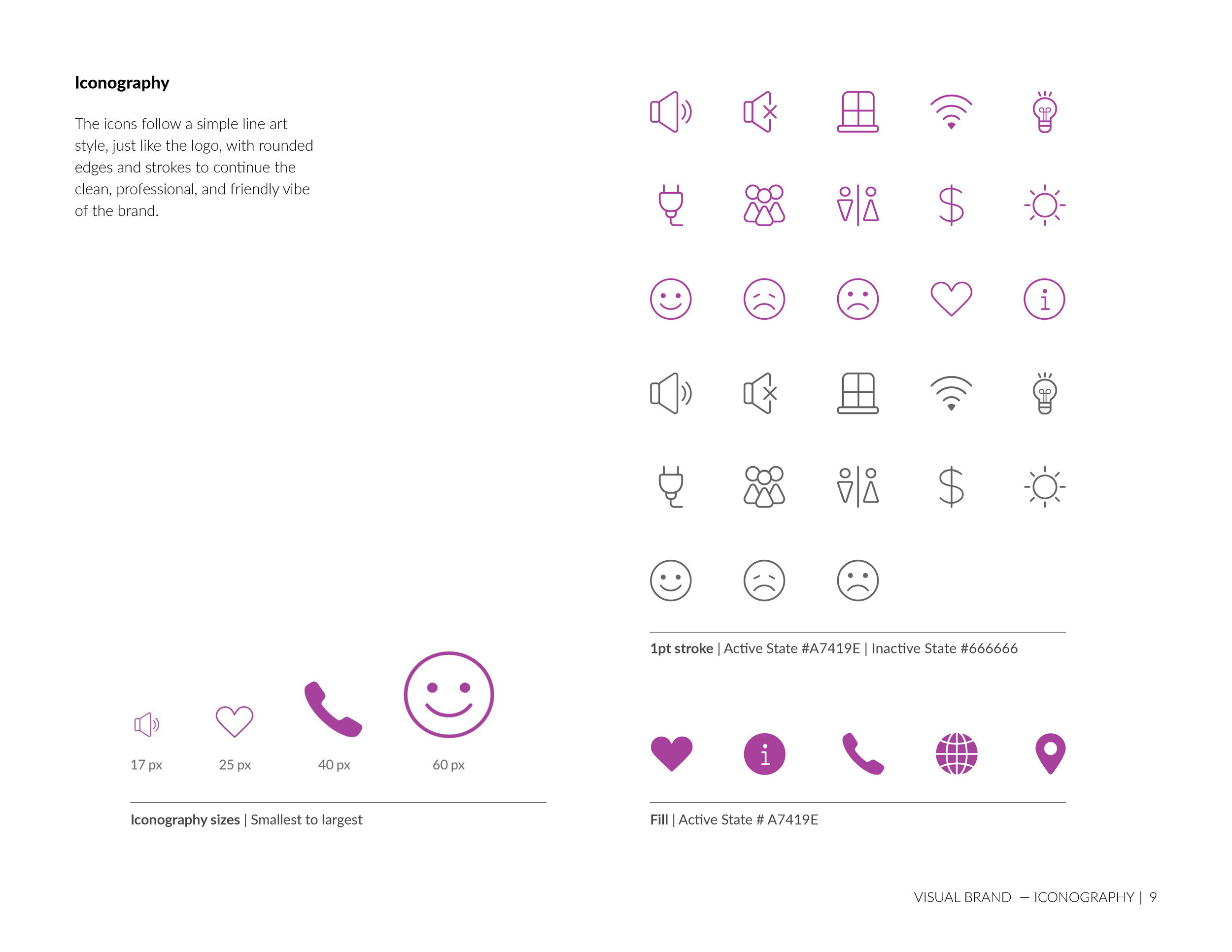
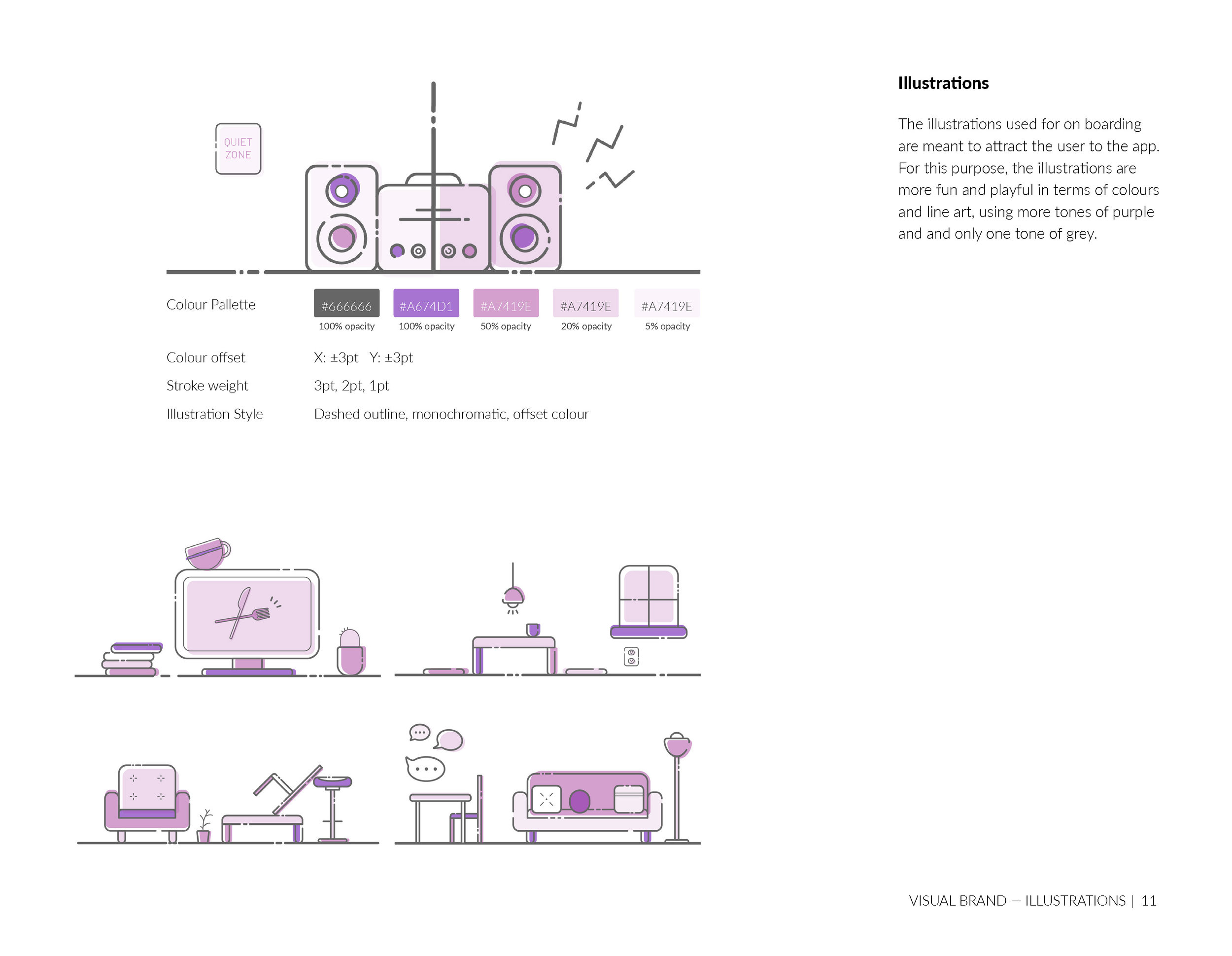
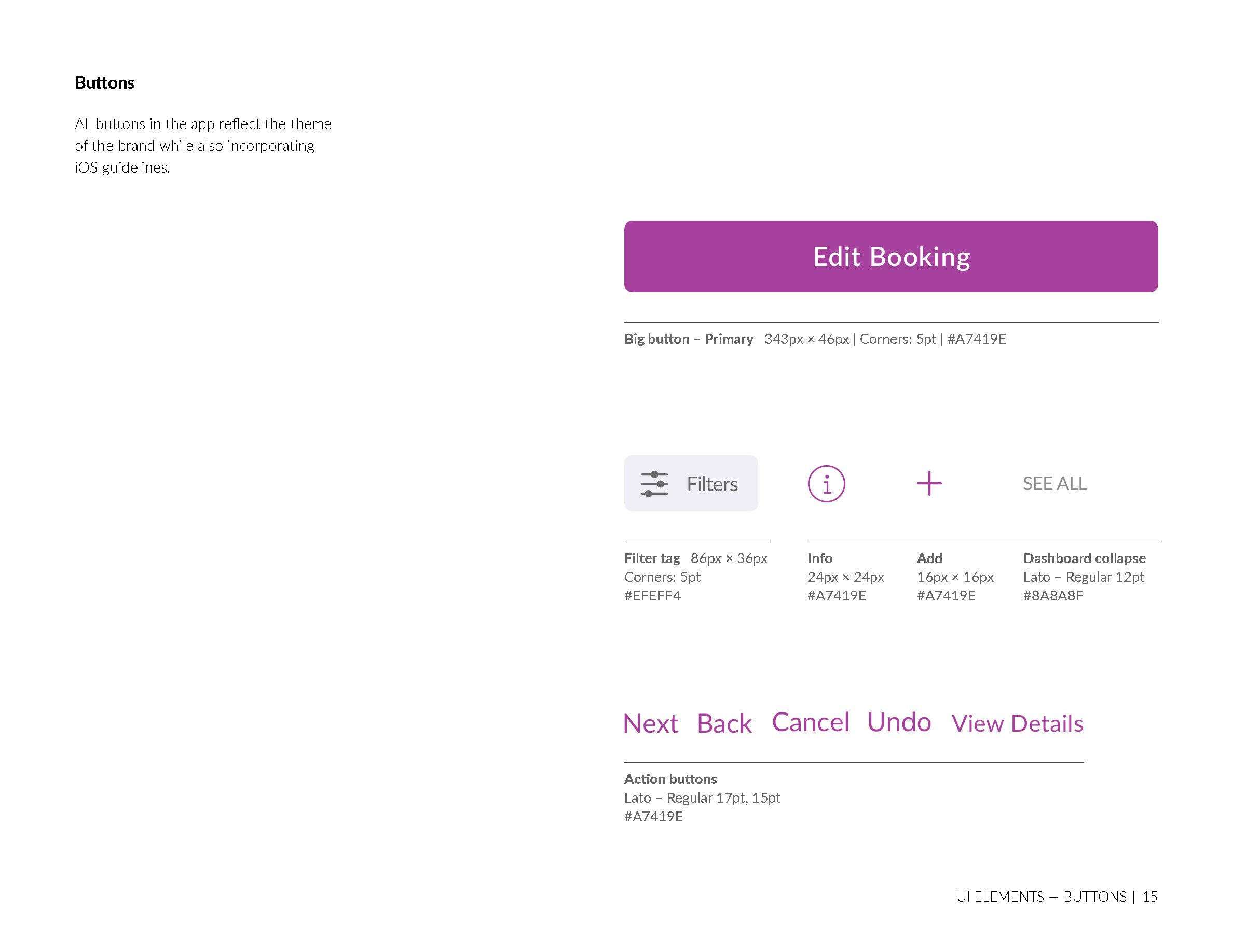
The app developed its own style guide that incorporates a unique visual identity with branding that is minimalistic and clean. We chose to use one dominant colour and simple illustrations to have a friendly but professional aesthetic. Having this visual style in place aided in designing elements, illustration, layout and experience.
Outcome
Designing this app in a team setting was a learning experience that has positively impacted my following projects. I learned about conducting user research, managing multiple assets, working with team members, time management, documentation and more in depth. The principles that I learned during designing the app are transferrable to any other type of design.
The final app reflects all of the research/testing we put into it, a clean designed interface with unique branding that allows the best experience in finding a seat to get down to work.

