Japanese Textile Festival Branding
The Japanese Textile Festival is a festival that I personally made up to fit the exhibition called “Artistry in Silk: The Kimono of Itchiku Kubota” that was shown in early 2018 on Itchiku Kubota’s kimonos at the Textile Museum of Canada in Toronto. Kubota is a Japanese artist that is known for modernizing the traditional decorative tsujigahana method. The tsujigahana method is from the 16th century that is “a combination of resist dyeing techniques and ink-drawing.” The method disappeared “some 100 years later, only to be replaced by a more successful technique called ‘Yuzen’.” The disappearance of the technique is accounted for the fact that the original technique is still not known today. This is where Itchiku Kubota comes in, over 400 years later when the original technique was used and spent 20 years to try to reinvent the lost method, but eventually revived it into his own modern technique based off of the original one, hence naming it Itchiku Tsujigahana. The Textile Museum exhibited 41 kimonos designed and produced by the artist that made him a legacy as an artisan. In theory, the event would be a 3-day event. This 3-day event will include talks, workshops and tours of the featured exhibition, the art of tsujigahana/Itchiku tsujigahana techniques and other Japanese textiles that the Museum currently holds.
Since I was mostly focusing on Kubota’s kimonos, I also wanted to design this made up festival to make a connection between Canadians and Japan’s culture in order to promote the 90th anniversary (in 2018) of diplomatic relations. I wanted to build the relationship to Canadians that are interested in Japanese culture, as there is a large market of those interested in the Eastern-Asia countries, or to those who are simply interested in other cultures.
For the visual identity, I had to build it from the ground up, starting with advertising posters to what the opening page on the website would look like to finally a pamphlet that would be given at the event. Because the exhibition is being housed in a textile museum and is a big accomplishment in reviving a traditional technique in textiles, I decided to use the textiles seen in the exhibition to majority compose the patterns for the theme, which will draw on the uniqueness of Japanese textiles and the common patterns/motifs seen in them.
Advertising Poster
Abstract Poster
The abstract approach was influence by a pattern I saw in one of the Japanese textile books I used to research. It was kind of a challenge to recreate the loose lines of the original threads into a vector version. To make it look more like a piece of cloth, I used different lengths of lines and thicknesses to keep it organic looking but still organized.
I decided to make the colour scheme for the different approaches colourful because Kuboto's kimonos are all full of colour and based off of lush nature. For this approach, to align it with Japanese design simplicity, I only kept the knots in the threads colourful and everything else in a monotone scheme for them to pop out.
Representational Poster
The representational approach was influenced by nuance of flowers ingrained into Kubota's kimono designs. I took a few of the types of flowers he used and then took my own spin on them by changing the stroke into patterns to create texture. I chose to make the pattern in the background instead of within the kimono and the kimono just an outline to use the overlay or offset printing look that is constantly used in Japanese graphic design.
This approach was very easy to apply colour as I had tons of colour combinations. I decided to use a red and yellow as it had the contrast and are symbolic colours to the Japanese culture. This poster was the only one where the hierarchy of information was changed, where I placed the title first on the top. But, since the outline of the kimono contrasts so much, it's usually the first thing you see and what catches the eye.
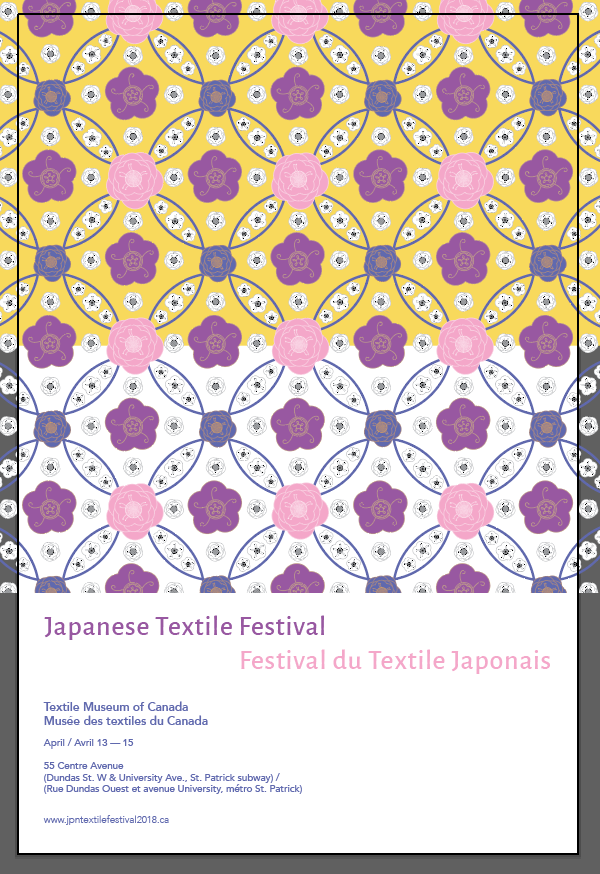
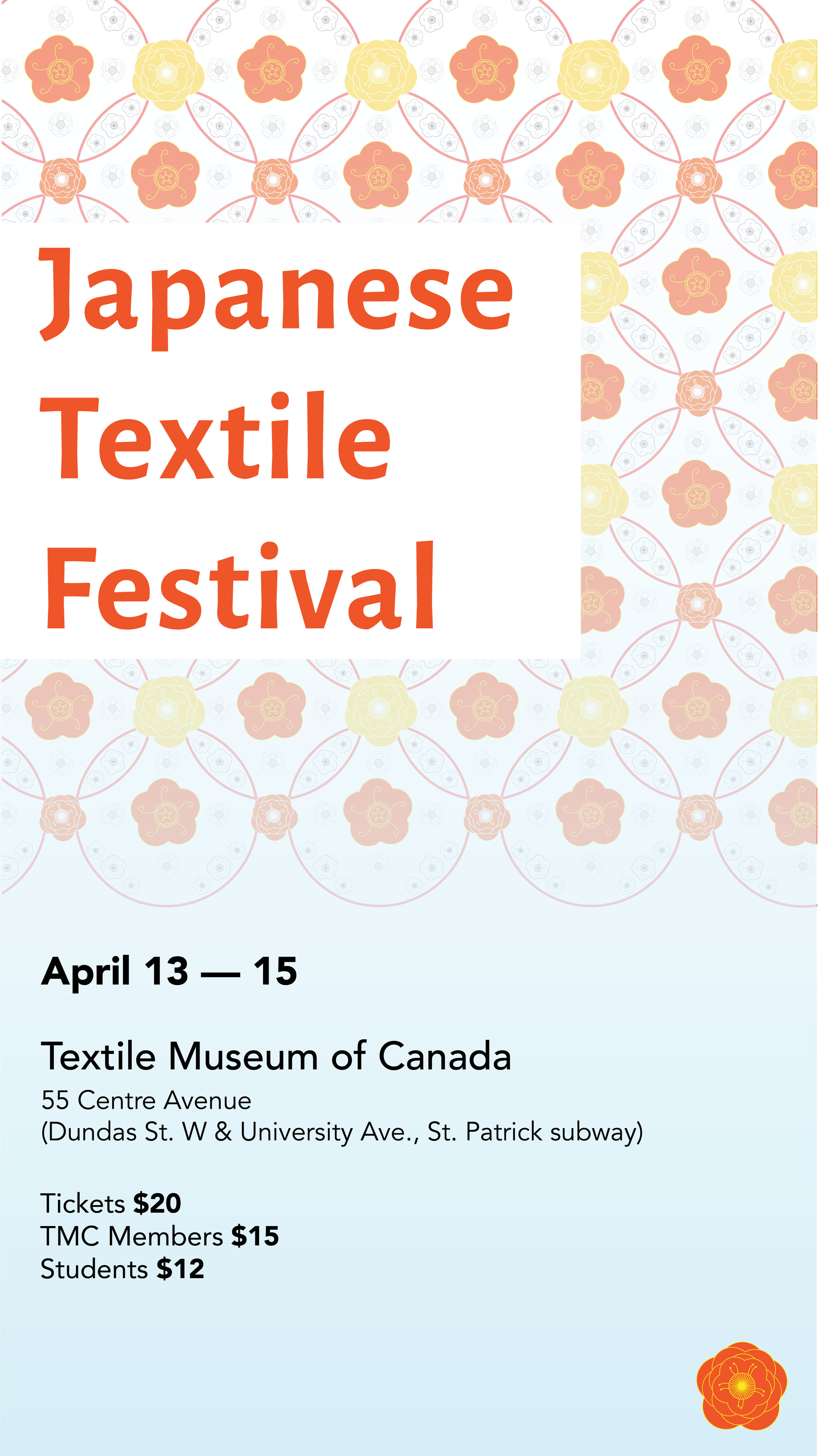
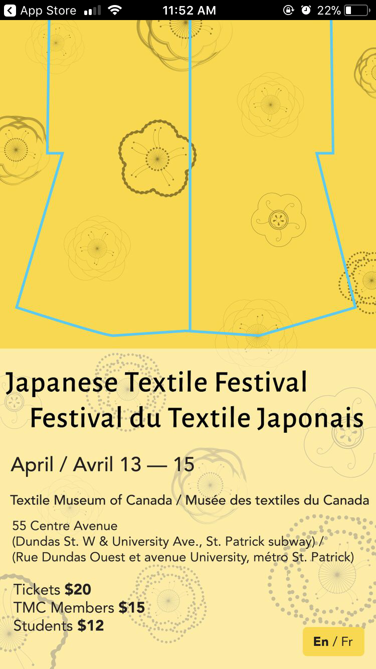
Symbolic Poster
The symbolic approach was directly referencing number 54 of Kubota's kimonos. While researching, one of the books I had were specifically about Kubota's work/life and showcased all of the kimonos called "Kimono as Art: The Landscapes of Itchiku Kubota" by Dale Gluckman. This book was very resourceful in understanding Kubota's process and seeing all of the kimonos printed in nice quality as it is hard to find concrete resources online. In the book, some of the kimonos were explained, and number 54 which this pattern was on was explained. The pattern is very symbolic for Japan as it is called Shippo (seven jewels or seven treasures) pattern. This pattern is traditional in Buddhism, a religion that has been practiced in Japan since 552 CE, as it references the precious stones that represent the seven powers of faith.
I recreated the way Kubota used the pattern in his kimono. I originally planned to have a full colour block for the background, but I decided to have the pattern go past the background to create the same overlay technique I also used in the representational approach. The pattern was placed on the top of the layout for the layout to have hierarchy of what is viewed first.


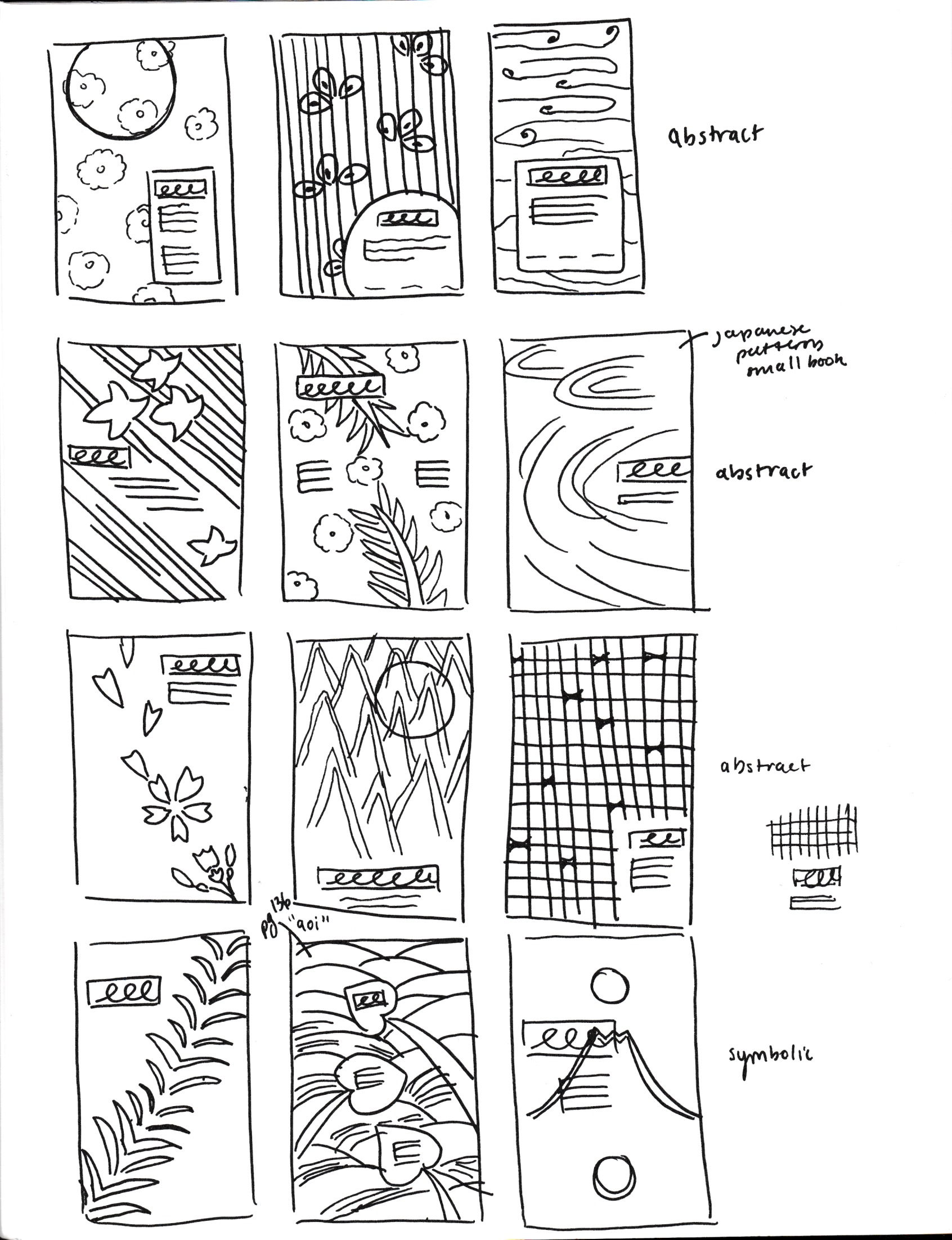
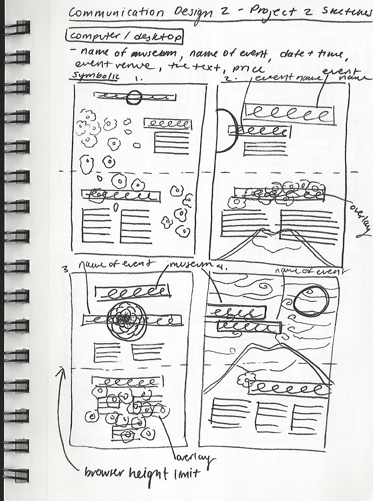
Posters Process Work
When I was first researching, I did a visual research on Japanese graphic design, to see what Japan’s usual style is: I found that they use a restricted colour palette (using 1-3 colours with one being emphasized) and minimal drawings/patterns (usually vectors) while using negative space as a principle. Another technique that I found recurring was an offset printing look to the posters. These design principles helped shape the layout and patterns I chose to recreate for the branding. I wanted to follow those principles in order to make a culturally rich branding.
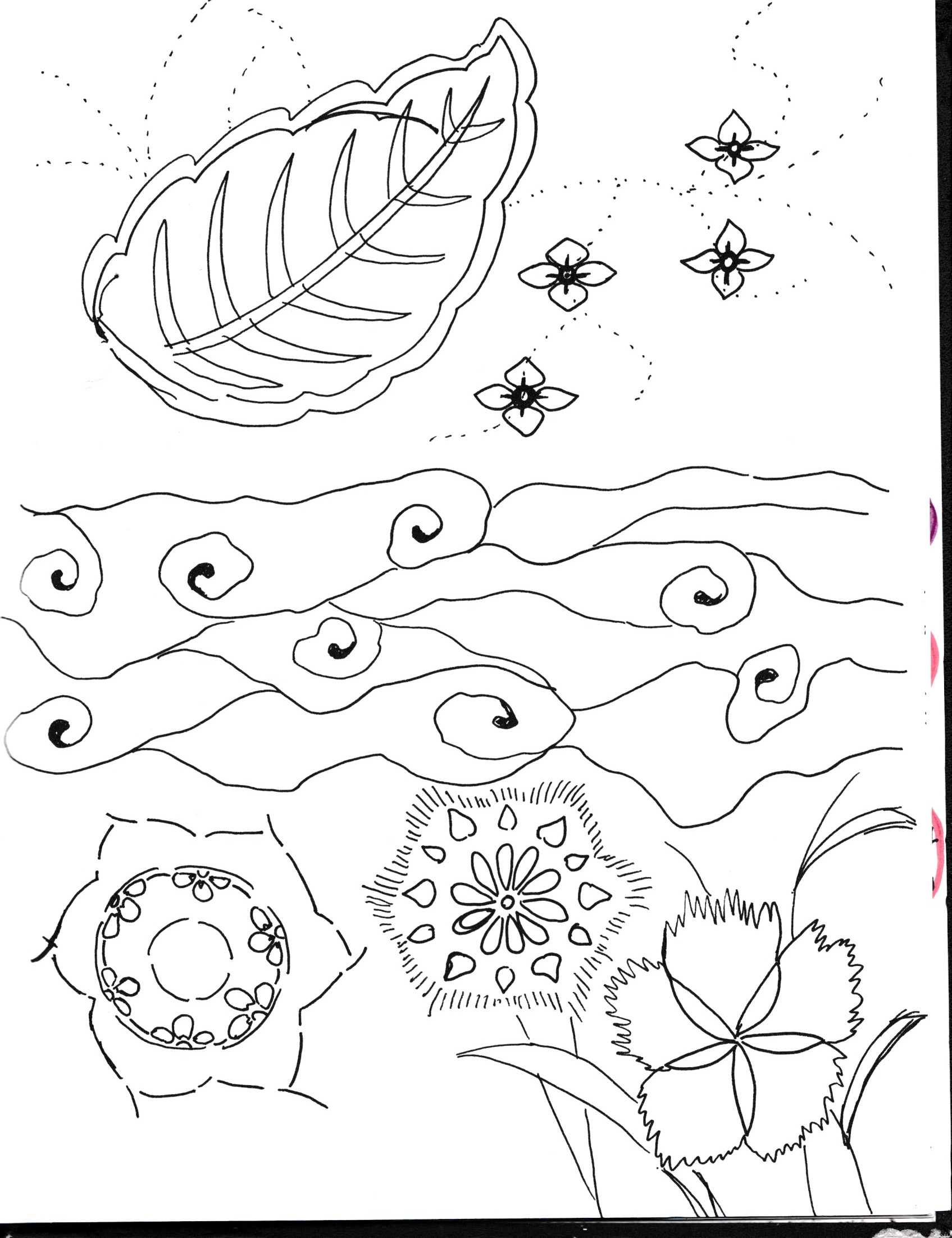
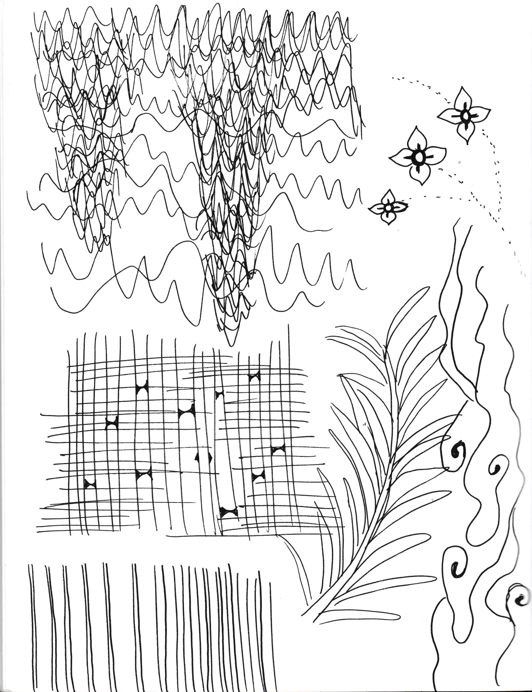
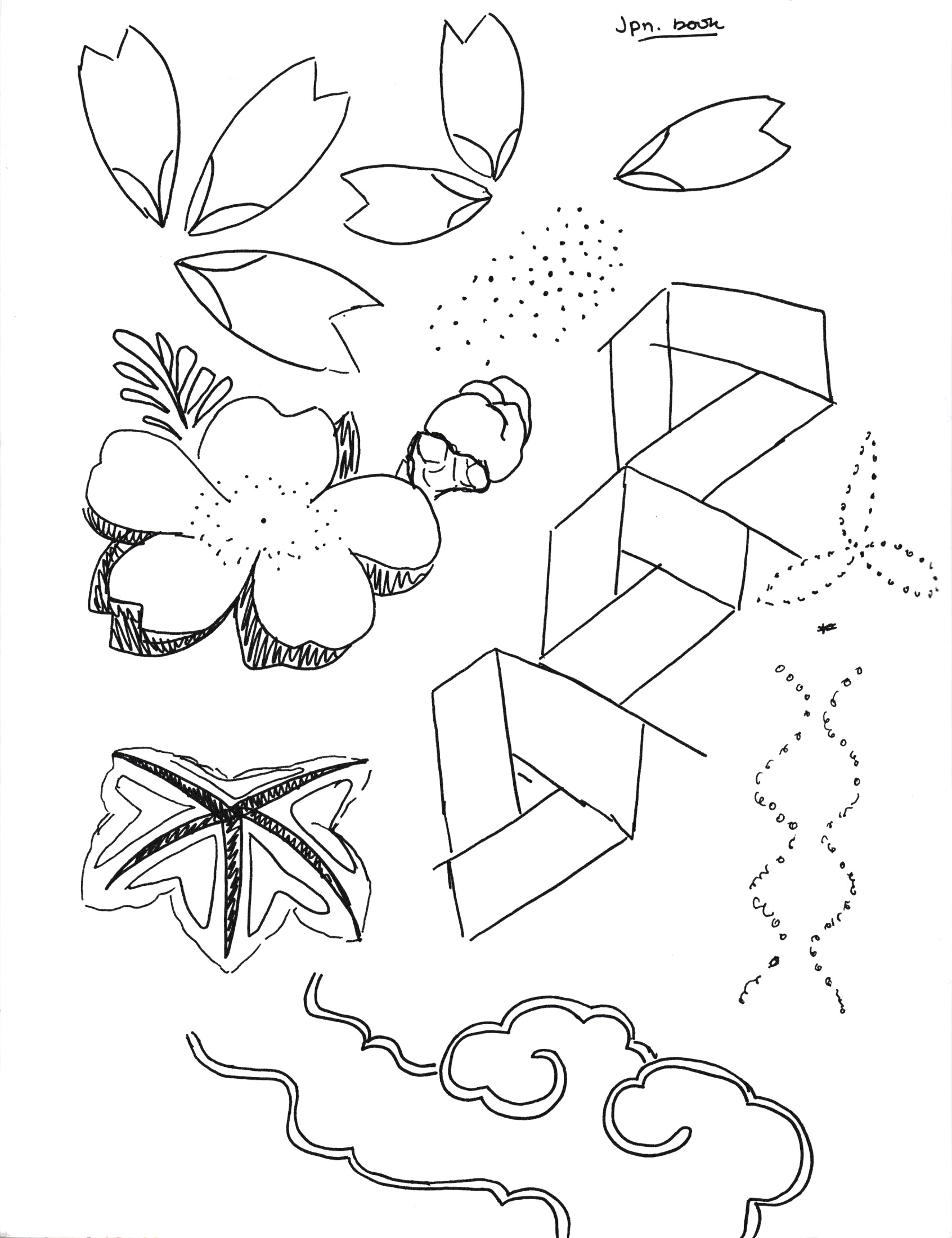
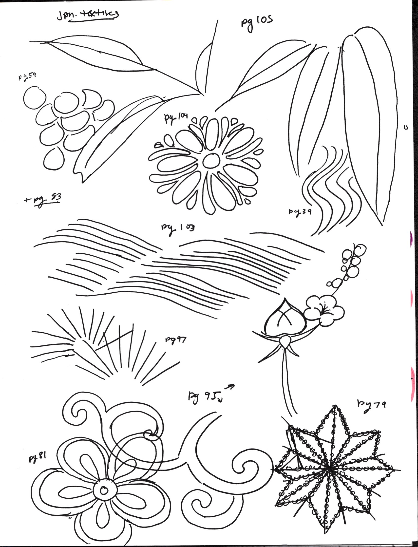
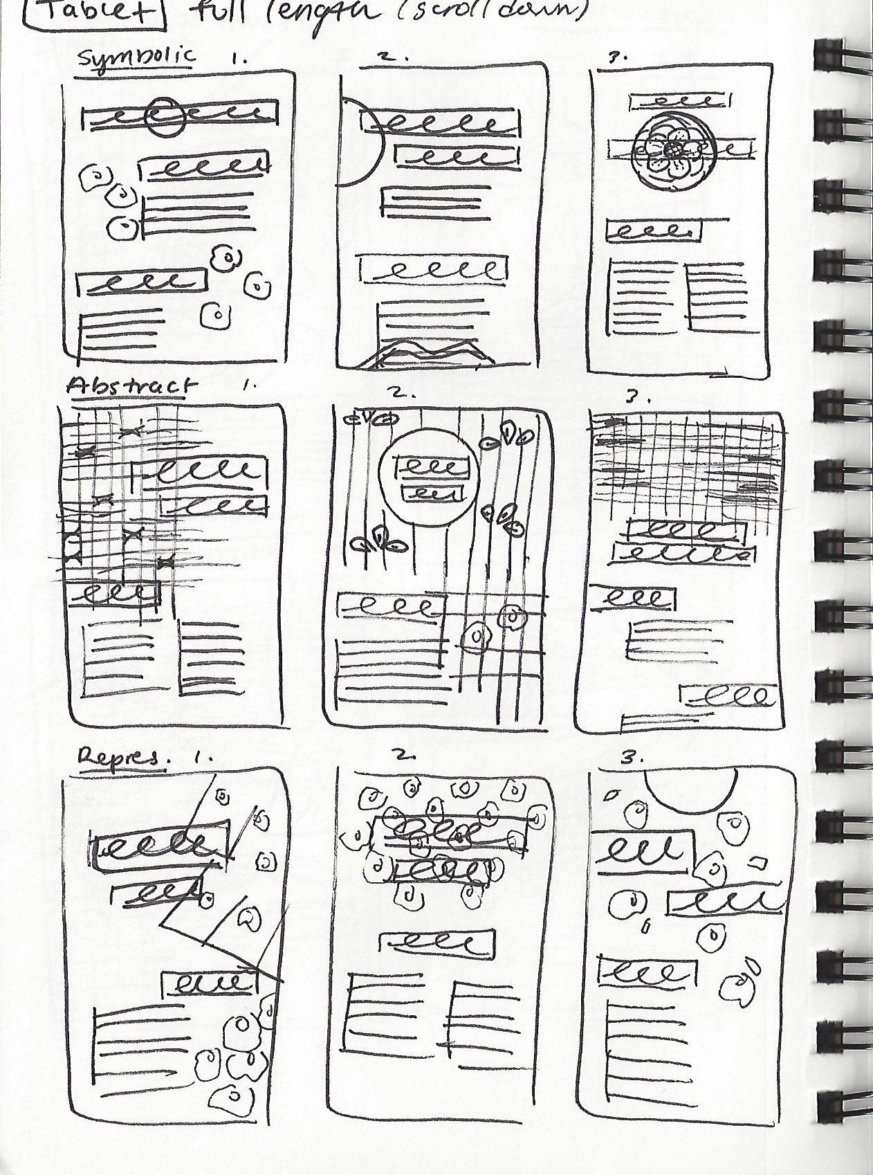
After that, I researched Japanese textile books and sketched the patterns that are showcased in the books. I drew out a simplified version of the patterns and picked out visual elements. I did the same thing when I looked at Kubota's kimonos, where I specifically looked at how he painted the flowers and scenery. These preliminary research sketches helped me with figuring out what elements can work together and what sort of elements are most present in Japanese textiles. Some elements looked more abstract than others, or it could be very clear that it is representational and then some were symbolic because of the meaning of pattern. The different types of elements helped with categorizing/using them in the three approaches (abstract, representational, and symbolic) for the branding of the festival. From these themes, I chose to continue with the symbolic theme for the rest of the branding.


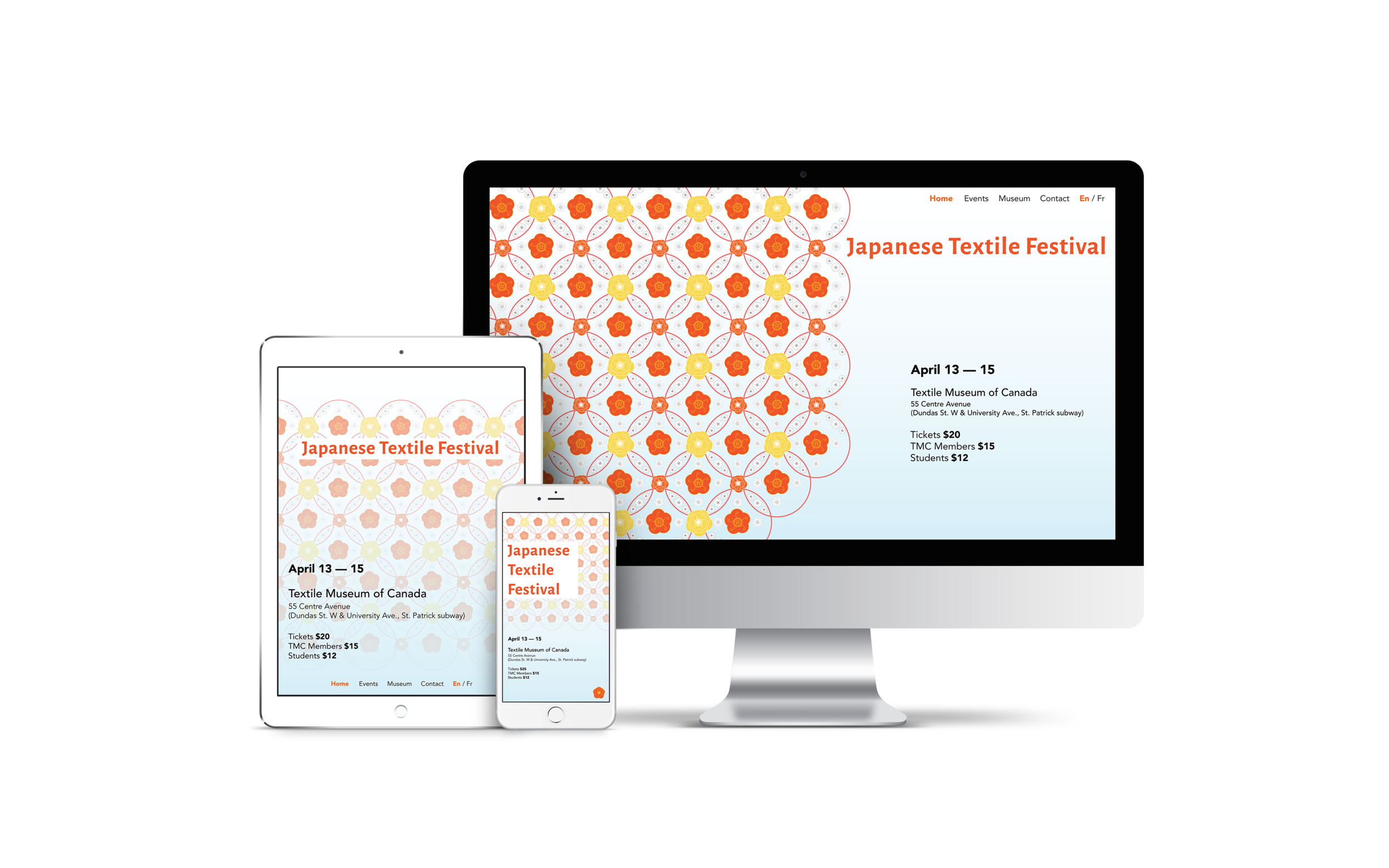
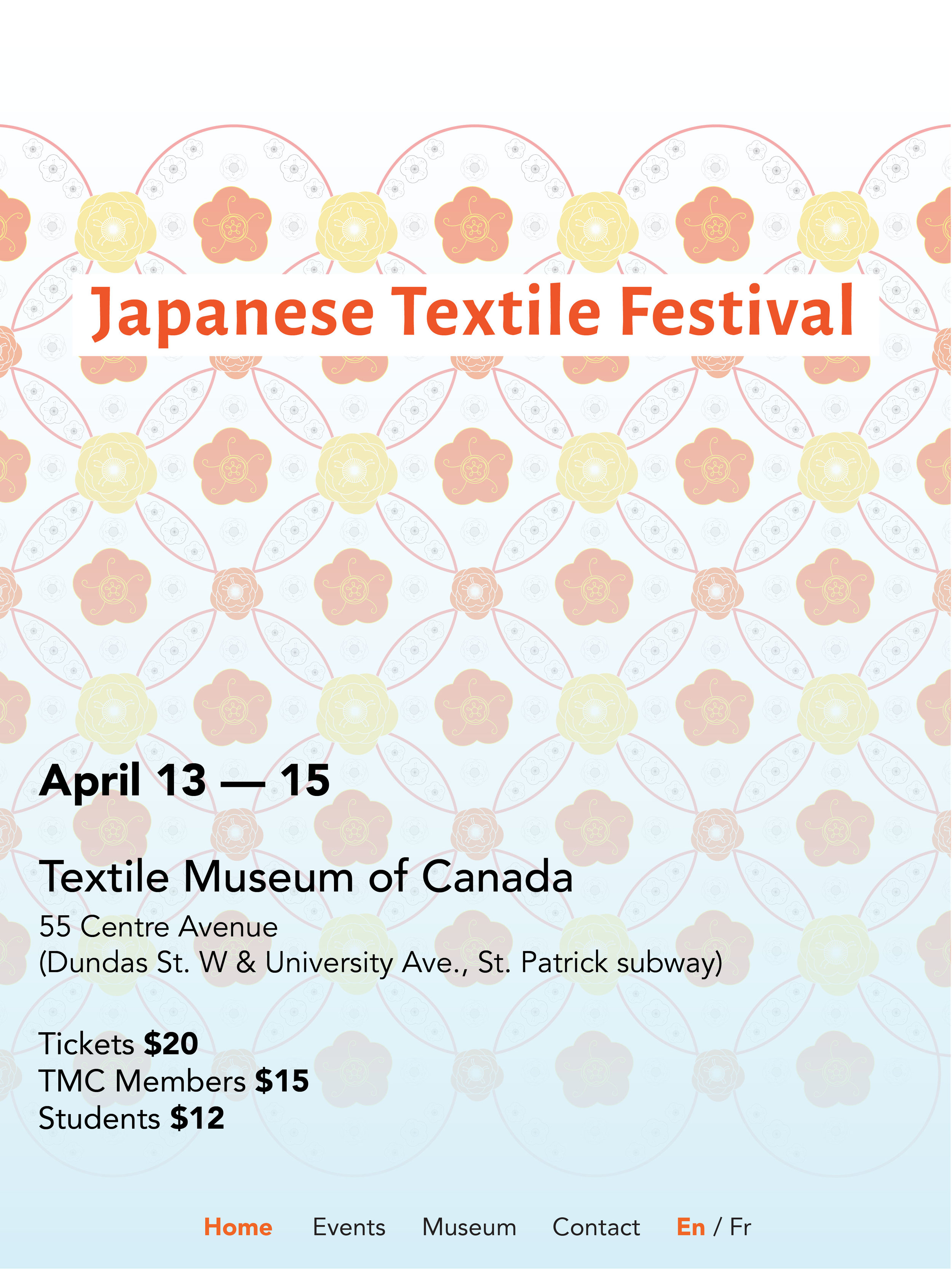
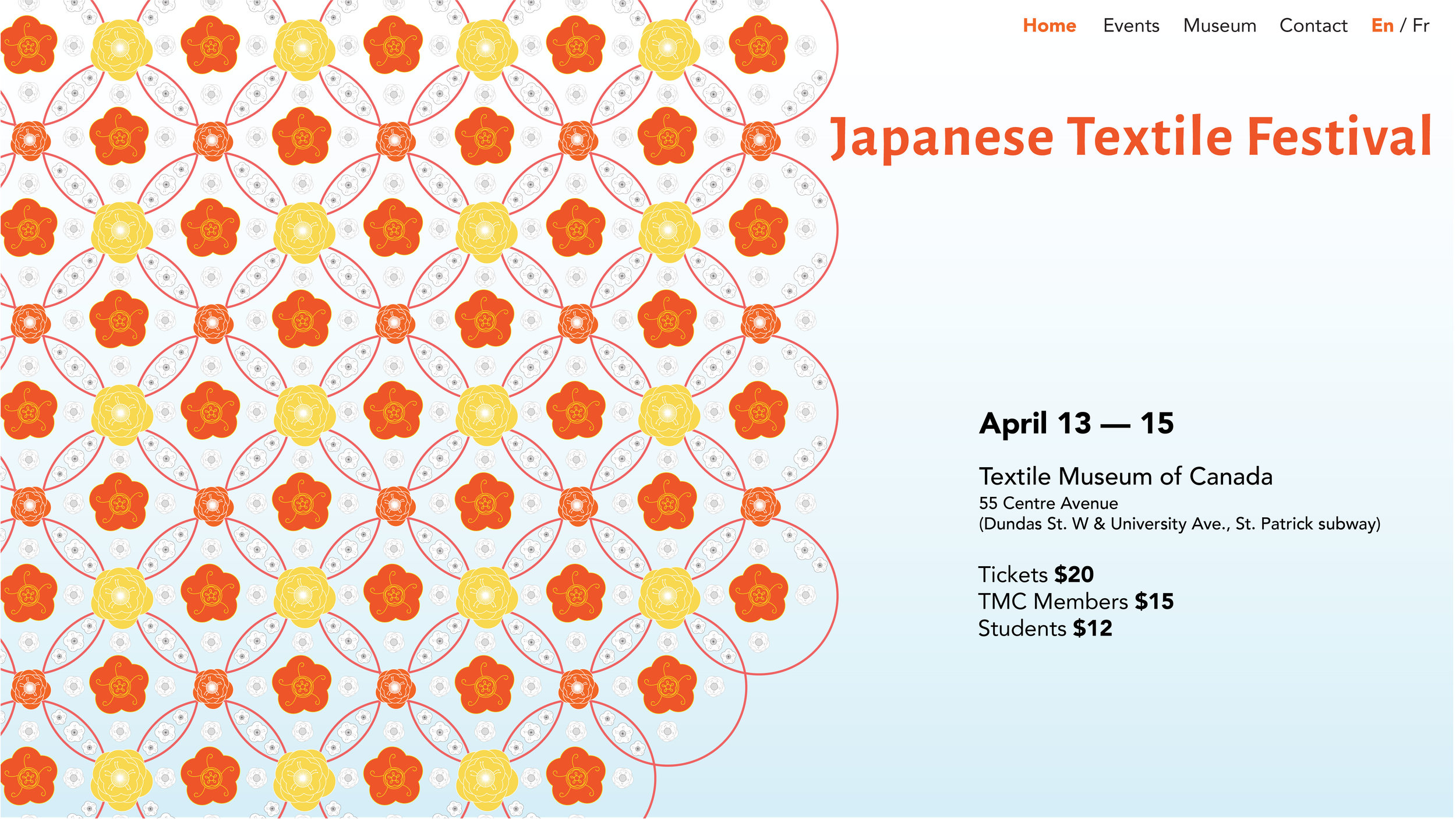
Landing Page on Website
The symbolic approach was chosen to continue for the rest of the design system for the festival. I changed the colour scheme for the pattern and background for Project 2 and 3. I played with transparency for the background as it would be more apparent on a digital medium versus print.
Landing Page Process Work


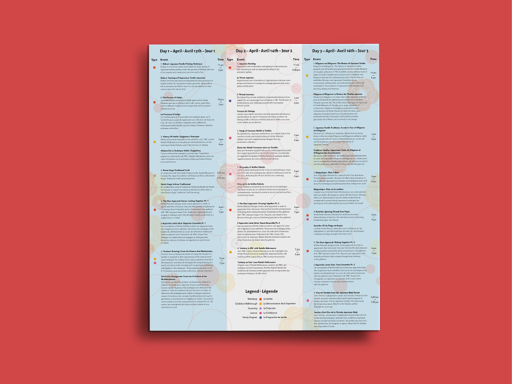
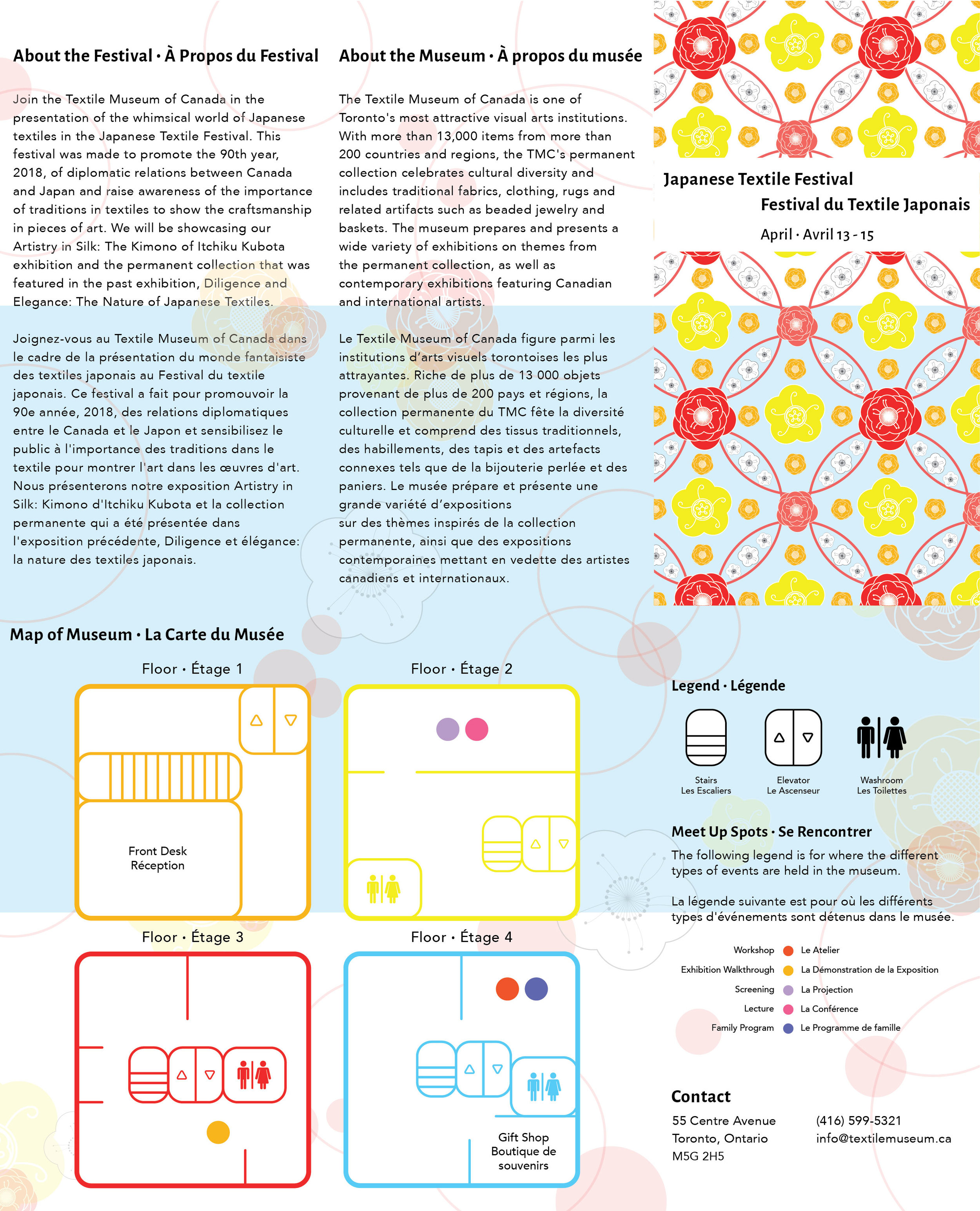
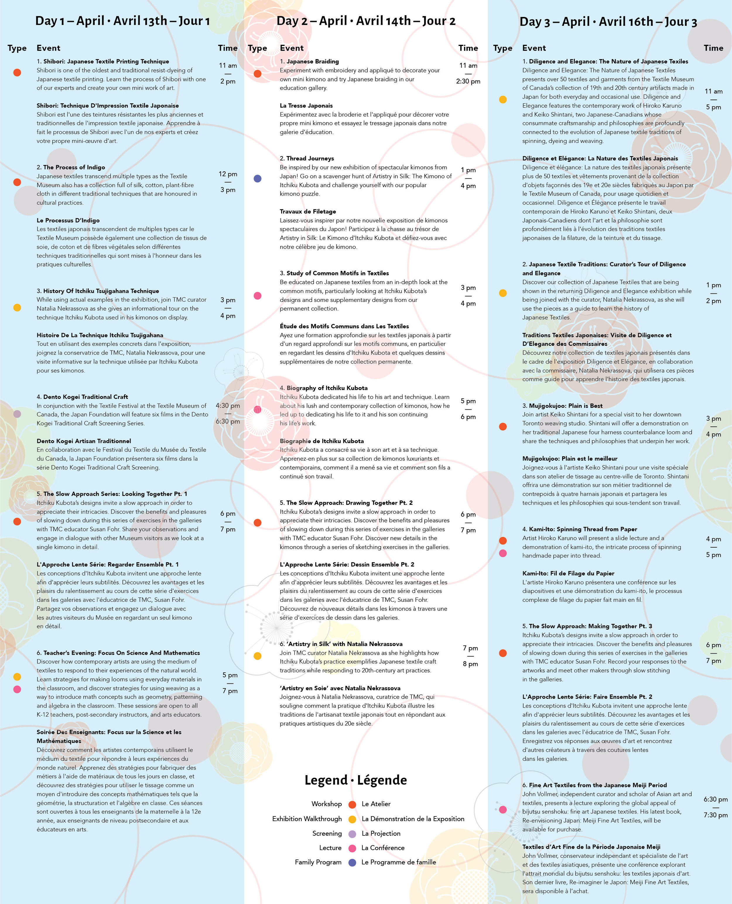
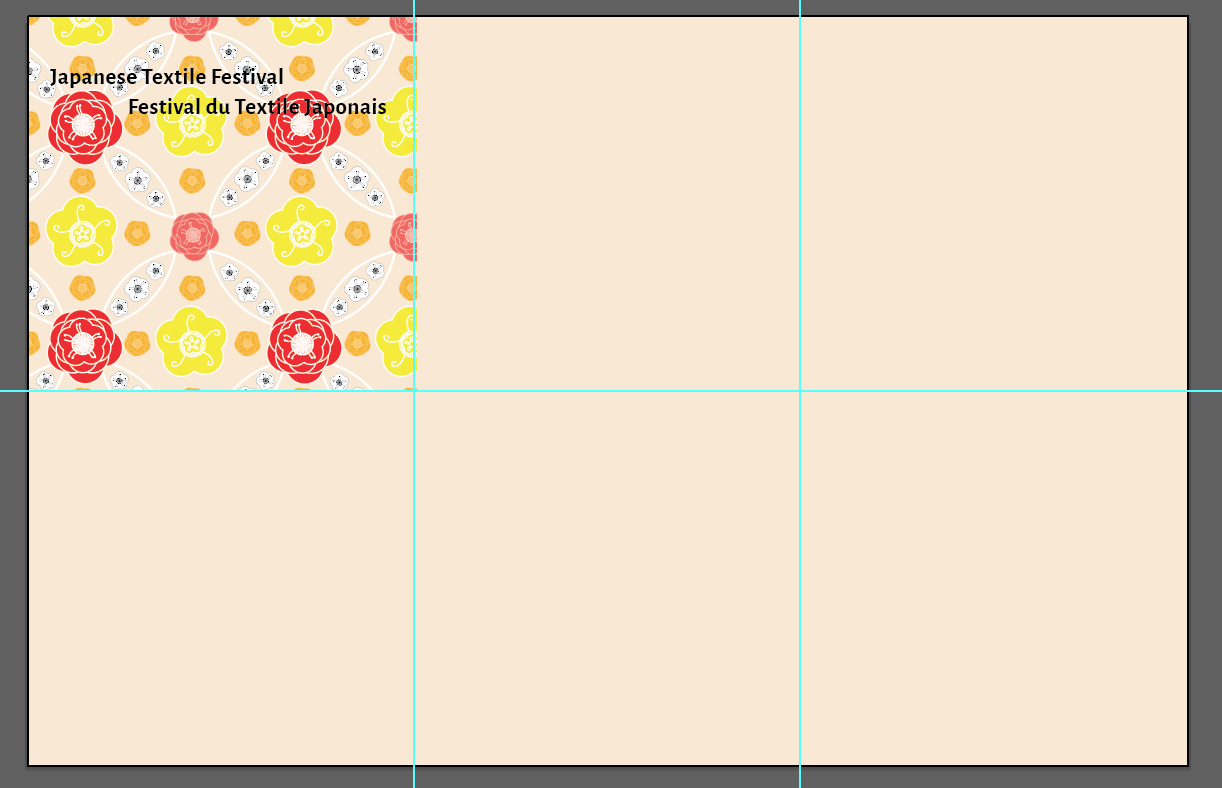
Festival Information Pamphlet
To finish off the visual identity, I designed an event program that would be given out at the event to clarify information both visually and verbally in its communication so that visitors can be informed about the event. It holds information about the events, venue, date and times. There is general information about the museum, about the festival, a map of the museum, contact, and a full-page timetable of the events over three days.
Outside of Pamphlet
The top would be flipped upside down when printed so that when the pamphlet is folded, the outside text would be facing the same way.
Inside Pamphlet
It is divided into three columns for each day of the festival. It is organized by the day, by time and has a legend to categorize the events.