
Brand Identities
These aren't in-depth brand identity explorations, but I did these as my own exploration on how to approach an image that the client wants to portray.
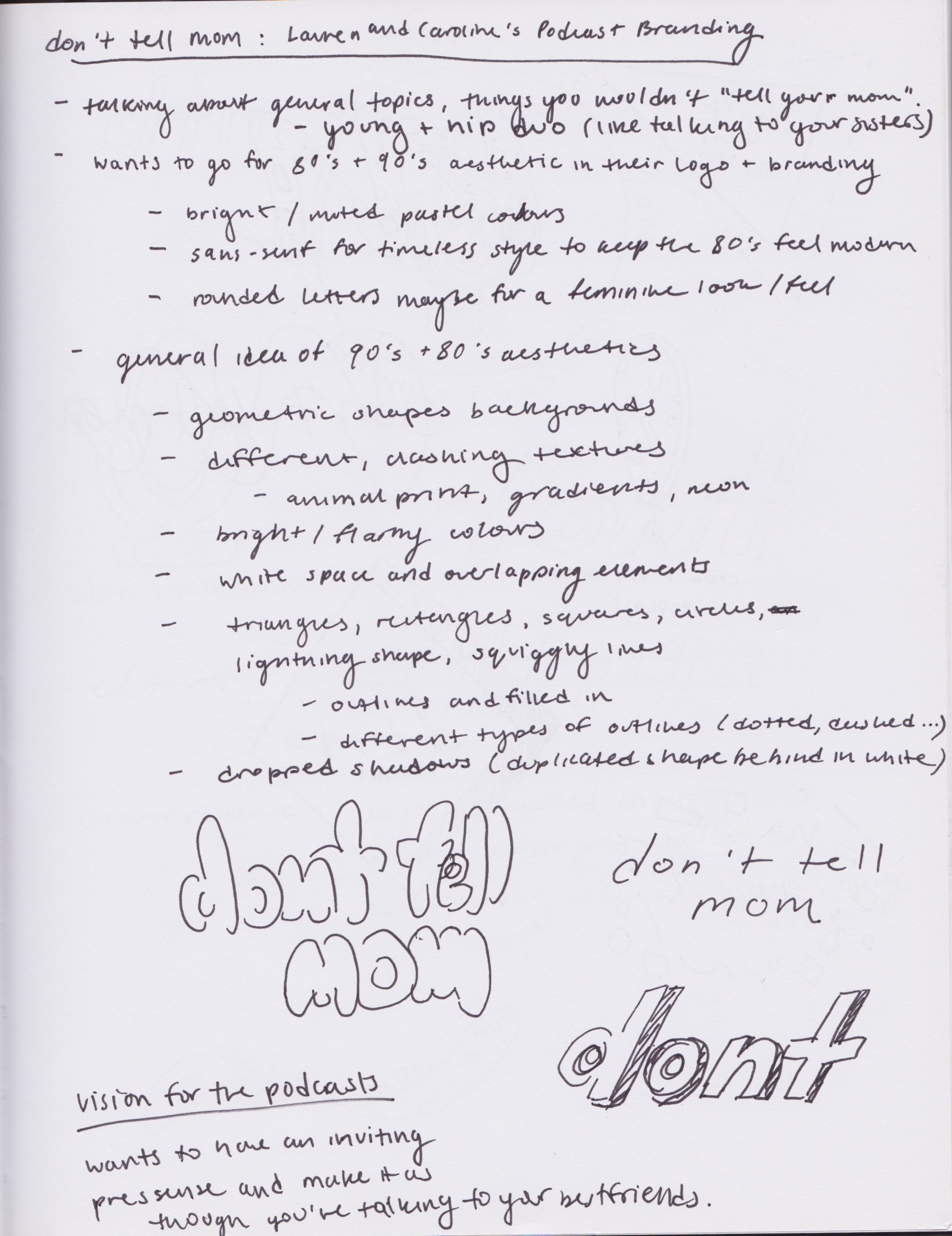
Don't Tell Mom Podcast
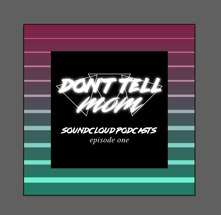
This branding was created for my two friends that I grew up with that made a SoundCloud podcast together (you can listen to it here). Quoting from them, their podcast is "Two friends chatting about highs and lows, guacamole, conspiracies, Miracle Whip and being left handed." Their intention or vibe they wanted to have was early 80's/Memphis design/Vapourwave, as they both enjoy that sort of aesthetic and music/culture from that time. At first you'll see that I went more abstract and more so on the 90's style, but they really liked the diamond layout at first so I ran with that idea until I got to playing around with neon-looking type. As neon-lighted anything is quite popular in 80's graphic design, I used that as the main focus for their logo and profile banner. From there, I played with the typefaces for the logo and different shapes I can use in the album cover art for each episode. With neons, comes bright colours therefore I used quite a bright colour palette in the final album art (compared to the pastel-sorts that I first created when trying out different logos).
Final Result - Banner and Logo


Final Album Art


Process Work


Future Album Art Ideas

NATS-AID
When I started as the NATS-AID IT & Graphics Coordinator, I knew that I had to give the organization a new branding/look because the one that was being used before was outdated (basically made with Microsoft Word). I started out with using the name as an indicator of what the logo should look like, it should indicate that we provide help (in this instance, tutoring service for the Natural Science courses at York). I played with the pre-existing cross shape that was already in the existing logo and refreshed it with a modern look and new colour scheme. It is also apart of my job to maintain the website, so I refreshed it as well. I organized the website so its easier to navigate and created assets to keep with the branding I created while keeping it within York's website structure and rules.
Process Work


Final Result


