Identity
In my second year of my degree, I took a screenprinting class to have a break from the digital work that I do for my design classes and go back to making physical designs. I started out only knowing a little bit about the printing process because I had a lot of guidance from my visual arts class. So this course definitely taught me how to learn quickly and adapt to work independently, especially after the first project since most of the tutorials on screenprinting were done for the first few weeks. But by the end of the course, I learned how to do the whole printing process by myself and accomplished learning a physical printing technique.
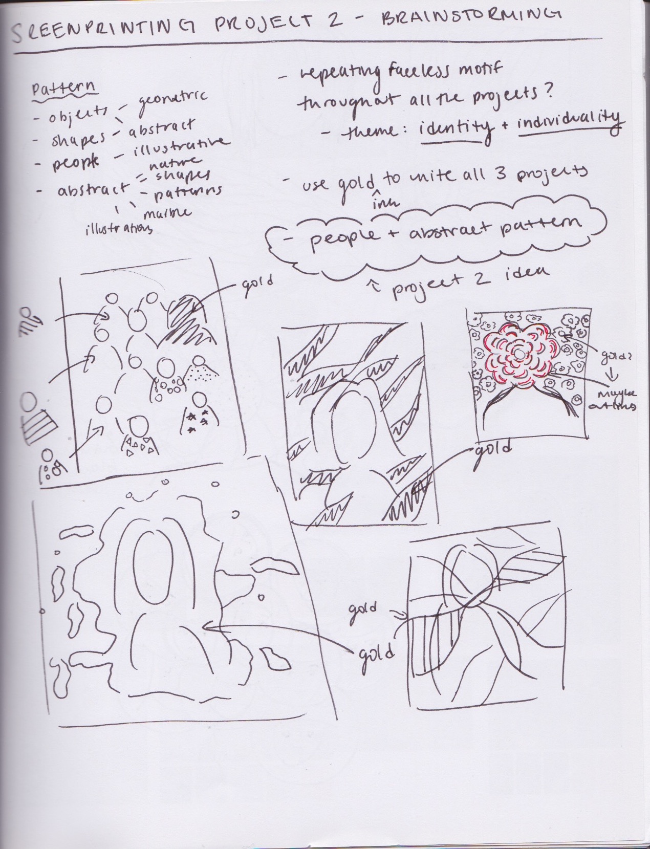
Note: The more I became comfortable with the printing process, the more I took photos to document my process so this is why my second + third projects are filled with more process photos. As well, the further in the course, the more the projects got complex and technically complicated (more layers involved and processes).
Project 1: Cultural Identity
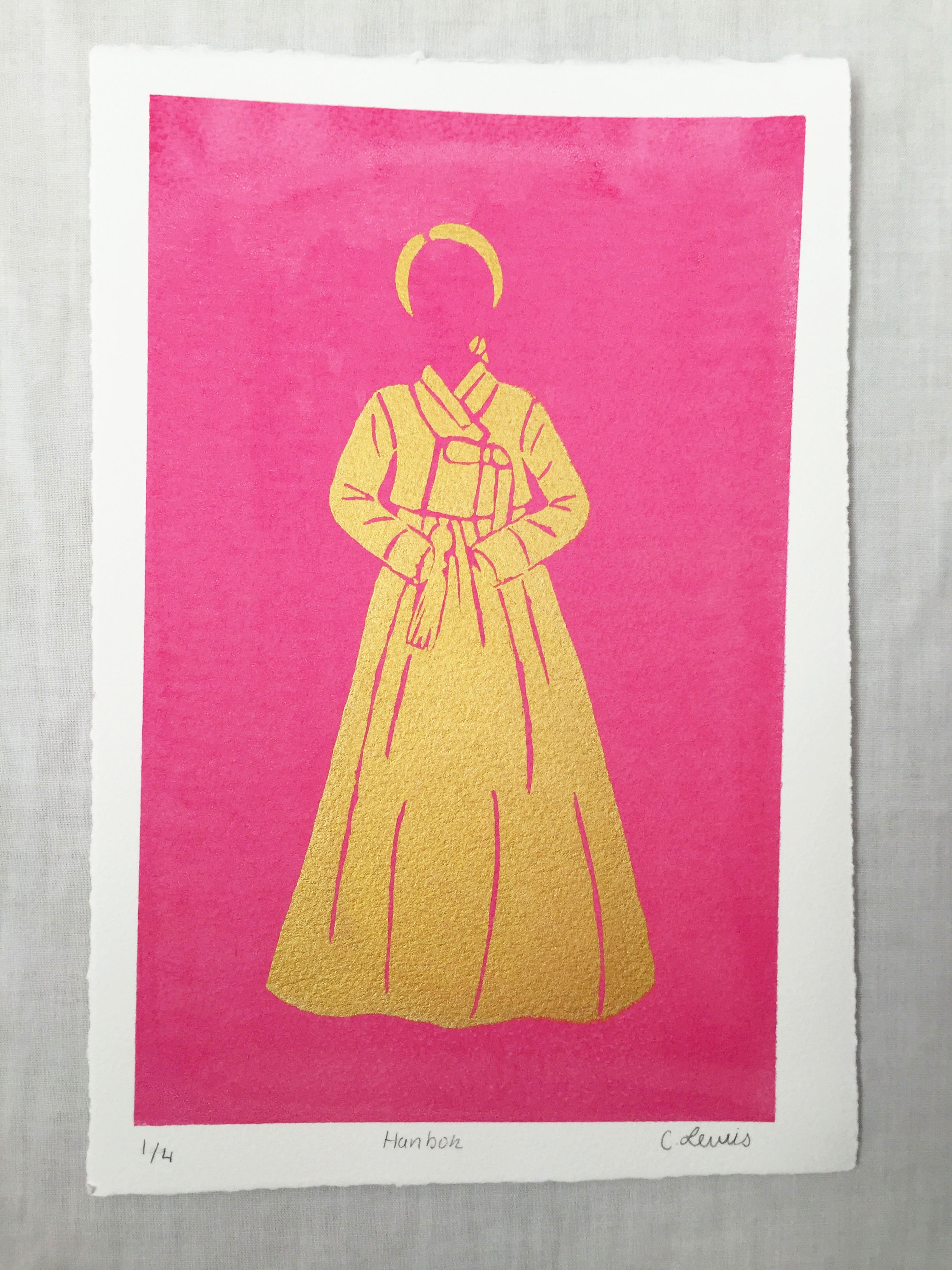
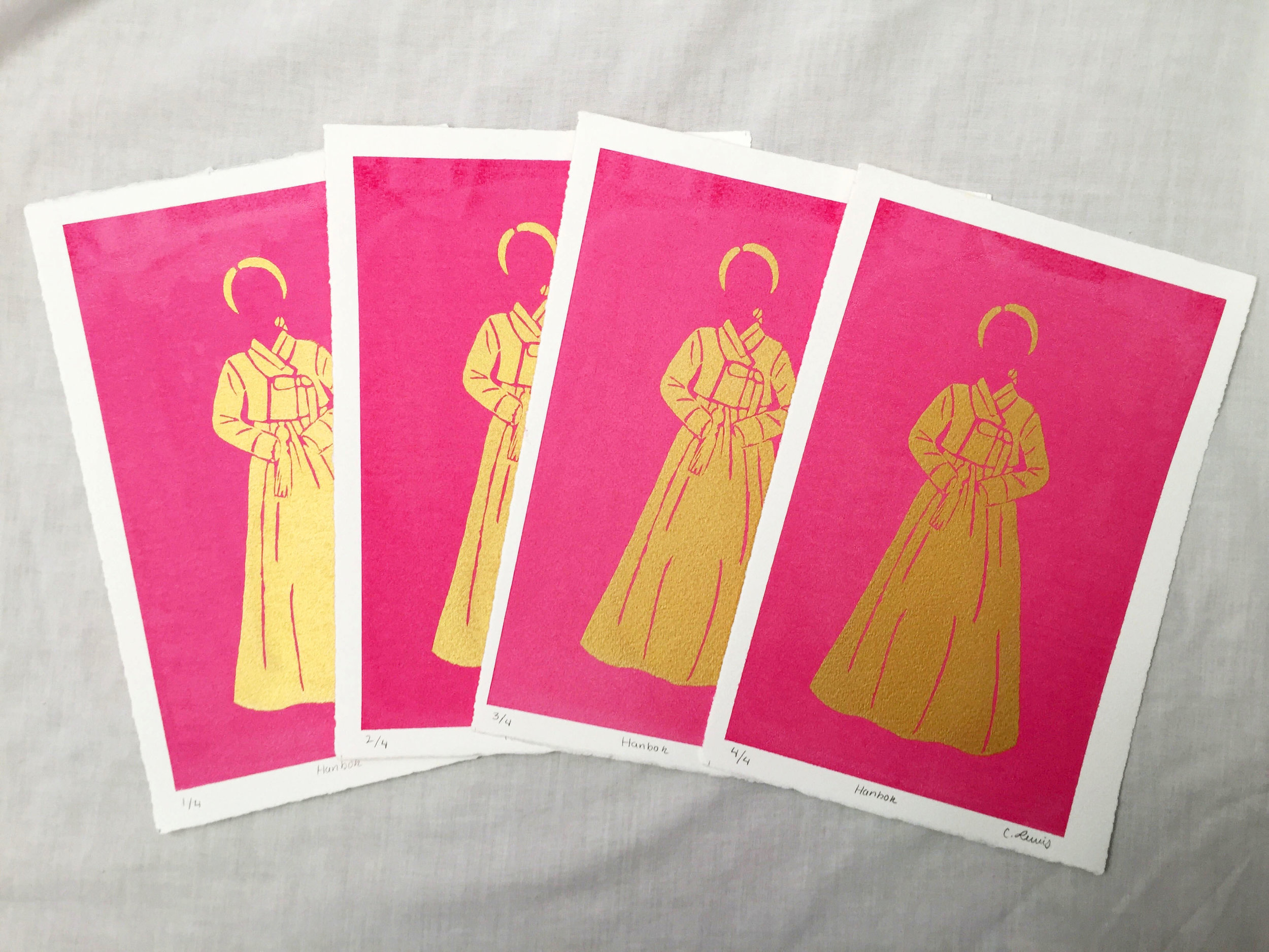
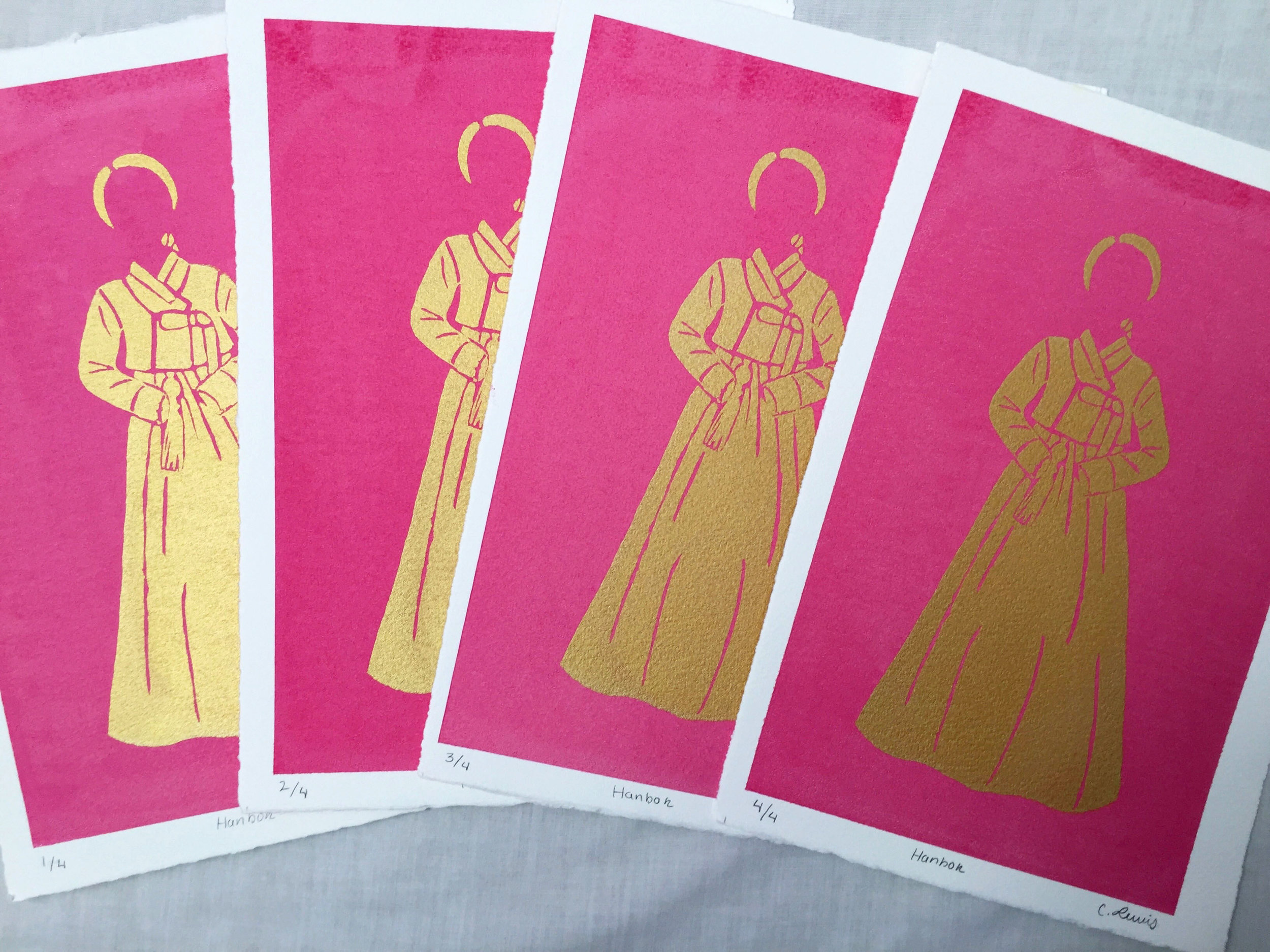
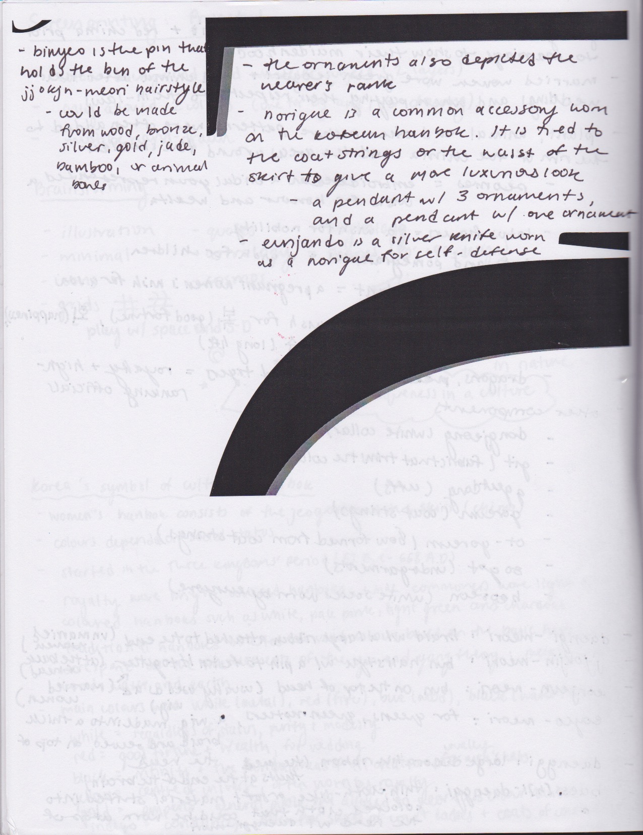
I started off my first project with focusing on Korean culture because it’s one of my personal interests. The way I presented Korean culture was to present a subject that is unique to Korea’s culture and that subject turned out to be the 한복 (hanbok). In the composition, an anonymous female is wearing a traditional dress, printed in gold on a fuchsia colour flat. I tried to represent the statuses of those who wore hanboks in the past, along with the typical accessories that were worn among all statuses. The colours I found to be recurrent in female hanboks were gold (a colour that the royalty wore in hanbok’s) and fuchsia (a popular colour for women’s hanbok, worn by different statuses). The hanbok is a well known cultural identity of Korea and is still worn today for formal events.
Final Prints — Edition of 4
Process Work


After my first project, I decided to have an overall concept for the rest of my work in the class to have a sort of consistency in my prints. When I realized that I could explore identity further in my following projects, I ran with the concept for the rest of my projects. I played with an abstract composition that covered personal identity (project 2) and then an illustrative composition that focused on perceived identity (project 3).
Project 2: Personal Identity
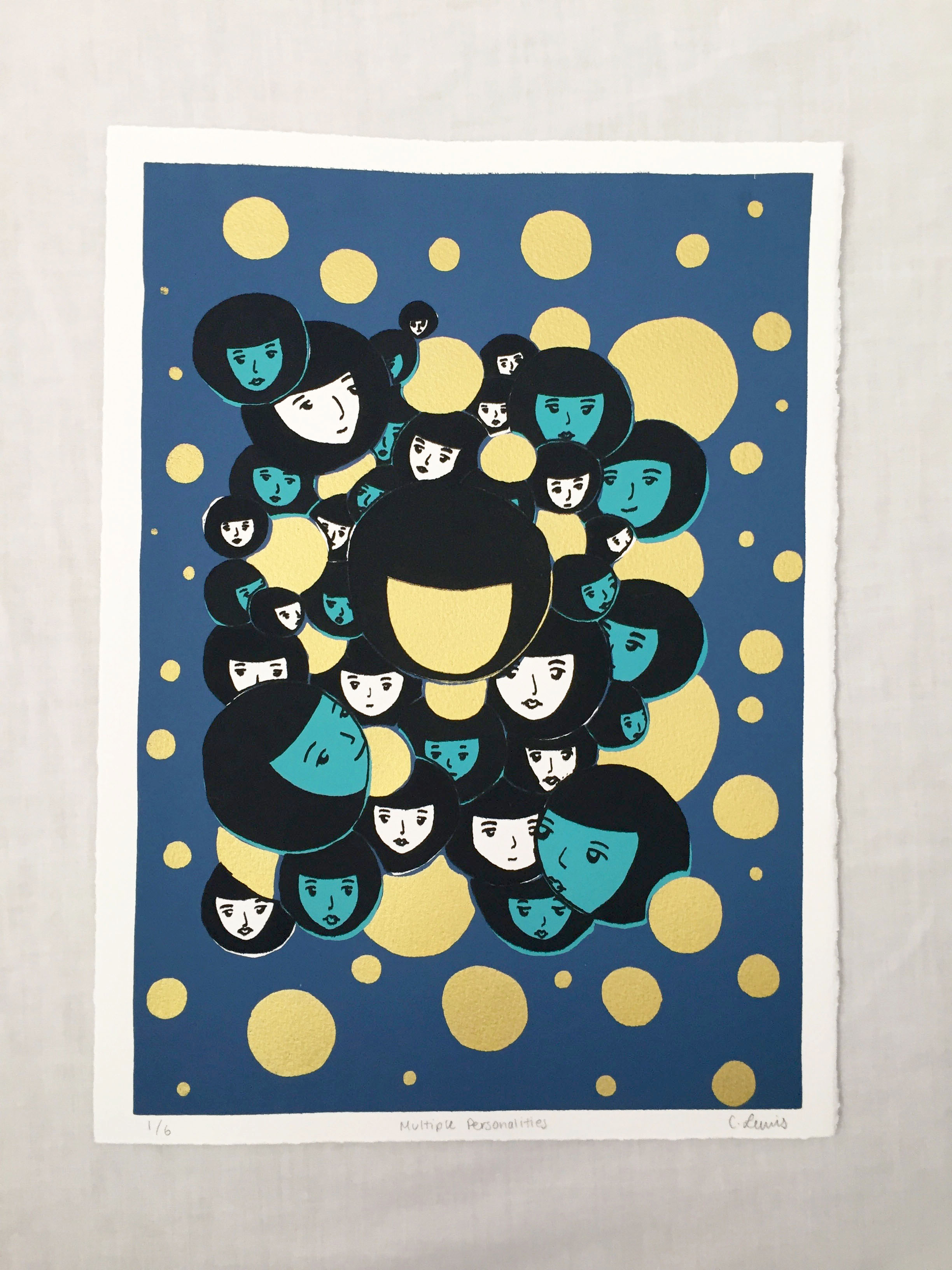
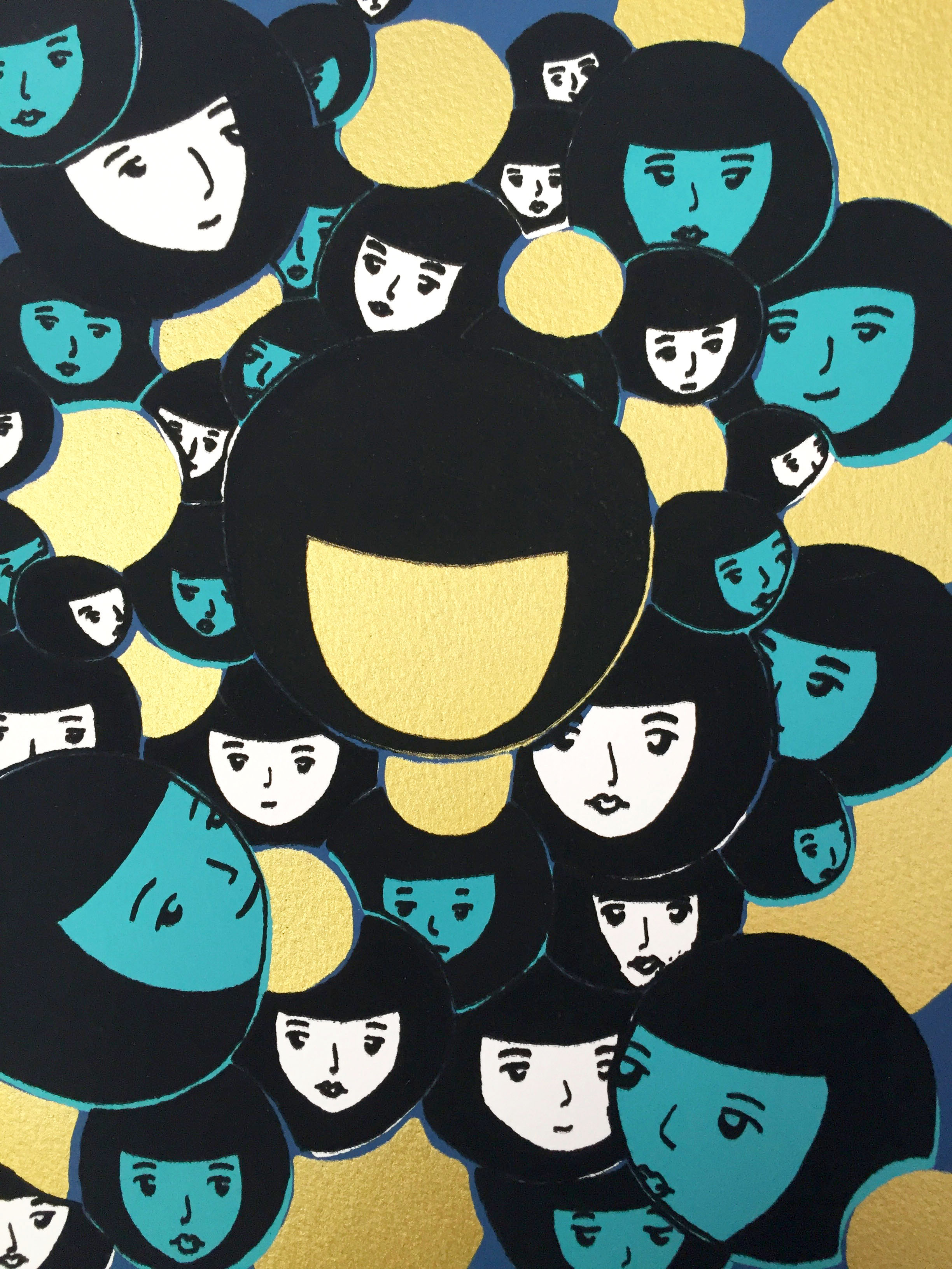
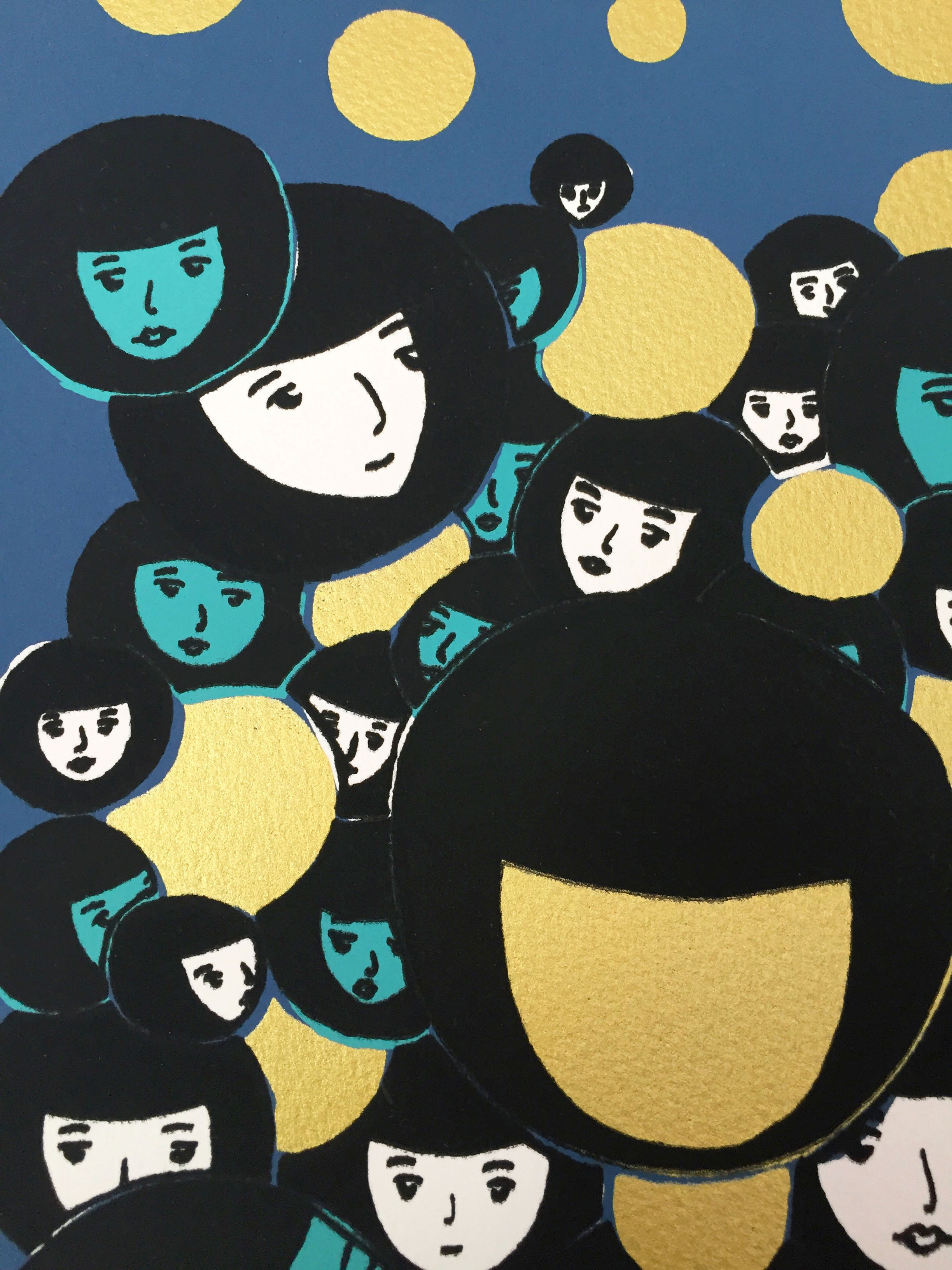
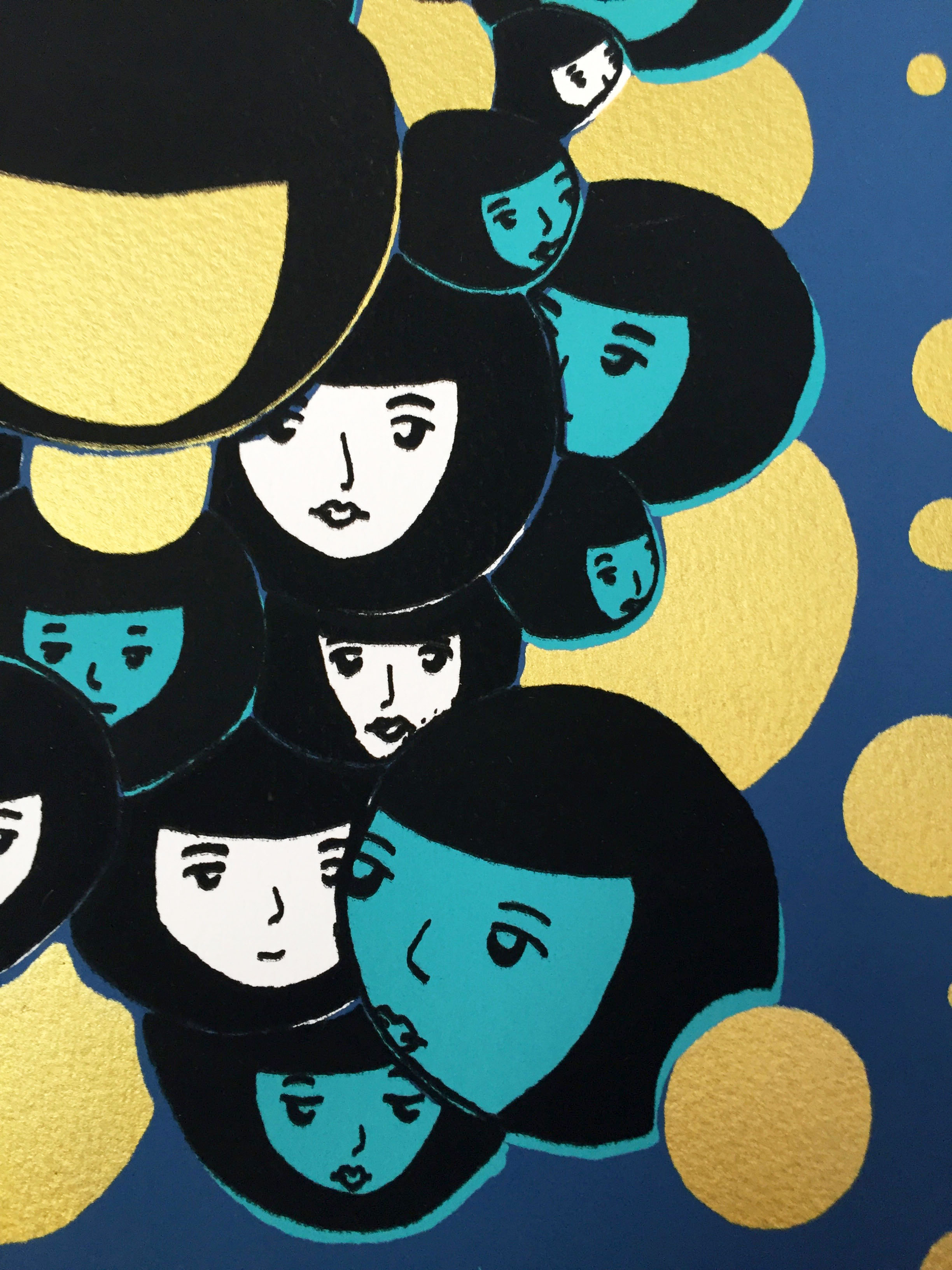
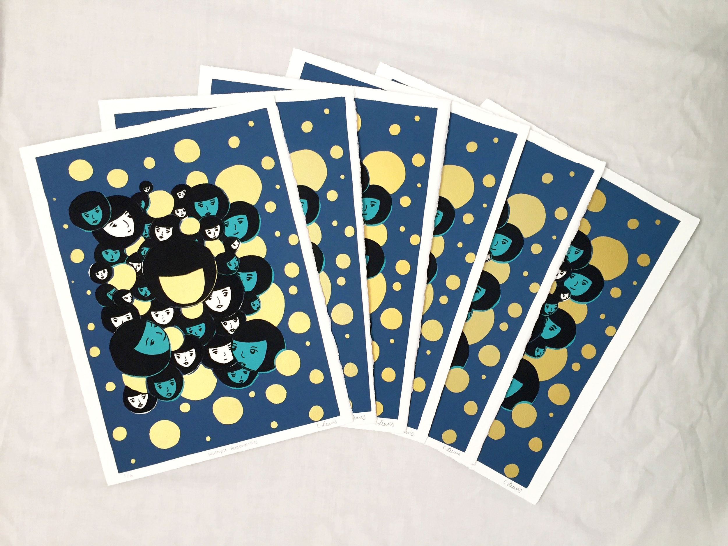
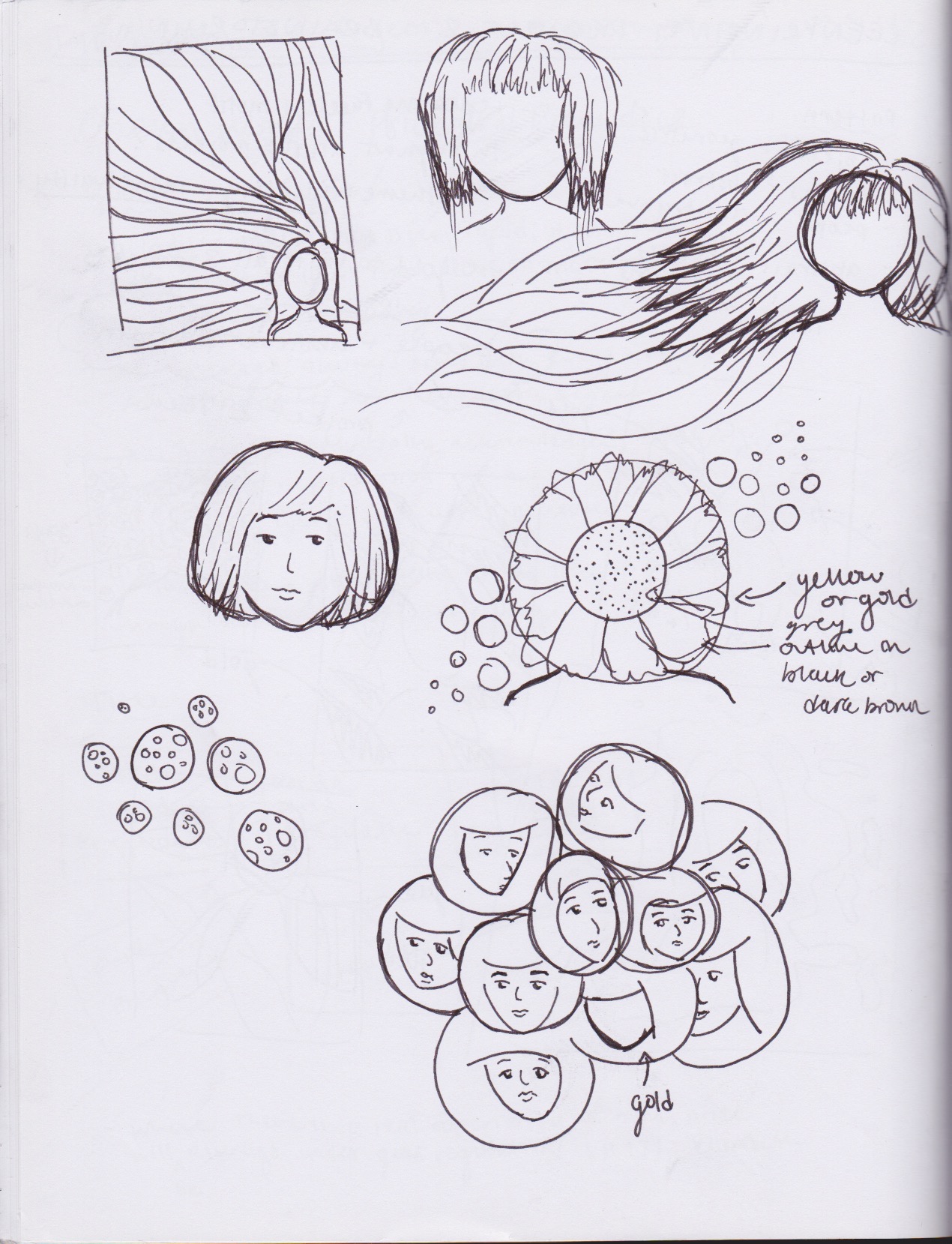
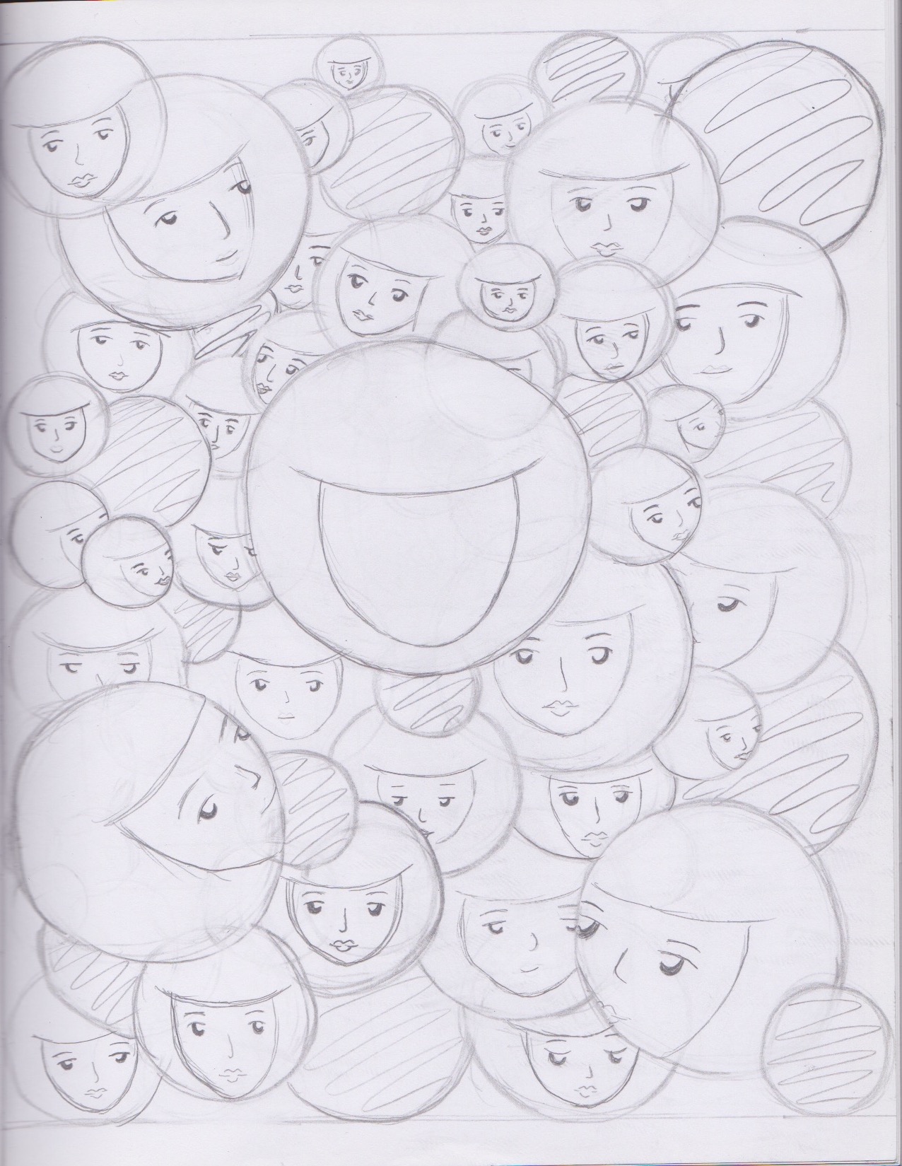
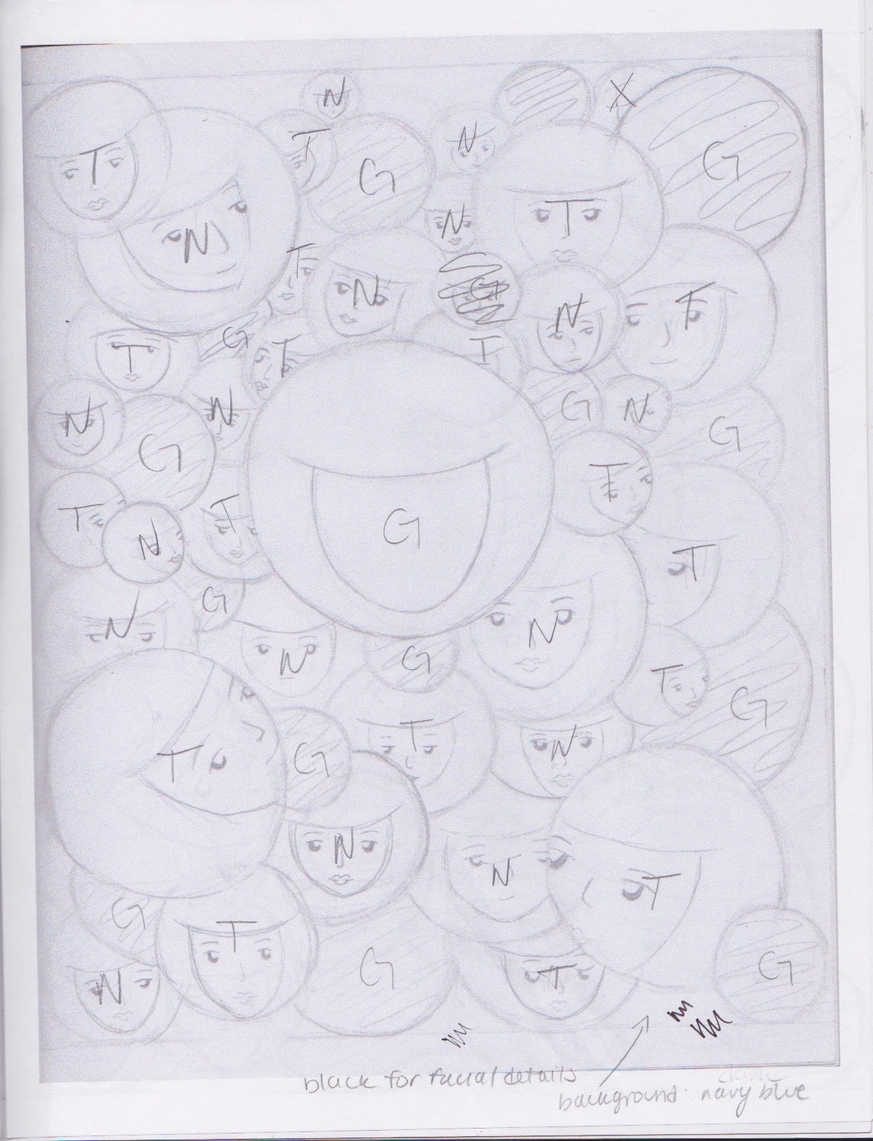
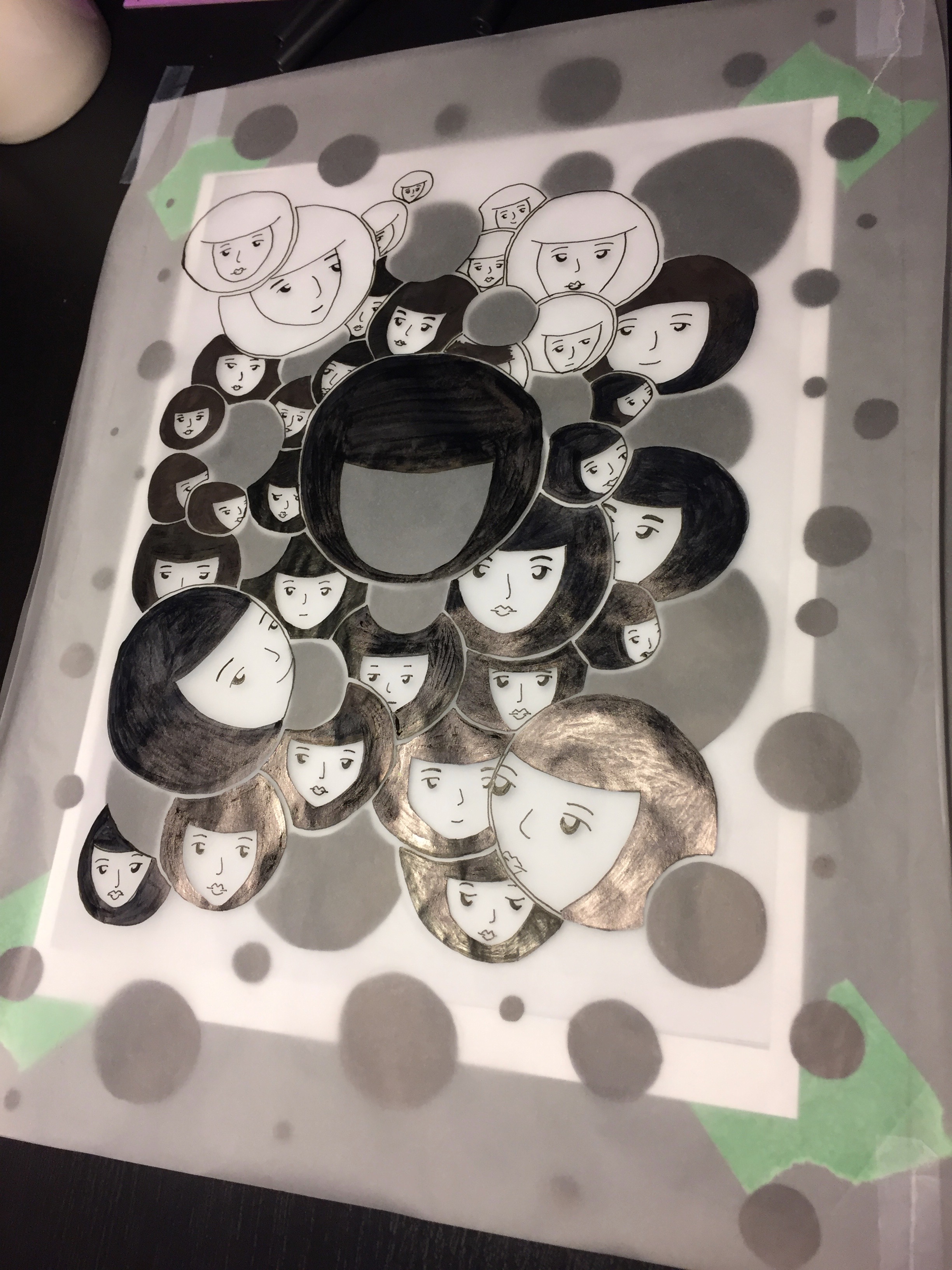
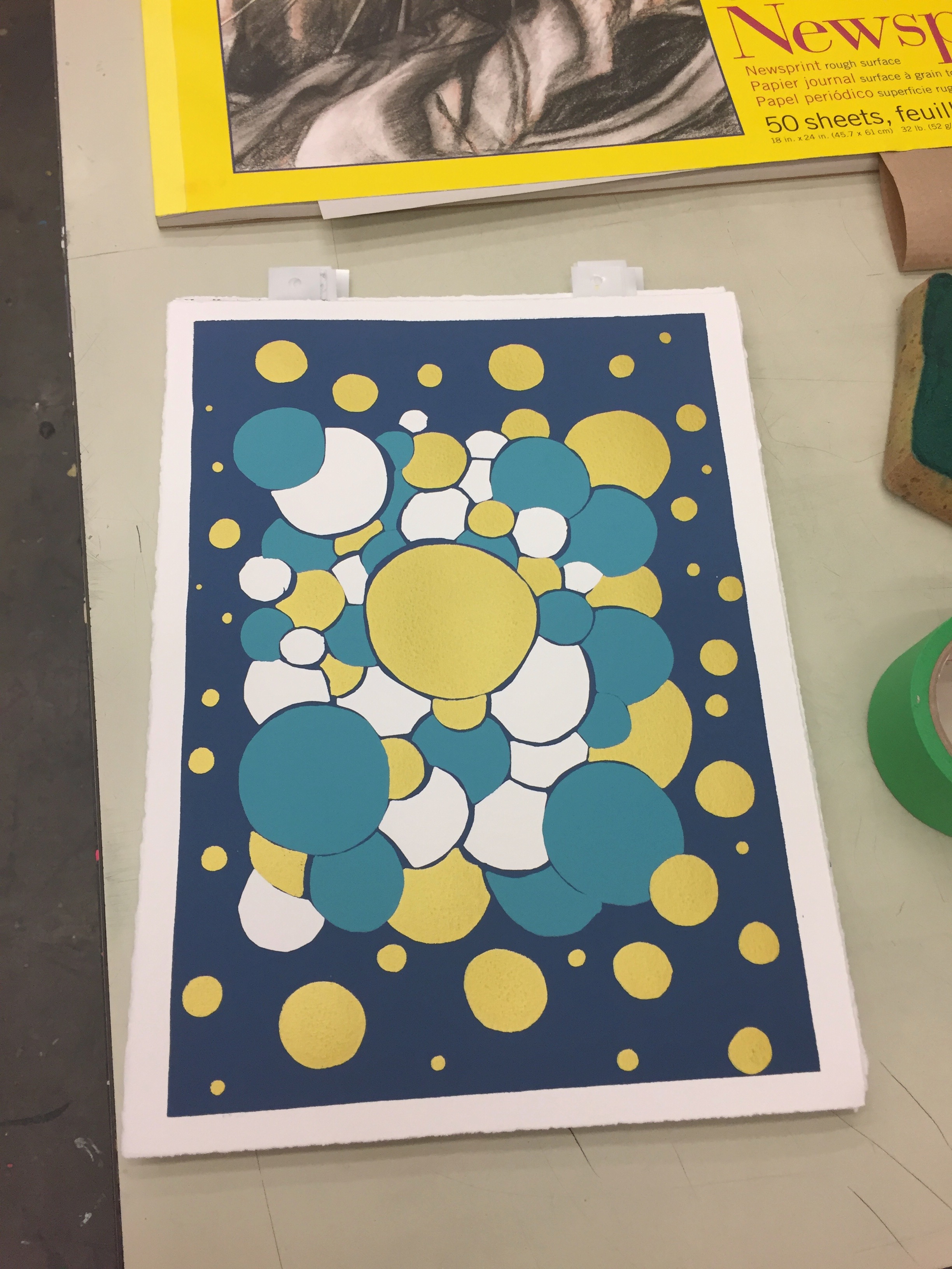
In the second project, I explored the sense of personal identity. As a twenty-year-old, when I look back onto my pre-teens, childhood, I bet that my past-self couldn’t believe who I’ve become. The circle motif is personified to show the different stages that a person’s identity goes through in their lifetime. A person’s identity can simply be changed by the expression or emotion (the different faces you see in the circles) their style (in the different colours used), or in the size (prominent life stages). I chose to use a cooler colour palette to play with contrast with the centre gold circle.
Final Prints — Edition of 6
Process Work


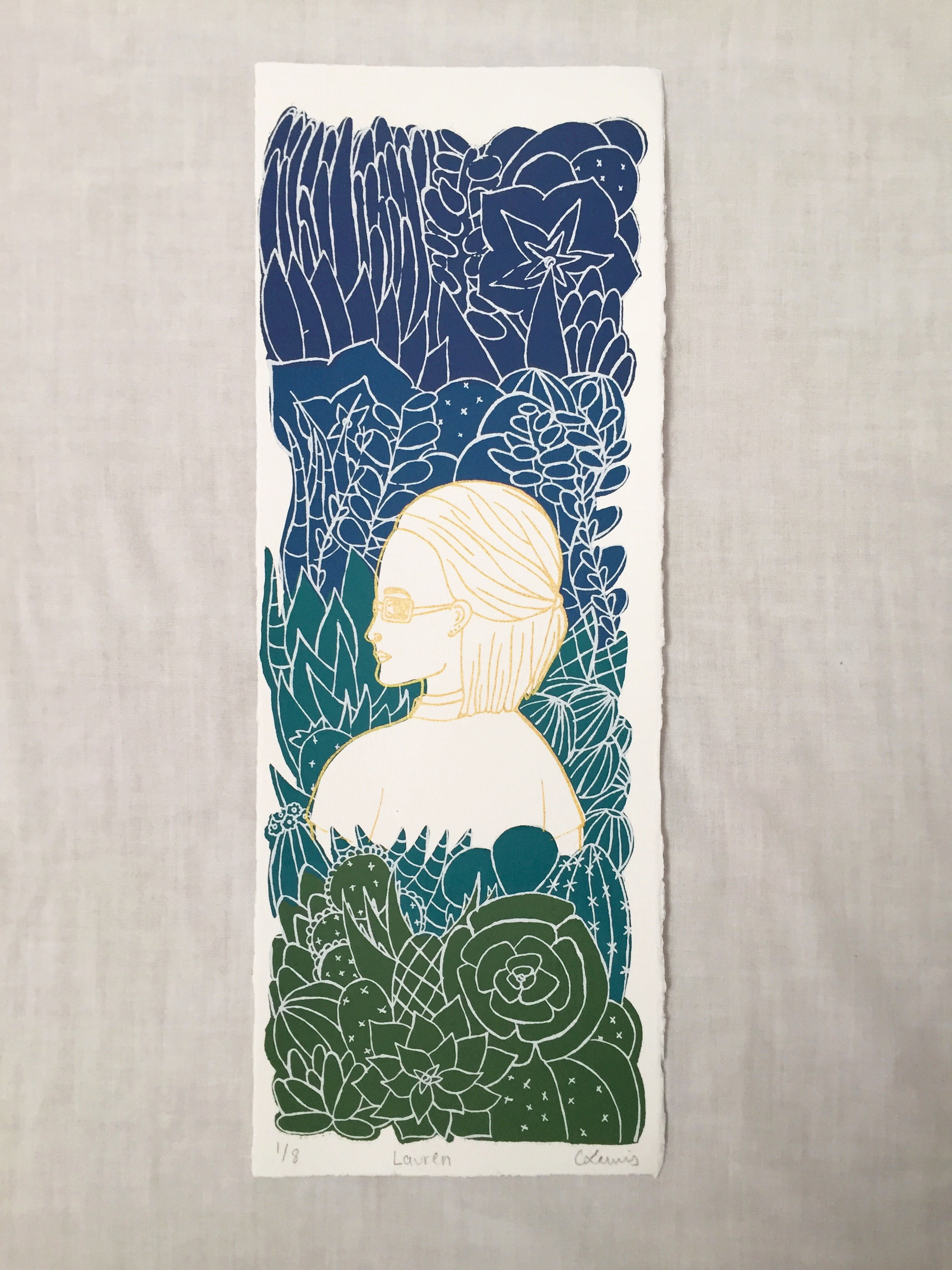
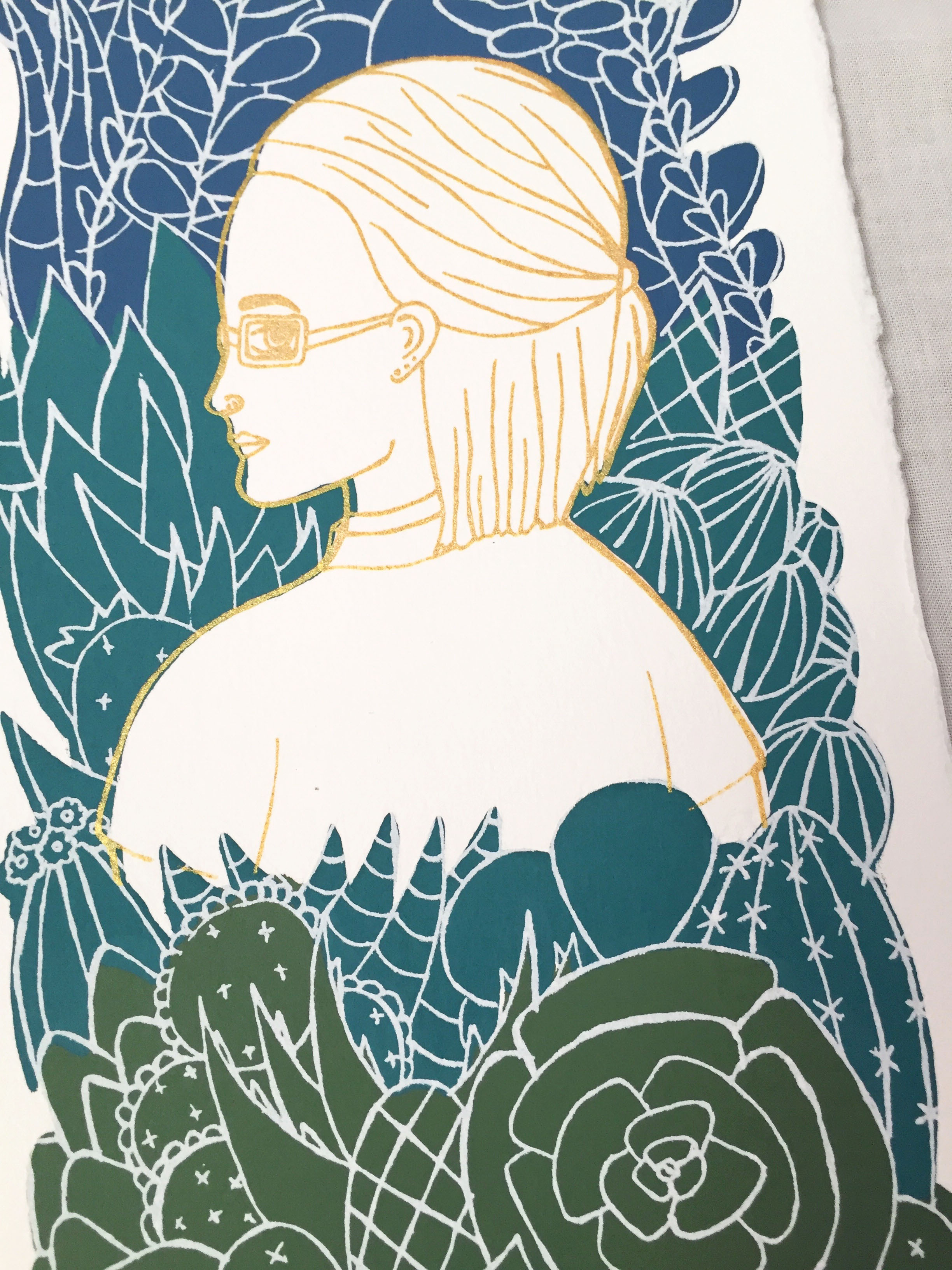
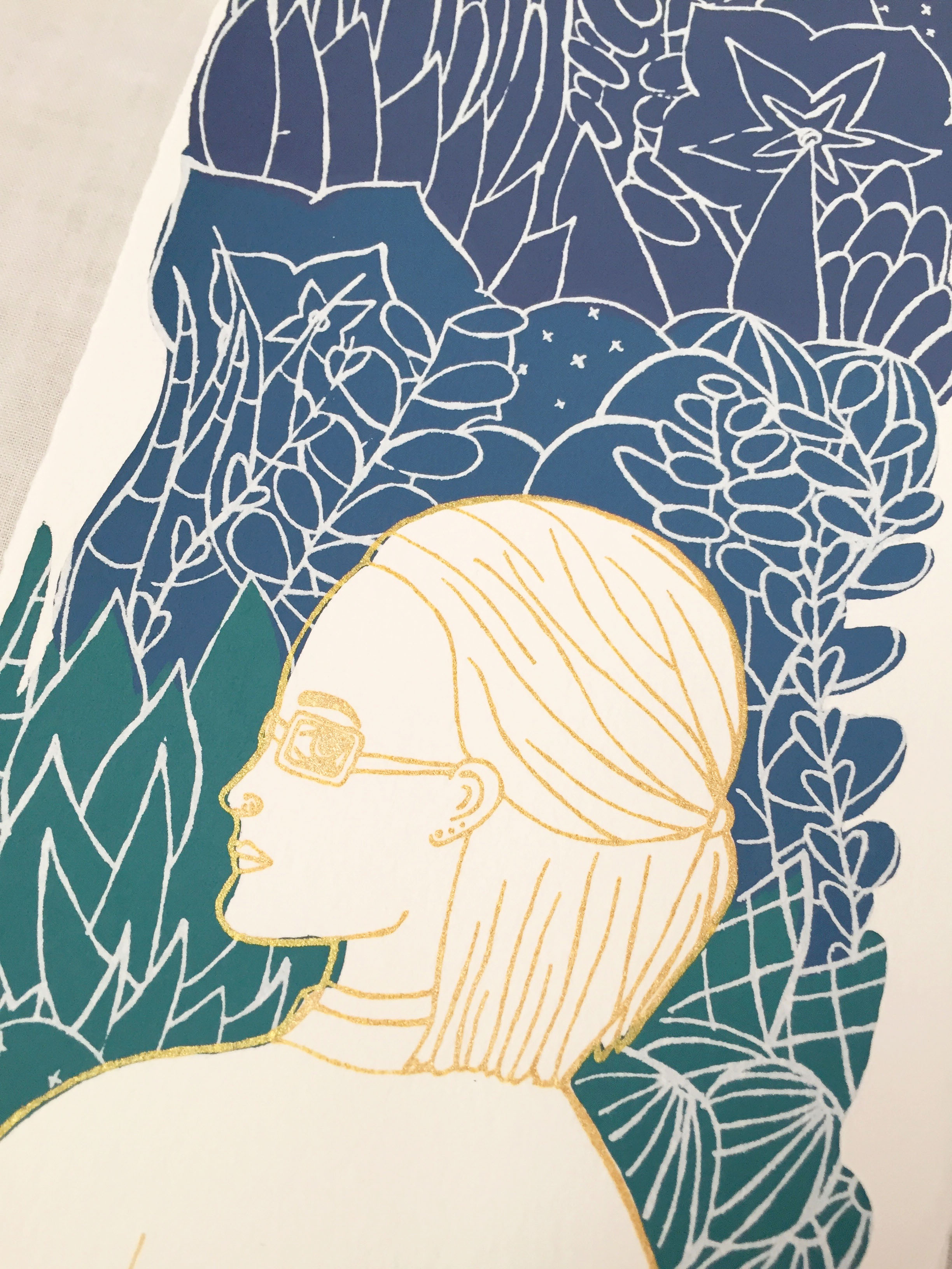
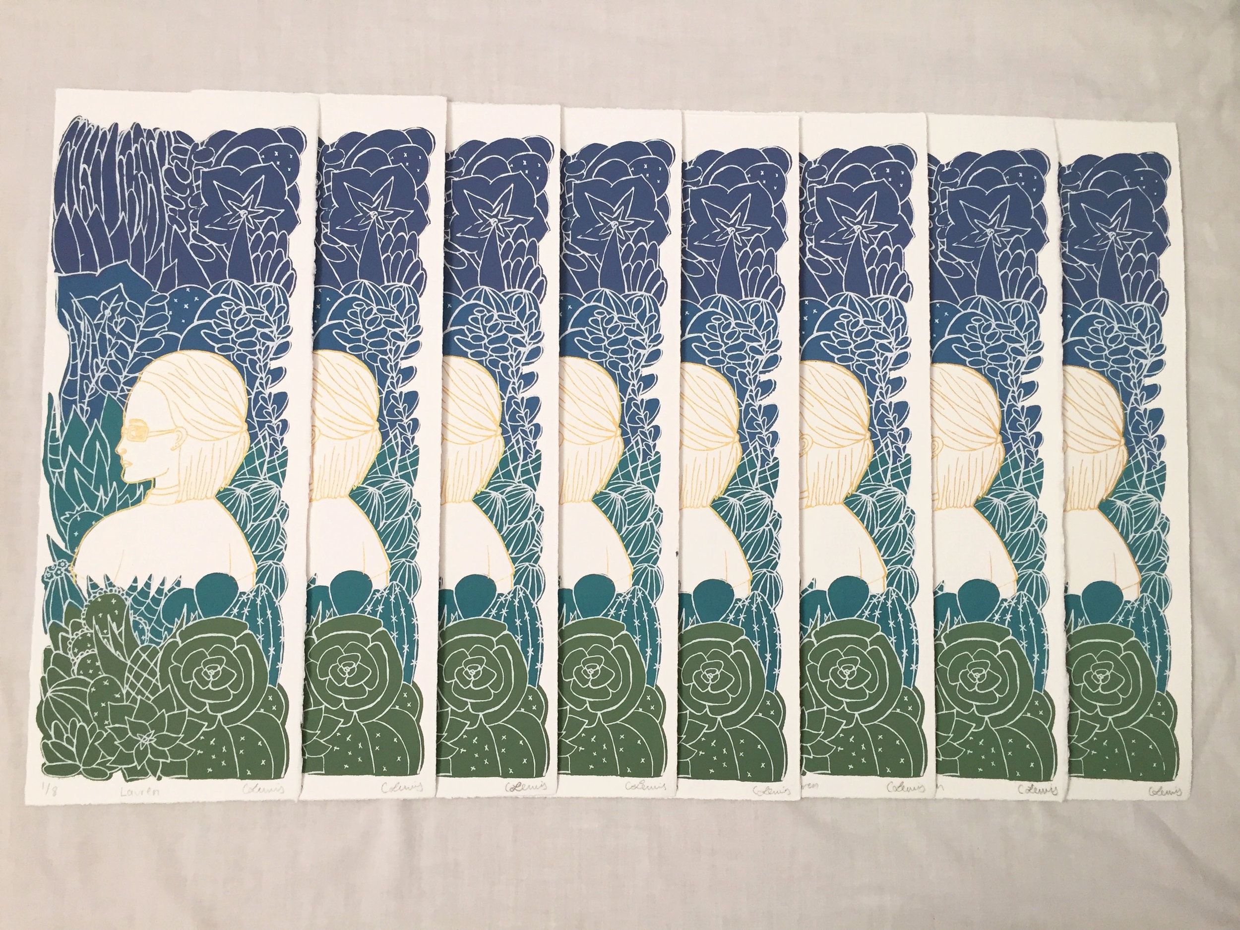
Project 3: Perceived Identity
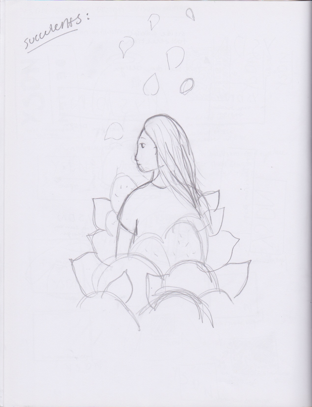
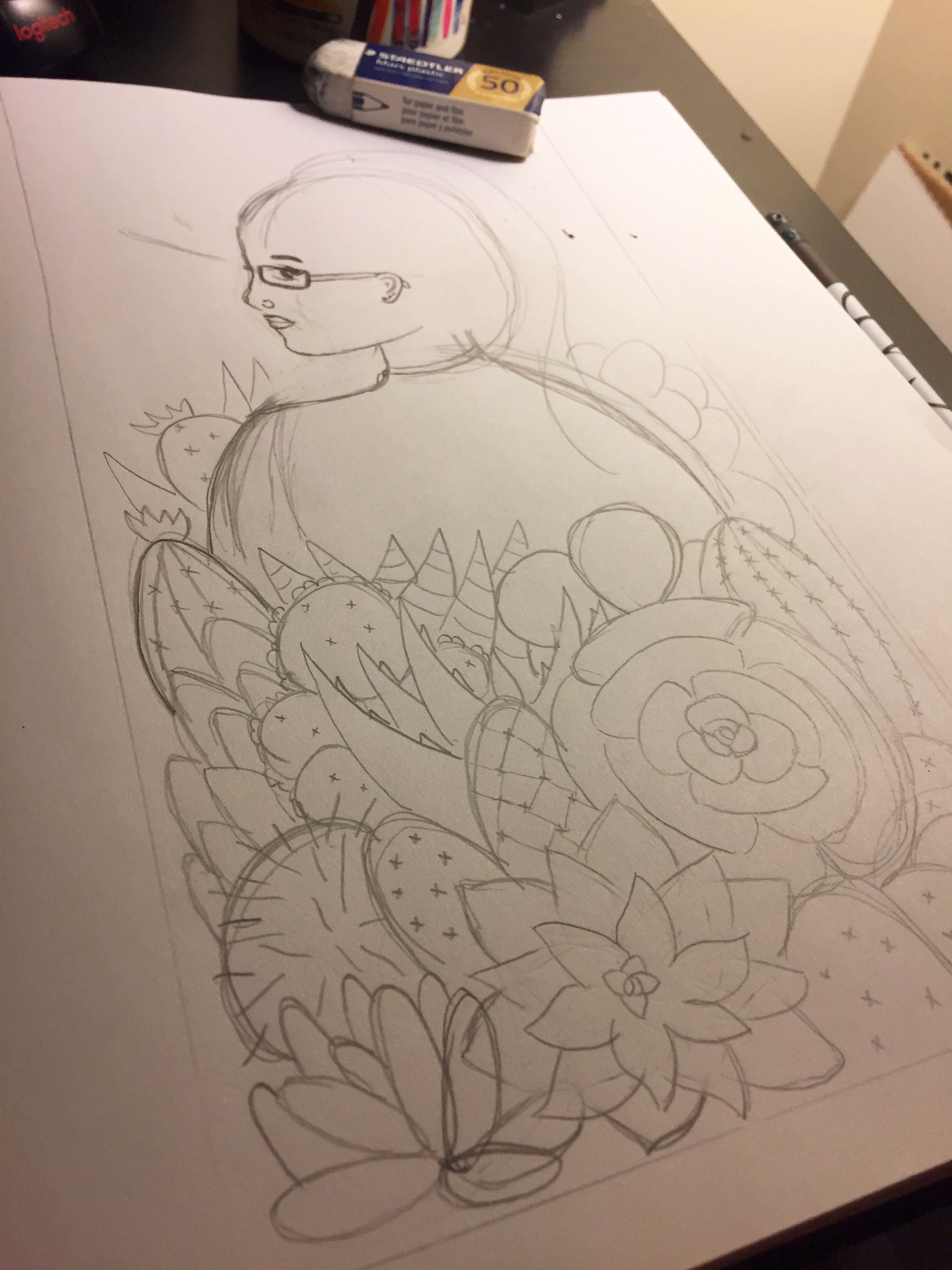
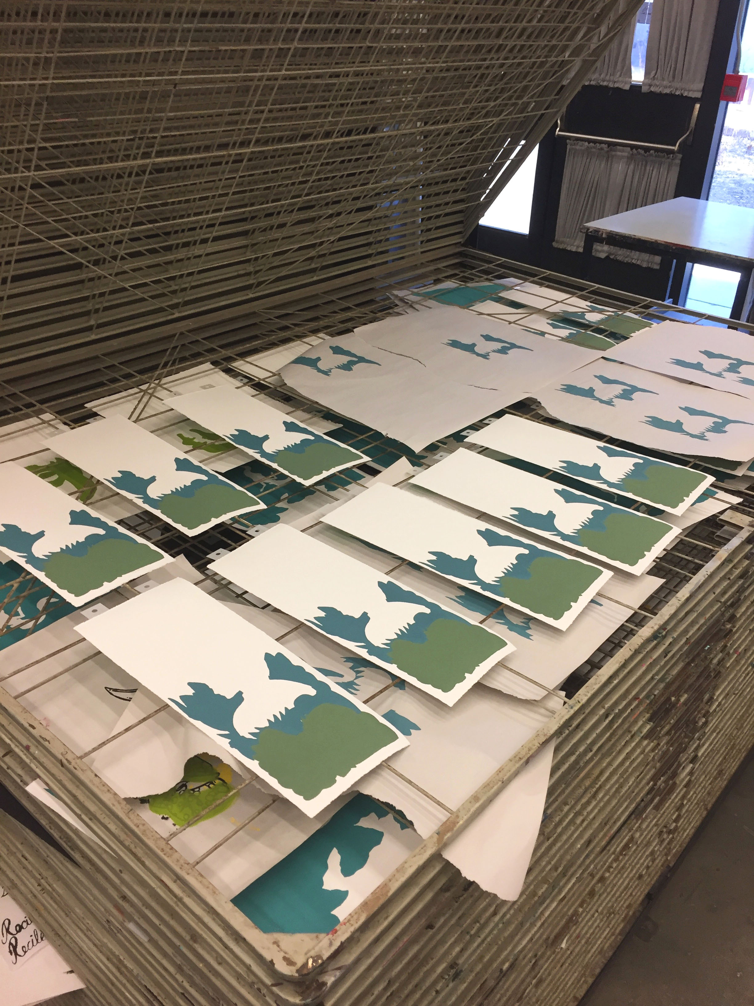
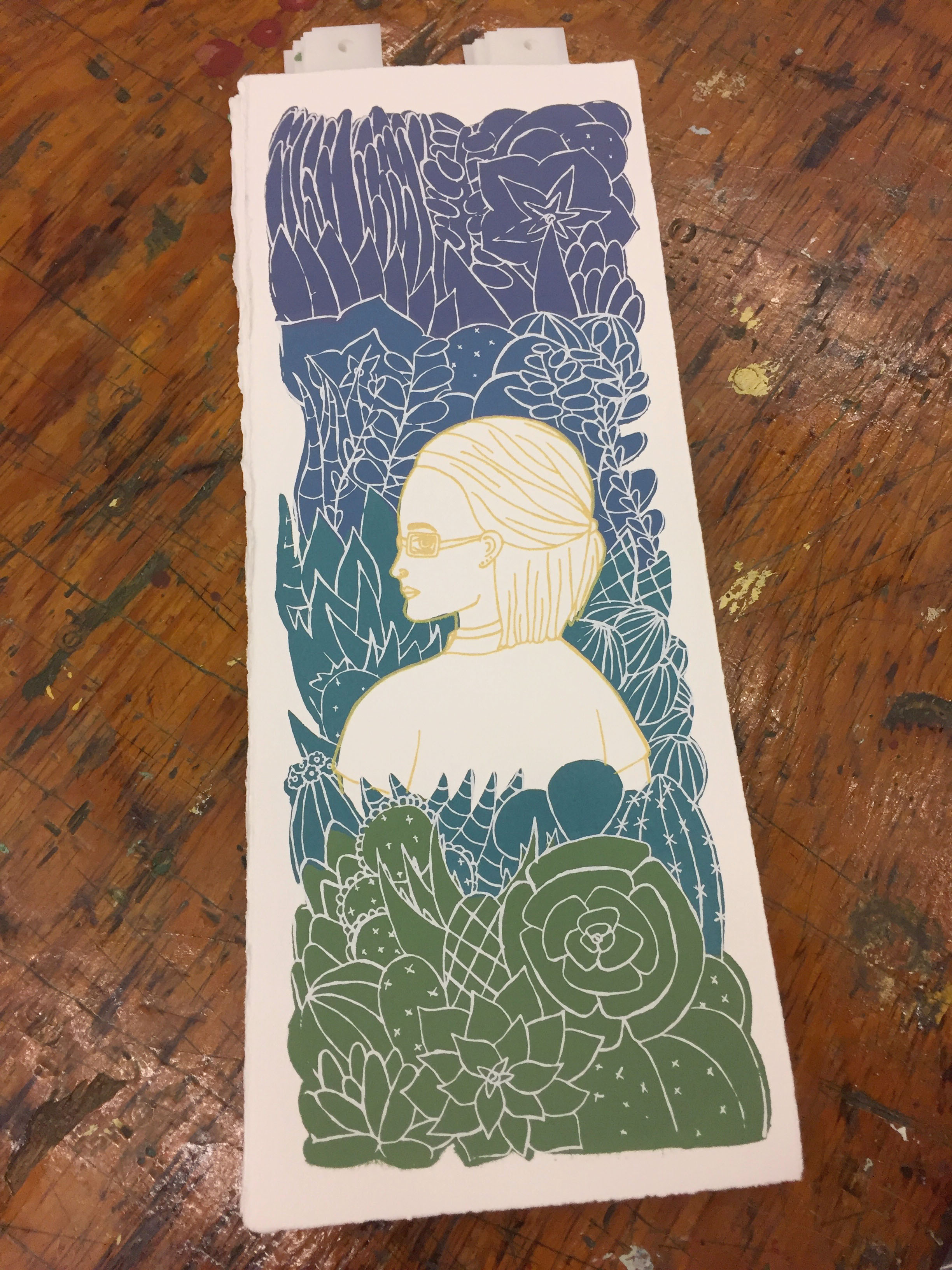
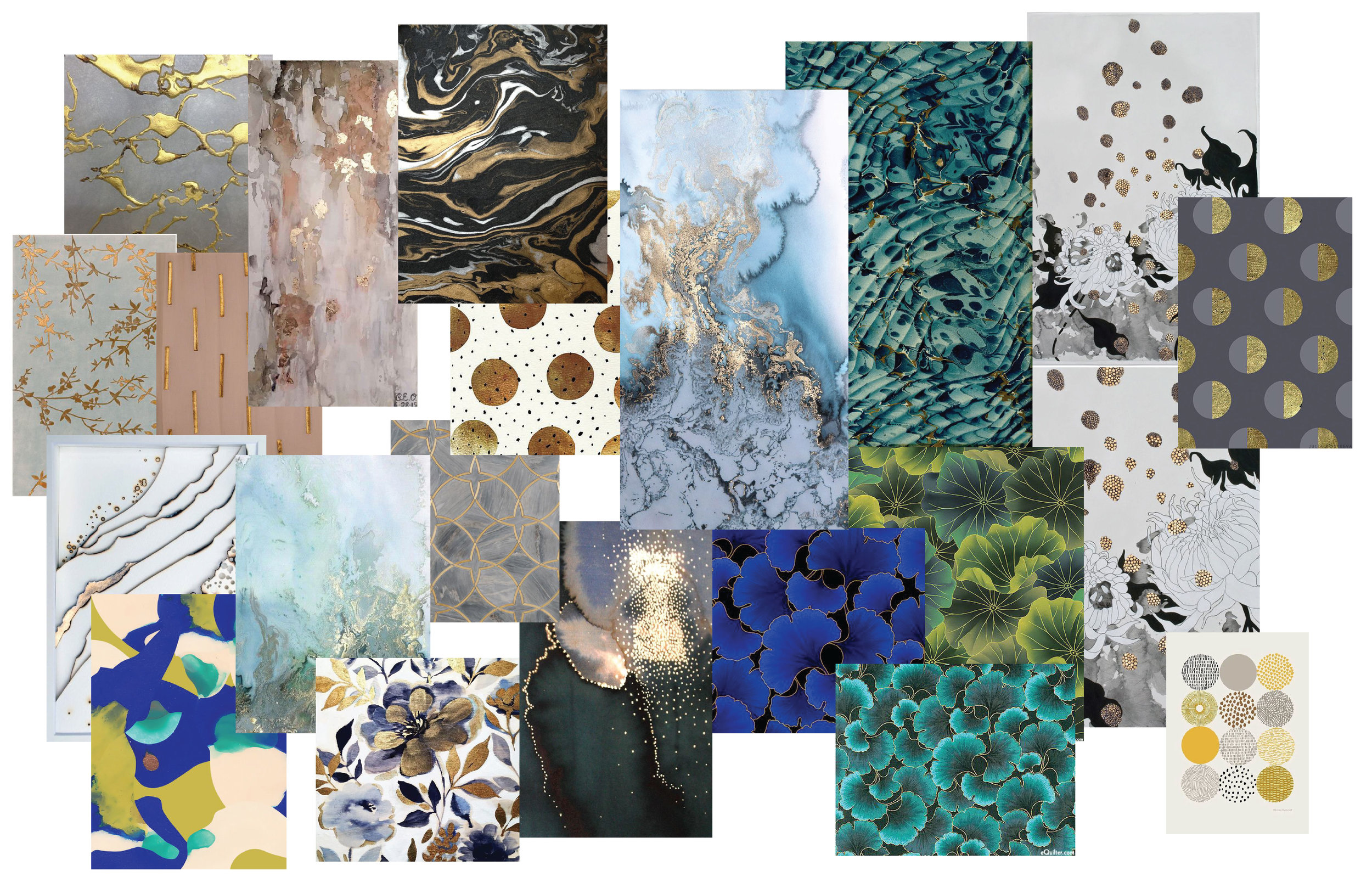
Finally, for my third project, I wanted to explore with layering technique and play with the colour scheme to represent my perceived view of my friend’s identity. I did a side-portrait illustration of her in my own style of drawing because I became interested in the work of Mi Kyung Choi around the time of making the project (which you can see most of her work on the mood board). I love how she uses plants to obscure the face to have a sense of mystery and the soft colour palette to balance the softness of her drawing technique. So I wanted a sense of mystery in my illustration as well because I will never fully know the identity of my friend because I am not her.
Using Choi's work as my starting point and inspiration, I chose succulents to surround my friend because she personally loves growing succulents and I find that they’re a good representation to her personality/identity (a bit stubborn but can thrive under positive environment). I used a gradient block technique as the background/shadow of succulents with a white fine lined illustration imposed on top and the repeating colour I’ve used in my previous projects, gold. The format of the design also created a panel size which was fun to play with and layer the colours one by one going up, directing the viewer’s eyes up and down the illustration.
Final Prints — Edition of 8